Jerry Cao is a content strategist at UXPin — the wireframing and prototyping app — where he develops in-app and online content for the wireframing and prototyping platform.
In today’s world of infinite-scrolling websites and touch devices, you must understand interaction design in order to create user experiences that feel fluid and life-like.
As described in Interaction Design Best Practices Vol. 1, interaction design requires mastery of multiple UX disciplines — which makes sense, since it’s not easy to make a system of objects feel friendly, learnable, and useful.
Let’s start by defining IxD, breaking down the core principles, and explaining a 5-step process to better interaction design.
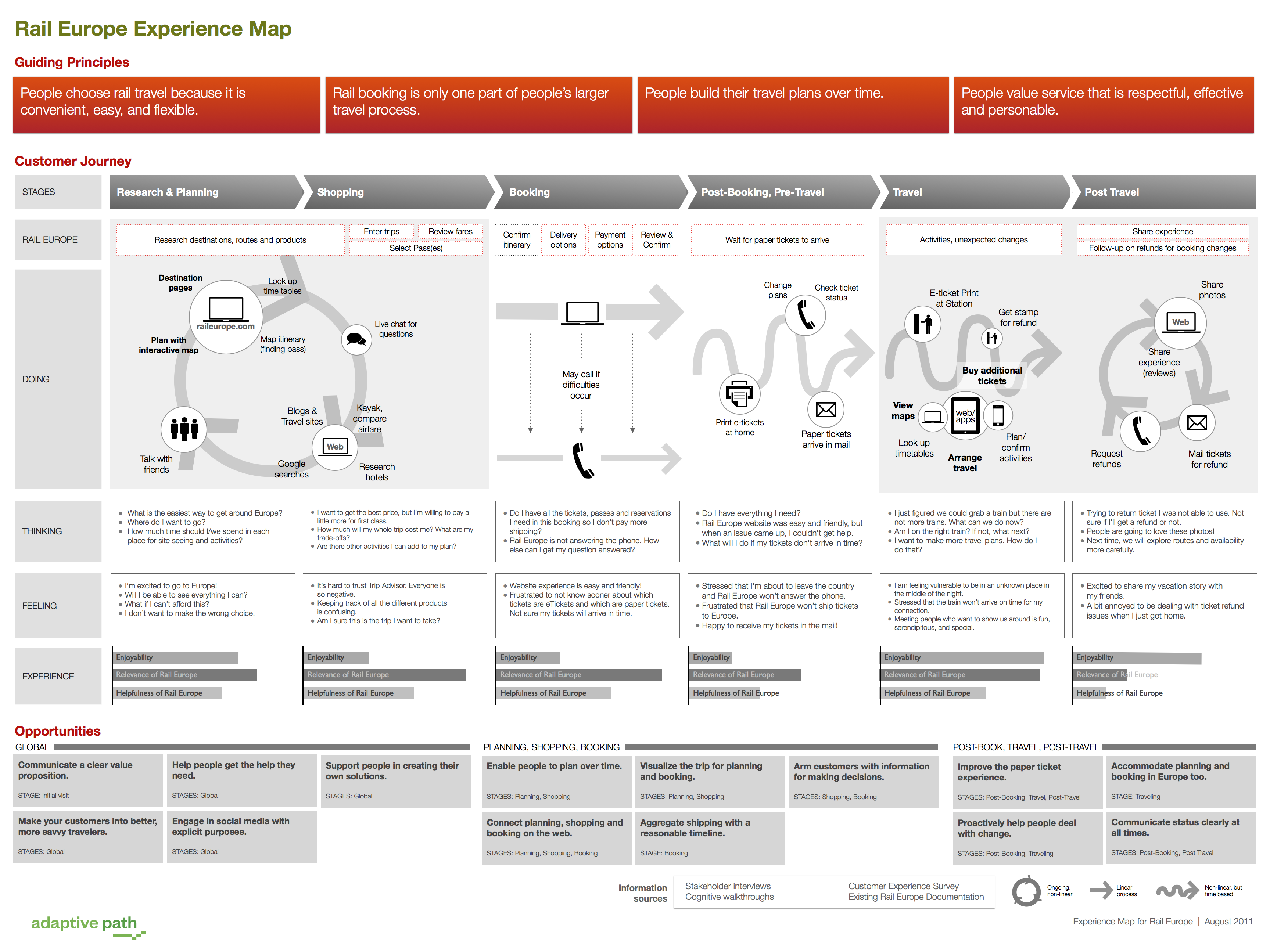
The 5 Pillars of Interaction Design
Good interaction design is driven by a human connection. But what drives human connection and how does that translate into a computerized interface? The answers to these questions aren’t so black-and-white. In our experience, we’ve found that success depends on the perfect execution of UX fundamentals.
1. Goal-driven Design
Even if you’re not personally conducting user research, you still need to know how to build the insights into the design.

Source: MailChimp Personas
We’ve found these UX processes help you empathize with users as people made of flesh and blood:
1. Personas — Personas are fictional characters created from the behaviors and psychologies of your target users. Personas come in handy as a reference when making crucial design decisions, for example, “What kind of checkout process would Sally the Seasonal Shopper prefer?”
2. User Scenarios — Related to personas, user scenarios explain how the personas act when using the site. For example, “It’s Black Friday, and Sally the Seasonal Shopper has a long list of presents to buy online before work.” User scenarios force you to explore the context in which the persona interacts with your product.
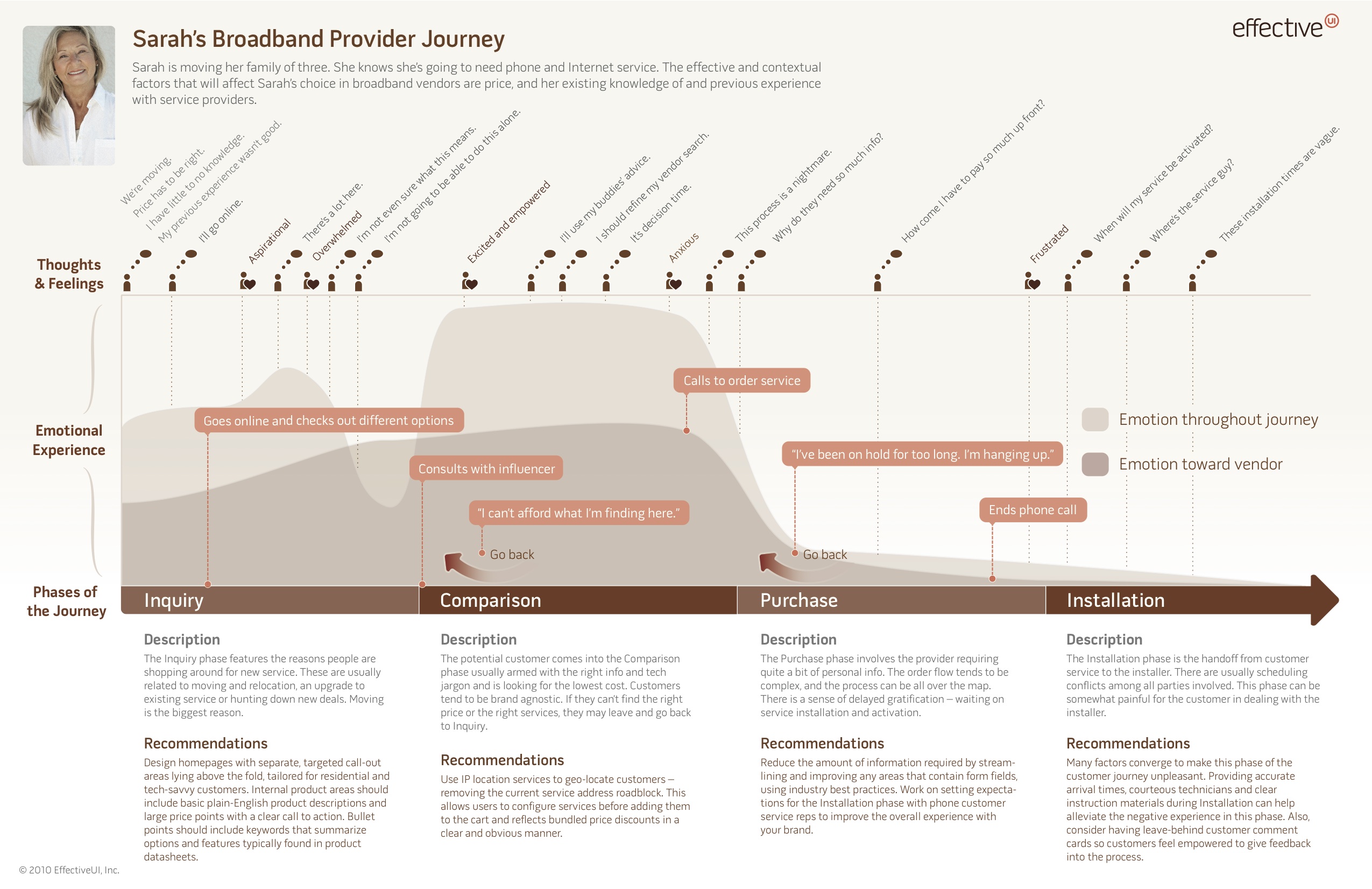
Source: Detailed Experience Map
3. Experience Maps — Going one step further from user scenarios, experience maps chronicle all the conditions surrounding a single interaction, including emotion and external circumstances. “Angry that her skiing trip ended in a broken leg, Sally the Seasonal Shopper must do her Christmas shopping as quickly as possible.”
These three techniques create a complete picture of the experience: the user, the scenario, and the entire emotional journey.
2. Usability
Usability is the bare minimum for design. If your audience can’t use the product, they certainly won’t desire it. Let’s look at EventBrite’s seat designer.
This online app lets event organizers create a reserved-seating event from start to finish with a high level of detail (such as determining rows, tables, and a dance floor, if needed). It consolidates a multi-step, multi-program process into a single linear path.
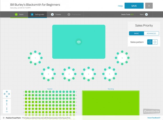
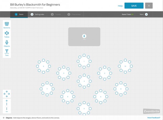
Source: EventBrite Seating Designer
Like Eventbrite, a system’s usability must be effortless. The less attention the user pays to figuring out the system, the more they can accomplish the task at hand.
3. Affordances & Signifiers
The concept of affordances is that a function must speak for itself, and suggest its own use (i.e. a road affords walking). Signifiers hint at the affordance (i.e. the road’s flat surface signals you to walk with your feet).
Affordances in Design
Without signifiers, users can’t perceive the affordance.

Source: Affordances in Design
In the above example, you can see the progression of button design. The first stage lacks any signifiers and looks just like standard text, while the third stage resembles a button with its rounded edges and gradient.

Source: Affordances in Design
Signifiers also work as metaphors, because people also need to know why they would interact with something, not just if it’s possible. In the above iPhone dock example, you can see how the rounded edges let us know that we can interact with the buttons, while the metaphorical images (phones, envelope, musical note) communicate the purpose.
4. Learnability
In an ideal world, a user remembers every function after a single use. Reality is much different. Familiarity and intuition must be designed into every interface.
Successful interaction design boils down complexity by creating consistency and predictability. For example, don’t make some links open in a new tab while others redirect the user. Likewise, don’t use a lightbox for some images while others open in a new tab.
Consistency creates predictability, which improves learnability.
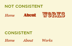
Source: Consistency As the Key to Better UX
A common tactic for improving learnability is using UI patterns. Many sites and apps already use these patterns so the user is familiar (plus the pattern is consistent), and you’re still allowed plenty of creativity to customize the design elements for your site.
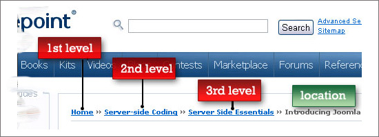
Source: Breadcrumb Navigation in Website Design: Outdated or Trending?
For example, breadcrumbs are a common web pattern for helping users navigate. It doesn’t matter what site you’re on, if you see breadcrumbs, you understand how they work. This familiarity lends itself to a product’s learnability. When products are learnable, it encourages people to use those products, which naturally improves usability.
5. Feedback & Response Time
Feedback is the heart of interaction. Since every interaction is a conversation between your user and product, your product better be friendly, interesting, and helpful.
Source: Applied Interaction Design
Whether an elaborate animation, a beautiful micro-interaction, or a simple beep, your product must communicate if the task was or was not accomplished (and what to do next).
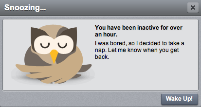
In the below example from Hootsuite, the owl simply “goes to sleep” after a long period of user inactivity, which makes sense since the app pulls in data from Twitter (and doesn’t want to overload the API). The feedback is intelligent and fun, and actually turns a possibly negative experience (stopping updates) into a positive one.
Source: Emotionally Intelligent Interaction Design
Another key factor in feedback is response time. The best response times are as immediate as possible. Imagine how infuriating it would be if you were playing a guitar, and every note came seconds after strumming.
5-Step Process for Improving Interactions
Now that you know the fundamentals, we’ll describe a process we’ve found helpful to nailing the details.

Source: IXDA Columbus
As notable interaction designer Stephen P. Anderson advises, it can be eye-opening to have someone pretend to be your interface while you interact with them as a user. You’ll be able to hear out loud any awkward responses from the interface, which will help you avoid creating robotic interactions that feel inhumane. Once you’re done with the role play, you can start scripting the narrative and restructuring interaction.
Here’s the process:
Roleplay the interaction — Grab two people, one to act as the interface and the other to take notes. Make a browser window prop to be held by the interface person and show the interface on a projector. Then, start a dialog with you as the user explaining their goal, and the “interface” limiting their responses only to labels, menus, and anything else on the UI. Check out this video and transcript to see how it plays out.

Source: Interaction Design Roleplay & Micromoments
Map out the narrative — Document each step of the experience, including tasks and emotions. As discussed in The Guide to UX Design Documentation, this can be as simple as a few user scenarios or as complex as a 4-stage experience map.
Source: Anatomy of an Experience Map
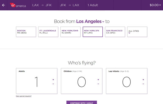
Simplify the steps — Users sometimes have goals that require many steps (buying a car online, booking airline tickets). As recommended in The Guide to Prototyping, your interface must be able to separate a complex goal into simple steps (like asking for a destination, then a departure/arrival date, etc). For example, Virgin America’s stepped form design make the booking process feel much easier than it is.
Source: Web UI Patterns 2014
Limit user choices — This is probably the hardest step, but you must minimize the actions available to users. Always ask yourself if all the choices are critical for that moment in time. If not, separate it for another conversation.
Pay attention to micromoments — A micromoment is when a person might hesitate, advance, or stop when engaging with interfaces. If you look back to the role-playing exercise, you’ll remember the moments of apprehension. To clarify the conversation, take advantage of microcopy and UI patterns like contextual actions and selection-dependent inputs (which we discuss in Web UI Patterns 2014).
Just like a magician’s trick will fail if the details are off, just one bad interaction can ruin the entire user experience. The process we described above will help you approach interaction design as a conversation rather than just a way of animating interfaces.
If you’d like more inspiration and examples of good interaction design, this Quora thread includes great sources ranging from films to websites like Core77 and PatternTap.
Closing
Interaction design isn’t about how interfaces behave, it’s about adapting technology based on how people behave. You must know your target users like and expect, functionally and emotionally. Based on the technological constraints, you must then design the product for desirability.
The best interaction design is barely there: your product responds promptly, doesn’t require much thought, and works like a good magic trick.
Read Next: How to optimize blog design to better engage with readers
Get the TNW newsletter
Get the most important tech news in your inbox each week.