David Arnoux is Head of Growth and co-founder of Twoodo, helping teams organize using simple #hashtags. This post originally appeared on the Twoodo blog.
One of the greatest lessons of the past few months is that when building a SaaS company you shouldn’t overlook the soft data just because it’s not hard data. This is especially true when following lean methodology. Talk to your customers, always. Especially if you are serious about increasing your activation rate.
Okay, so that’s easy to say, but what does it actually mean and how do you implement it?
I’d like to share with you the tips, tricks and tools we used to develop a kick-ass customer feedback loop – even though we were still in private beta and we didn’t have huge amounts of traffic (around 200 unique visits per day).
The feedback we have collected has greatly helped us increase our activation rate and engage with our users. It has also given us great insight into what features we should be building for our early customers.

The <3 of EU tech
The latest rumblings from the EU tech scene, a story from our wise ol' founder Boris, and some questionable AI art. It's free, every week, in your inbox. Sign up now!
1. We chose to go the “private beta” route
The first three months of Twoodo were spent in private beta mode. There is a debate about whether a SaaS startup should be open right from the start, but we decided to stick with the control that a private beta offers. The main argument for this was that it would allow us to incrementally grow our website at our own pace.
We also wanted to only let who we had identified as our true early adopter segment right from the start. I’ll explain this a little further down.
In the first month of our private beta, we were extremely strict as to who we would let in. In order to be allowed to use the tool you would have to
- Sign up to the waiting list
- Fill out a questionnaire
- Agree to a short Skype “webinar” with us (we ended up not enforcing this one as the survey gave us plenty of information)
2. Create a questionnaire that your users have to fill in
We set up an “Add me to your waiting list button” as the main call to action of our landing page.
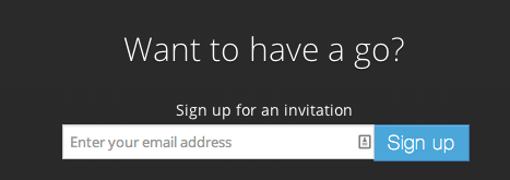
After you signed up you would receive an email from us asking you to fill out a questionnaire that we had created with Google Drive. You would only get access to Twoodo if you filled out the questionnaire.
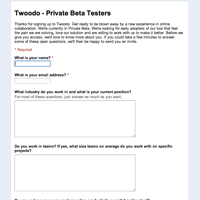
To be honest, the questionnaire was pretty long and painful to fill out but we did that on purpose. By doing this we were sure that the users we were letting in REALLY had the pain we were solving and REALLY wanted to use our solution.
You’d be amazed at how many people actually accepted to fill out the questionnaire. We were amazed ourselves. More than 50 percent of signups filled it out. Not only was this additional validation that we were solving a real pain, but we got tons of invaluable information such as:
- the types of users that we were attracting,
- the size of their teams,
- their industry, the location,
- the tools they were using, their workflows,
- the pains that users were having with other tools,
- some initial insights as to the functionalities they were looking for.
Without realizing at first, we had actually started a conversation with them. This is when we dropped the compulsory “Have a quick Skype with us” step to getting access to the website.

We were actually getting real live user cases within the questionnaire, a fantastic profile of our users and the size of their teams. We could use this information to then make their activation process easier and to start a real conversation with them.
At this point, our activation rate was 2 percent and the sign-up process was messy.
3. Offer a Skype webinar right off the bat!
The next email that we sent them was a “Thank you for filling in the questionnaire” + invitation link to the site, followed by an offer to do a 10-15 minute Skype webinar. The webinar had three purposes:
- Our onboarding process wasn’t great at the time so this would help activate the user.
- We could get live feedback as to what problems they had faced when first using tool.
- We could create a relationship and learn to know our customer even more.
For the webinars we planned to follow this simple format:
- 5 minutes: understanding who we were talking to, what was their workflow, what was their pain.
- 5 minutes: onboarding them to Twoodo based on understading of their pain/workflow
- 5 minutes chit-chat and Q/A
They usually lasted well over 15 minutes. We started out by using Skype but then switches to Zoom.us after a while. The share screen on zoom works so much better than on Skype and was free up to 45 minutes.
Through these webinars we understood right away that our user interface was too complex. We were bombarding newcomers with too much information. This pushed us to carry out a large user interface simplification.
Although not all users had the time for the webinar, the ones who did gave us great information. They are still using Twoodo today and have become some of our most insightful sources of feedback. The conversation with them has never stopped.
Through simplifying the user interface and making a first attempt at our on-boarding process, we increase the activation rate to 8 percent.
This still wasn’t great. We needed more information as to WHY the other 92 percent were not having a great first time experience.
4. In-app messages
In general people will try your tool out for about one or two minutes and then either adopt it or abandon it forever. Getting feedback on those first seconds of a user’s journey are vital to increasing your activation rate.
What did they like? What blocked them? What didn’t they understand? Was it our colors? Is there too much text? Are they seeing that big red button they’re supposed to click on? These are all crucial User Experience questions that we HAD TO answer in order to increase our activation rate.
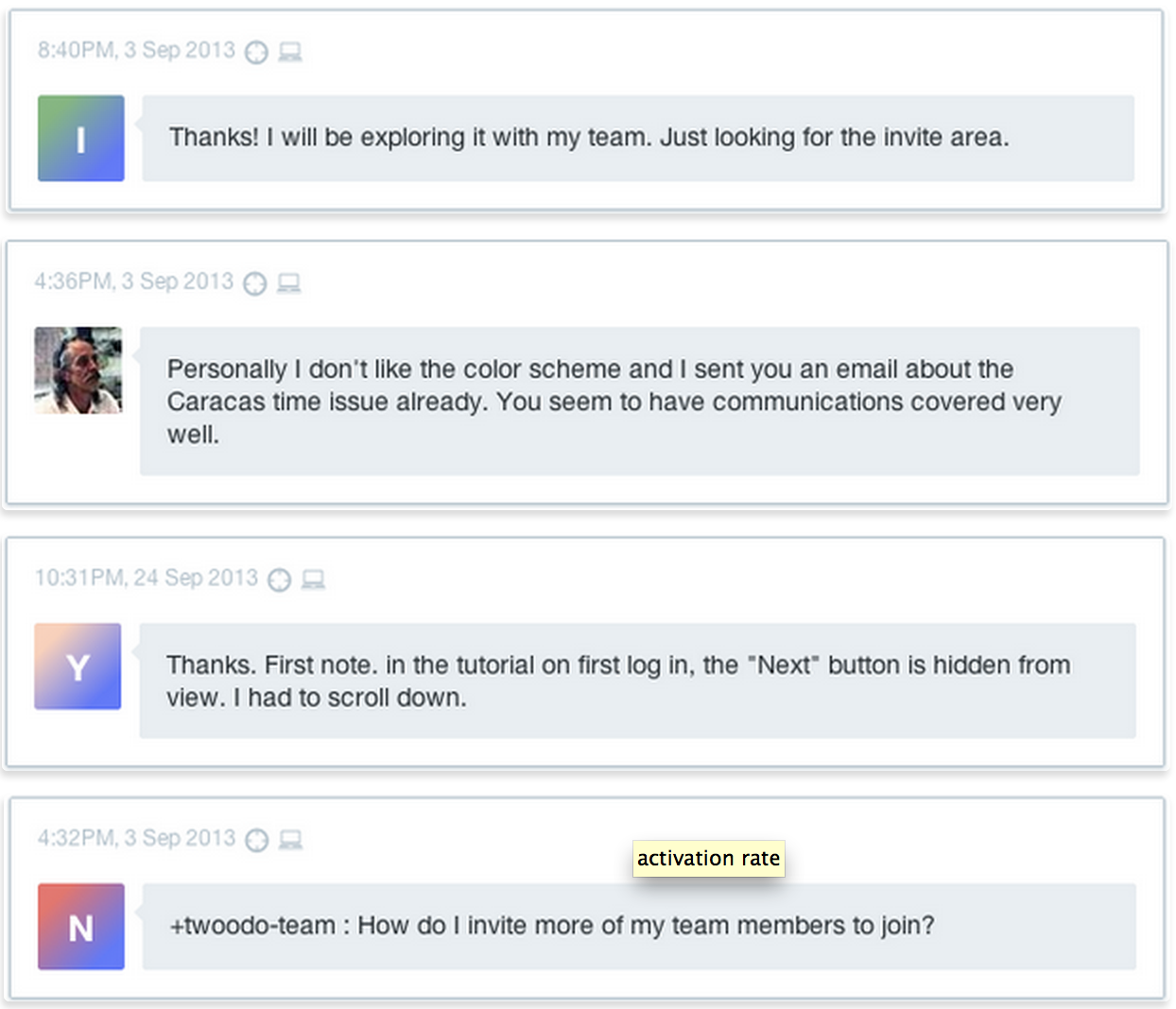
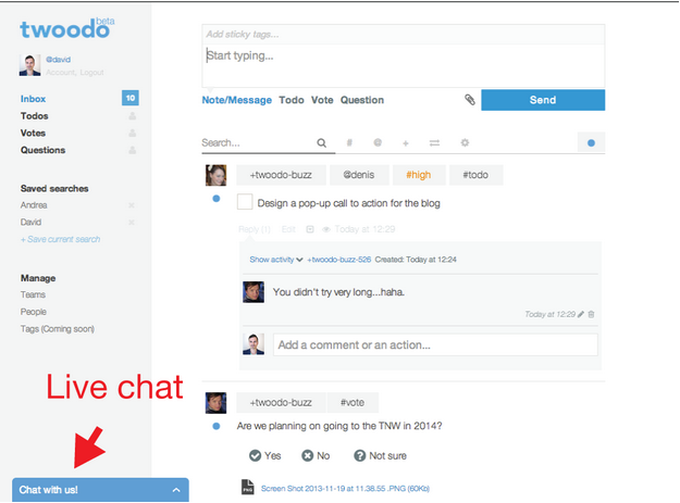
Tools like intercom.io (which we love) have the great advantage of offering in-app messages that you can trigger when you like. Here’s what it looked like on our website.
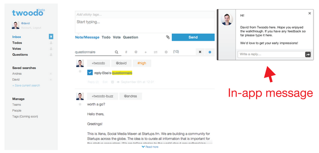
Closeup..

We set the in-app message to appear as soon as the user was finished with our 4-page walk-through (or had clicked “skip”) and started using the tool. Users saw a picture of David and a very short message. All they have to do was click an input box to give their feedback.
There’s almost no effort for the user to send us a message (unlike sending us an email, or using a contact form) so we got tons of feedback from this. We identified some really basic things that users were not clear about and were able to fix those rapidly. Here’s some random examples of the feedback we received:
We established a list of all the feedback and grouped them by category. Some points kept coming up. The ones with the highest score would be attended to first.
We learned TONS from this.
- Our product walk-through and on-boarding were still too confusing so we needed to simplify them
- Users didn’t know how to add their friends to the platform
- Some browsers were more tricky than others
The list goes on…
We fixed all these issues and progressively tested our new solution. We also started carrying our usability tests on www.usertesting.com. At this point we also started populating the most recurrent questions into a FAQ on a Google doc for future use.
After a month or so of testing and tweaking, our user acquisition rate had reached 17 percent.
5. Install a live-chat. Be online.
Another great way to get feedback from users is to use integrated Live Chat systems. We opted for Olark as the installation was quite simple and they offer a free version (kind of hidden on their pricing page) for up to 20 chats per month.
If you’re having more than 20 chats per month with your users, I’d definitely suggest to start paying for one (I know there are a bunch of other tools out there for live chat so feel free to share them in the comments).
We all installed Adium and linked the Olark live chat with our Adium accounts. Everyone committed to signing in to Adium as soon as they had our laptops on. It ended up being a bit too distracting for some of the technical team but we were sure to have at least one person from our team online at all times and it was really worth it.
We received tons of user feedback from the live chat. We were also able to activate users live, get more info on what was confusing about our website and kept on filling up our FAQ guide for later.

Another cool feature is that you can see everyone who’s on your website at any given time with notifications that pop up during the day on your screen. To be honest, it was cool at first but became very distracting later on.
Nevertheless it was a motivating “real time analytics” tool and if you wish, you can engage with users spontaneously.
At this point our activation rate had risen to 19 percent.
6. Next day message for non-activated users
81 percent of users were signing up to our website, were giving good initial feedback to the in-app message, but were then still not using the tool. They had signed up but hadn’t been activated – they hadn’t been through the “minimum delightful experience”. So rather than playing an endless guessing game we decided to ask users why.
Using Intercom we set up an automatic email that would be sent to “unactivated” users the very next day after they had signed up. As you can see we also used this message to introduce the iPhone app. Here was the message:
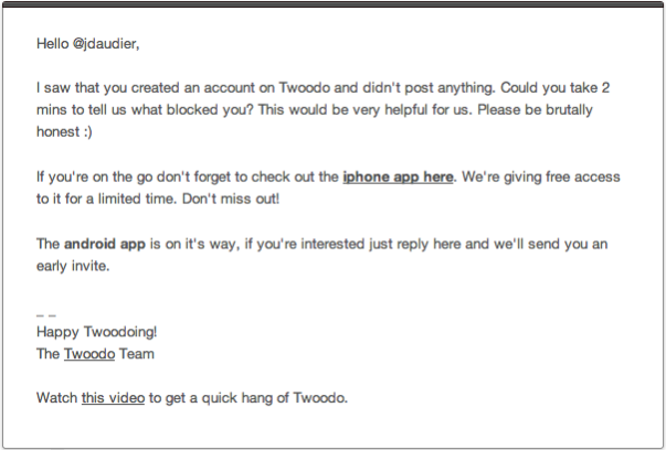
The major finding was that many of them were extremely busy and just hadn’t had the time. Some of us thought this meant “their pain just isn’t big enough”. Other thought we should continue trying to activate them while it was still time.
7. Drip email campaigns
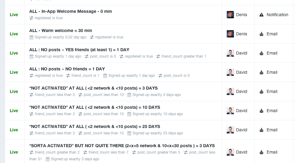
We learned that if you’re trying to activate users on your website, there’s one good thing to know. A large proportion of users who sign up to your website and then don’t actually use it, do so just because they don’t have time. The main learning from this was that drip email campaigns are extremely valuable. We set them up using Intercom.
By setting up emails based on user behavior and sending them at 1 day, 3 days, 10 days and 25 days we were able to increase our activation rate to around 28 percent.
We’re still working on improving this drip email campaign and hope it can take our activation rate past 40 percent in the near future.
8. Using our own tool
Twoodo is an online team collaboration tool. Because of this, we could also use our own tool to interact with users and improve our activation rate and retention.
We created a “global” team called +twoodo-team. Users could simply post a message to +twoodo-team and we would all see it. Everyone in the team could then answer user’s questions and interact with them. It gave users a feeling of transparency and we got tons of feedback through this channel.
The friction with contacting us was almost nil. We later changed our in-app message to explain to users how to contact us directly on Twoodo. This was great because users could use the tool and contact us at the same time. We could then reply and engage with them. If your tool has any such possibilities, grasp it right away.
At this point our activation rate is around 30 percent.
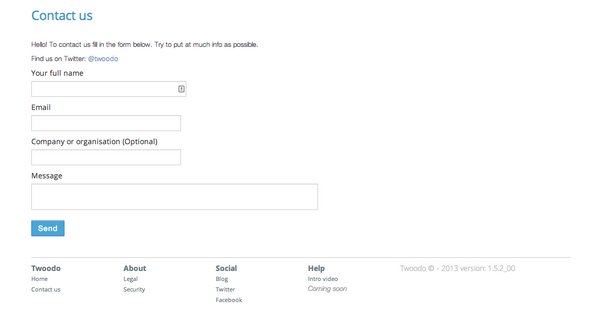
9. Contact form
Like any website we had a contact form. The link to the contact form was in the footer. I’d say a contact form is a good first step solution if you have nothing else in place.
But as we implemented all of the above tools, our contact form was seldom being used anymore. The friction and effort for users to fill out a contact form are simply too high. We get very few messages through it today.
10. Build a community
We love websites like Stackoverflow and Quora. They’re great communities that answer important questions. We’re thinking of building a similar community that will act as our FAQ + community + customer support desk.
Conclusion
You’ve made it this far so I’ll make this brief. Every user has different preferences as to how they will interact with you and at different times. I’d advise you to cast the widest net possible using the most customer feedback channels possible to help make your tool truly awesome.
And don’t forget that the only SaaS sales strategy you need is listening to customers and offering them continual support.
Get the TNW newsletter
Get the most important tech news in your inbox each week.