Sean Mitchell is an interactive designer based in Vancouver, British Columbia, and the editor of TypeRelease.
We’ve gathered 20 of the most beautiful typefaces released within the past month. Let’s take a look at this edition’s lovely batch!
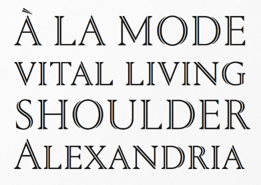
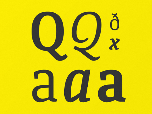
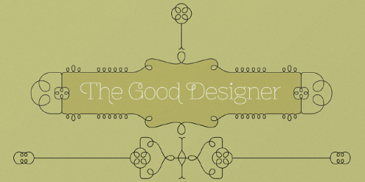
Lian Types: Erotica
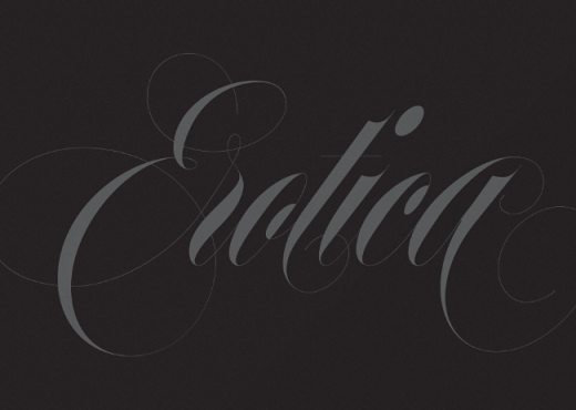
Beauty and elegance guaranteed.
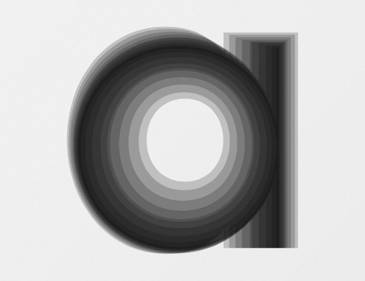
Village: Odesta

The <3 of EU tech
The latest rumblings from the EU tech scene, a story from our wise ol' founder Boris, and some questionable AI art. It's free, every week, in your inbox. Sign up now!
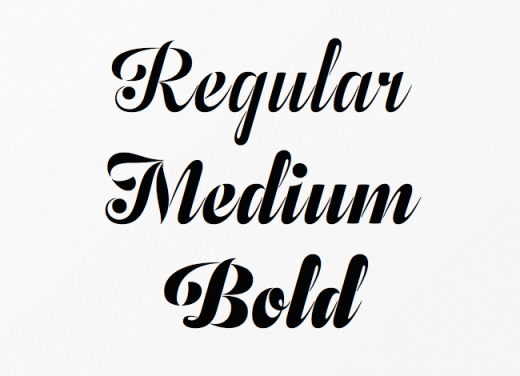
Seven feature-rich weights with built-in small caps, swash alternates, and contextual alternate initials and finials.
Thinkdust: Nanami Rounded
A carefully engineered take on the original Nanami family.
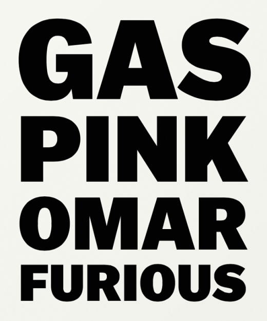
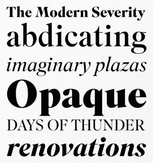
Commercial Type: Portrait
Aggressive in its simplicity but nuanced in its details.
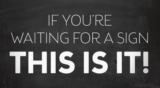
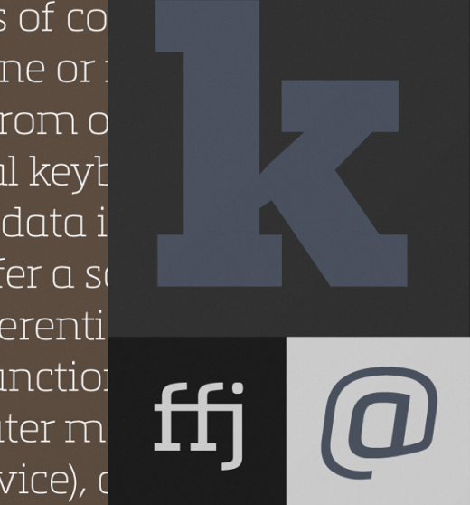
FontFont: FF Mark
New meets old meets technic, FF Mark is not an average geometric sans. Strong, simple, bold – and created with utmost consideration and precision.
Type Supply: Balto
From casual to authoritative, classic to contemporary, passive to aggressive, Balto is ready for the job.
Samuelstype: Brooklyn Samuels
Based on geometrical shapes, it’s primarily intended for headline use but also offers excellent legibility in small sizes.
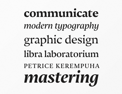
TipoType: Quiroga Serif
Designed for continuous text – legible at medium and small sizes, with great space-saving.
Village: Superior Title
A high contrast transitional typeface, a kind of missing link between Bodoni and Times.
The Signal Type Foundry: Center
The future is squarish. Based on a rounded rectangle, its geometry has been subtly refined for smoother reading.
Typonine: Nocturno
Broad-shouldered and heavy-armed: the rolling, dark silhouettes of its characters create a soothing yet forceful impression that serves to anchor words, no matter where they appear.
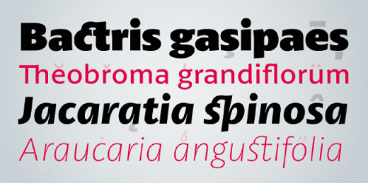
Sudtipos: Brownstone Slab
Influenced by the ironwork and carved decorations of New York City row houses.
Typotheque: Lava
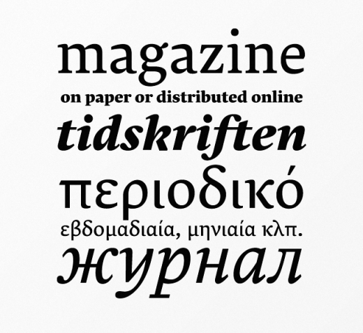
Designed for magazine use, but far transcends its original application. It’s a no–nonsense workhorse typeface that can handle large quantities of text with ease.
Mostardesign: Metronic Slab Pro
A slab-serif typeface with a technological and minimalist look.
FontFont: FF Kievit Slab
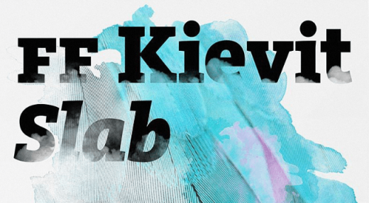
Not just Kievit Sans with slab serifs attached. It has been carefully adjusted and fine tuned in width and contrast to help make it an extremely legible typeface.
Nootype: Felice
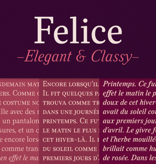
An elegant serif with a humanistic touch.
Hoftype: Equip
A new versatile geometric sans face in 16 styles, designed on a geometric base.
Fairgoods: Compunabula
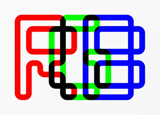
Compunabula began as a rejected logo for a client. Happy accident!
Typefolio: Petala Pro
Combines readability with a gentle but strong personality. The smooth and balanced forms share space with expressive ink traps.
Talbot Type: Kilburn
Continues in the fine tradition of fonts such as Franklin Gothic, News Gothic and Trade Gothic offering a contemporary interpretation of the condensed sans-serif – functionality with personality.
Header image credit: Shutterstock
Get the TNW newsletter
Get the most important tech news in your inbox each week.