This post by Flin Nortier was originally published on the blog of design agency Soda Studio.
As an interaction designer, how often have you run into projects where you’re asked to ensure a great ‘user experience’, without looking at the cocktail of emotions your design might produce? “Preventing frustration or any other negative emotion makes it good enough” or “we want to delight our customer” they might say. Well, they’re missing something.
While emotional design isn’t currently in scope of many (corporate) interaction design projects, it should be. Because interaction design is about how it works. You can interpret this in many ways, but we think ‘how it works’ also means what your product ‘does’ with the user, i.e. how it feels.
In this article I’ll give you an idea of the potential of emotional design. We’ll be looking at copywriting and visuals but especially looking at interaction, since we’re interaction designers.
Emotional design
Contrary to what the term might suggest, emotional design is not designing while being very upset and emotional. Emotional design is designing for emotions in the user. It means you try to make sure that users feel a certain way. Preferably a way that complements the brand or product, or just the specific process the user is in.
These may be different emotions at different points in the interaction. And the designs can be for the short term, single interactions, or for long term interaction spanning many interactions for decades. These application possibilities give emotional design huge potential for the future, and this didn’t go unnoticed.
The practice of emotional design has been getting more and more attention in books and articles over the past decade. For example books by Donald Norman – Emotional Design, Aarron Walter – Designing for Emotions, and blog posts by Sabina Idler, and Simon Schmid. There is even a Design & Emotion Society. But this is still a very limited amount of discussion for an area such as this. There is still so much to be discovered.
And discoveries in this area will probably go fast from now on, since the big fish like Facebook and Bitly have taken an interest. First, let’s take a look at some bad examples.
Banking
Lots of services and websites being built today still have sterile emotionality. For example, take a look at the homepage of Bank of America.
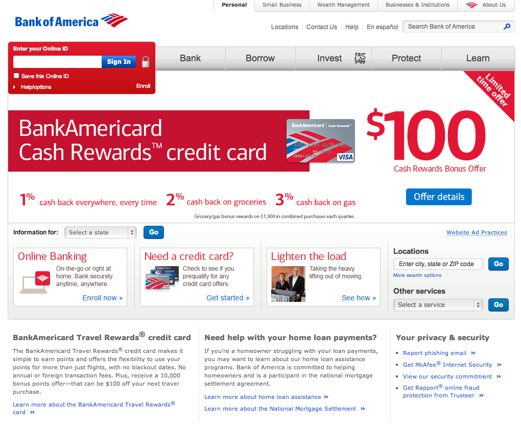
What could be the emotions you want to evoke as a bank? Probably something like trust and optimism towards the future. Of course that isn’t enough basis to motivate people to become customers, amongst other things there should be a good product proposition, but these are very helpful emotions.
There are probably lots of reasons why it’s practical for Bank of America to have a dry, and uninspiring homepage like this (probably big-corporate consensus), but it’s obvious that it isn’t aimed at evoking trust and optimism.
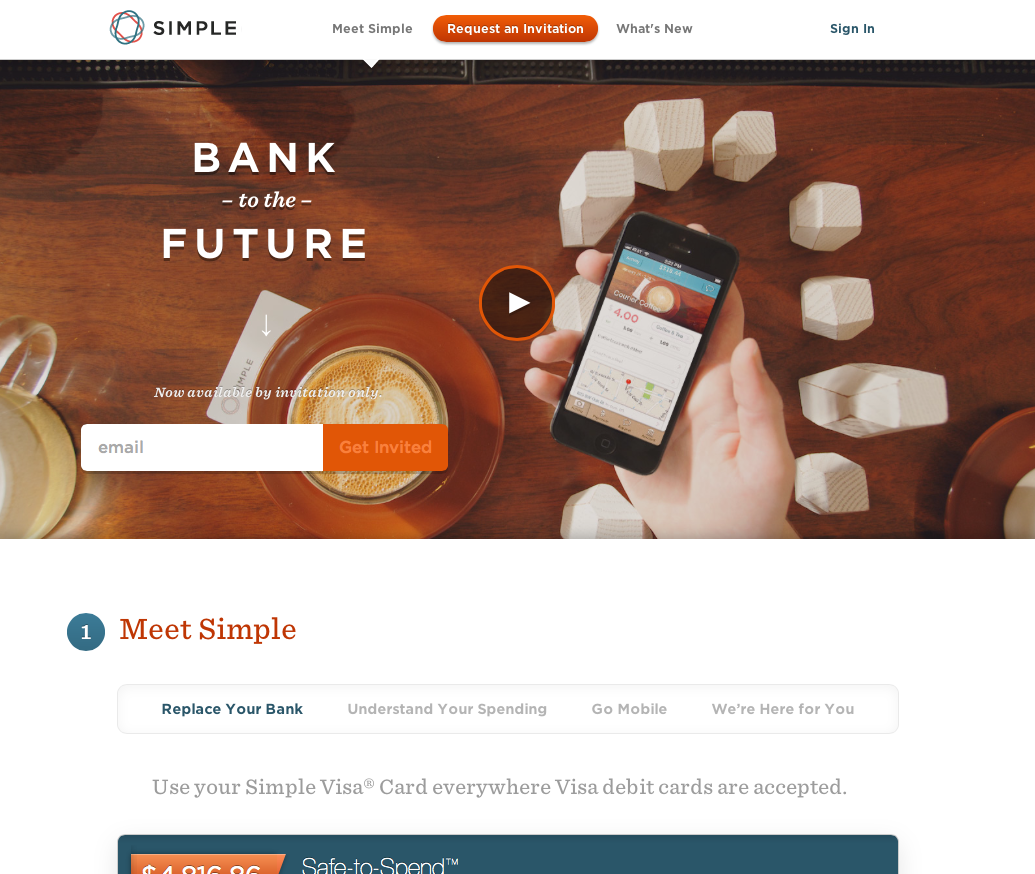
A bank that does this a little better is Simple Bank. It’s pretty neutral in its wording (as they still need to be elegantly formal as a bank) but it is obvious that they worked on the first impression you get when arriving at their home page. For example, the combination of the words BANK and FUTURE is a pretty strong stimulus, targeted at people’s current mistrust of banks and worry about the future. These few words acknowledge people’s worries and their need for a bank that is future-proof.
About emotions
Before we continue: first, a little about emotions. Even in science, for the concept of emotion there’s no clear single definition, nor is there consensus on a categorization. But a useful definition is: an emotion is a subjective feeling that is mentally directed toward some person, thing or event, real or imagined (adapted from Peter Gray – Psychology). He adds that “[the object of emotion] is always something that is in some way important to the one who experiences the emotion.”
This is also why people are generally less concerned by, for example, wars in other countries than their own, unless they have some personal connection to that country. An emotion is about something in the world that’s related to your self-concept of ‘you or yours’.
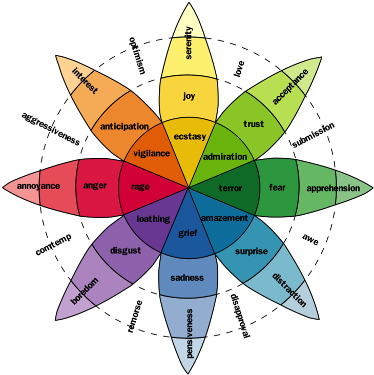
A useful index of basic emotions was made by Robert Plutchik. The outer ring contains the less intense emotions, and when you get to the center the emotions get more intense. According to the renowned emotion researcher Nico Frijda, there seem to be basic emotions, but all sorts of subjective forms are possible trough mixing multiple emotions and the unique subjective experiences of people. This means that a real-life and subjective emotion could be the thrill you get when you’ve just bought a desirable product.
Moving people
A business in which emotional design seems pretty relevant is car rental. When would you want to rent a car? Probably when you really need one. And what would it mean to you? Maybe something like freedom. To stay in the emotional framework of Plutchik, this sense of freedom could feel like joy, anticipation and trust. Okay, so an applicable emotional design could target these emotions, what would it look like?

Probably not like the homepage of Thrifty.com. It doesn’t play into these emotions. It’s purely about aiming at a low price. As Pine and Gilmore said in their book The Experience Economy, this puts you into the commodity business, where the provider of the rental car for the lowest price wins the battle for the customer. This is a hard battle and leads to small margins.
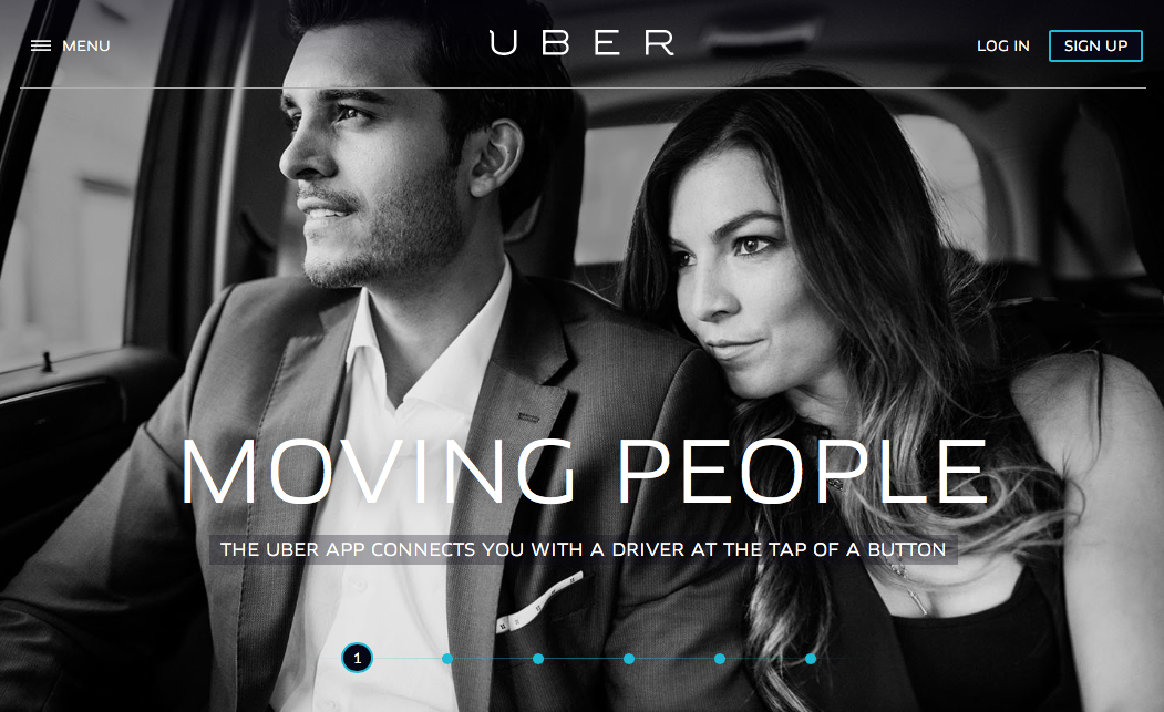
On the other hand, there’s Uber, also about mobility but with a driver (and a whole lot of ‘experience’) included. Uber builds technology to connect customers with a one-trip private driver (you could call it a deluxe taxi service). While the copy is still a bit anonymous and lacks character, the visual design speaks loud enough to deliver the right emotions.
Anticipation, joy, and trust are all there on the first impression of the home page. Also, the interaction designer had to leave a lot of space for that big photo. So here we see a first example of emotional design through interaction design.
Emotional design through interaction design
Next to emotional design in visuals and copywriting there’s also a big role for this in interaction design. As interaction designers we can, at the very least, facilitate emotional designed visuals and copywriting, but ideally we take it many steps further. In our role we’re able to orchestrate the emotional dimension of the website or application over the short and long term, weaving coherent emotional design into the total customer journey.
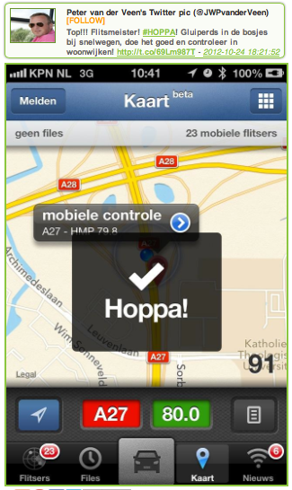
Flitsmeister
In the Netherlands there’s an app to get alerts on traffic radar posts (even for example the police scanning with a mobile scanner that day), so you can slow down in time to avoid speeding tickets. As a by-product (or, is it?), this creates an exiting experience of ‘I’m dodging the law’.
In previous designs of this app, the alerting had to be switched ‘on’ before it could give you the location on upcoming scanners. When you switched it on, the system gave you the feedback “hoppa!”, which means something in English like “booya!” or “did it!”. This transformed a possibly dull or unnoticed moment into an exiting moment. Why? By pronouncing the moment, it reminds you of the meaning of this moment the first time you turned it on, when it was still naturally exiting. Some users even tweeted this moment in their excitement.
Mailchimp
Another great example of emotional design through interaction design is the previous version of the Mailchimp interface.

As Aarron Walter (lead user experience designer at Mailchimp) writes, the chimp was designed to have a very specific role in the interface. It was to “add a layer of fun that enhances a usable workflow, and above all, stay out of the way of our busy users.”
Microsoft Word’s Mr. Clippy was the exact opposite of what they wanted. The chimp (called Freddy von Chimpenheimer IV) shouldn’t interfere with the tasks of the user, and in general not provide any feedback on the app itself. Therefore it was placed in the periphery of the user, also located on the top right of the screen.
It would tell short jokes, and link to funny YouTube videos. You could look at it to charge your batteries with a bit of fun, but it didn’t interrupt your workflow. This seemed to work very well, as users reported to have been cheered up on a dull day in their windowless office, and have more energy to work.
This is what Donald Norman describes in his book as the positive effect of design that makes us feel good, which makes the product more usable and any errors more forgivable. This success is due in large part to the appropriate interaction design of it, by putting it physically and cognitively into the periphery.
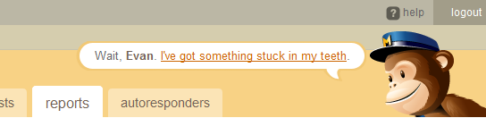
Mailchimp’s latest redesign doesn’t feature the chimp in this way anymore. They say it’s for the sake of facilitating responsiveness. You can find him on a seperate website now. They seem to have tuned down on emotional design in general, and users, like Laura R. do miss that (see picture below). She’s actually asking for more emotional design.

Groupon
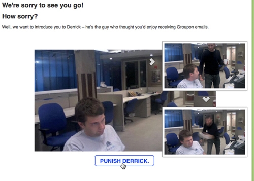
It’s an example of a bit edgy humor but it fits with the moment of unsubscribing for the mailing list and with the playful tone of voice of Groupon. As interaction designers we can think of fun (or dramatic, tension building, or relaxing/ethereal) interactions to express the moment in the interaction better.
Justbuythisone
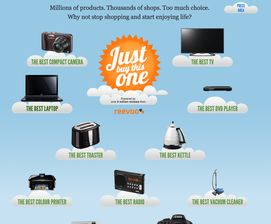
This design looks like the result of a good collaboration between interaction and visual design, resulting in an emotional design that really complements the concept of the website. By placing the products in this non-typical layout (on cartoon-like clouds) there is a lot of ‘air’ and lightness in the interface, with matches exactly with the simple proposition of ‘clearing the sky’ for you by greatly (absurdly even?) simplifying your product selection process. I
t also enhances the humor of the concept by answering the visitors’ (probable) doubt of “I thought choosing the right product was a long and heavy process, can it really be this simple?” with “Yes it is. It’s so easy and light, it floats in the air”.
So….
The examples in this article have shown that emotional design can reach a user on the level of feelings. This is done by engaging their emotions intentionally and specifically, instead of letting it up to chance.
A ‘good user experience’ in the common sense is a great impression to get when evaluating a design, but for us as designers it’s too unspecific. There’s a whole range of positive emotions out there (like joy, trust, interest, anticipation, but also more applied forms like “the thrill of just having bought a desirable product” is an emotion) and by intentionally designing for the right feelings you make sure your design compliments the brand, product, or just the specific process the user is in.
Header image credit: Shutterstock
Get the TNW newsletter
Get the most important tech news in your inbox each week.
This post is brought to you by Shutterstock – over 30 million stock photos, illustrations, vectors, and videos.