We recently reported on how, for startups, design is more important than ever. The same is arguably true for blogs – with so many others out there, giving yours a distinct look that’s pleasing on the eye can be a real advantage.
It’s particularly tricky to make advertising work well with a great blog design, so by way of inspiration, here – in no particular order – are ten blogs run as businesses that rely on advertising revenue. They’ve all got designs that we think work incredibly well, are functional and look gorgeous.
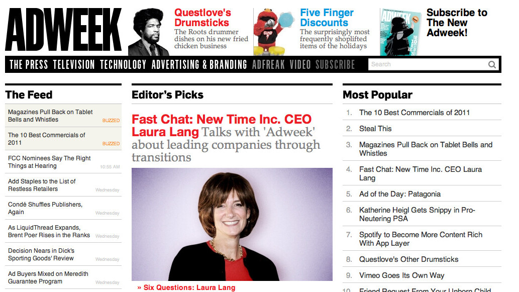
AdWeek

Is advertising industry news site AdWeek a blog per se, given that it started as a magazine? The line’s pretty blurred these days so we’re including it here, not necessarily only for the homepage but for the individual articles. The design here is unconventional and emphasises the article itself, rather than drawing your eye to bells and whistles around the sides.
Often employing an unconventional, full-width headline and text displayed in a central column with few distractions, it encourages you to keep reading and helps AdWeek’s content stand out from the crowd.

The <3 of EU tech
The latest rumblings from the EU tech scene, a story from our wise ol' founder Boris, and some questionable AI art. It's free, every week, in your inbox. Sign up now!
Bleacher Report

With its clean lines and huge photographs, US sports blog Bleacher Report lets images tell the story on its front page. Even on the sub-menus for individual sports’ and teams’ coverage, the photos call at you to click in to read more.
Visiting one of its articles you’ll notice its use of HTML5 to easily swipe between articles. A page view driver and instinctively easy to navigate.
Even if you know nothing about sport, the emphasis on images here make browsing Bleacher Report a pleasure.
CNET

CNET covers a wide variety of areas of technology but its sharp new design does a good job of helping you navigate the sprawl while drawing your attention to key articles. A large carousel highlights top stories, while flags ‘draped’ over each image help direct your eyes around the page.
Individual articles are displayed within a neat container that keeps share buttons visible on the left as you scroll.
The Verge

When Joshua Topolsky and some of Engadget’s top writers left the site to work on a new gadget blog with publisher SB Nation (now known as Vox Media), it was obvious that it would be something to keep an eye on. It wasn’t just the content that got people talking when it launched, however, it was the design.
Huge images – and lots of them – elegantly overlayed with text. That’s the thing that strikes you first about The Verge when you first load the page, but a long front page packed with content, and magazine-style box-out sections highlighting must-read articles add to its appeal.
Fast Company Design

You’d expect a blog about design to be, er, well-designed, right? Fast Company’s Design blog doesn’t disappoint. It takes similar cues to The Verge, with an emphasis on large images and an eye-catching headline font.
There are some fabulous details, like the 3D effect that makes the blog seem to pop out of the screen, the analog clock displaying the time a post was published, and the multicolored navigation tool to help your access earlier posts. A thin left-hand column on the front page teases you with images which expand when clicked, offering an unconventional way of exploring other content on the site.
Gizmodo and the Gawker network

Despite gaining much criticism, we believe Gawker’s network qualifies for the list. We could have opted for any of Gawker’s main titles as they share a common design, but on Gizmodo it perhaps looks best. With two separate scrolling columns, the design caused a stir when it was unveiled as it looked so different from what was expected from blogs. It’s been tweaked a little since then, but still maintains its unique identity.
While the approach, which sees content on the left and all navigation on the right, doesn’t appeal to everyone, it’s a refreshing approach that encourages the user to explore the site without an overload of navigation options. It’s interesting to note, however that Gizmodo’s recently relaunched UK site doesn’t share the design of its US parent.
Gothamist New York

When designing a professional blog, it can be difficult to keep a unified ‘vision’ once you throw in all the ads and navigation elements that keep things ticking. Gothamist succeeds where other have failed in this respect.
The original New York edition of the city-focused network of blogs has a design that echoes the skyscrapers in its logo, emphasising vertical shapes throughout. Even the placement of the ads fits a homogenous layout in which nothing looks out-of-place. Blogs for other cities in the network succeed to varying degrees in replicating this feat.
The Daily Beast

The Daily Beast has a lot of content, and it does a great job of highlighting priority stories via a long, visually striking page with stark fonts and large images.
Scrolling through the homepage is a visual pleasure, with plenty of jumping off points into the content, be it via a snappy, all-caps headline or an eye-catching image.
Engadget

While arch rival The Verge has received praise for its design since it launched, Engadget itself looks great. An attention-grabbing ‘Top Stories’ widget is the start here, but well-chosen fonts and gorgeous photo galleries helps the genre-defining gadget blog stand out.
Abduzeedo

Design-focused blog Abduzeedo offers inspiration and tutorials with a grid-focused navigation scheme and an appealing ‘glow’ effect on titles when you hover your pointer over them.
The white-on-black design stands out in a world where white backgrounds are currently more common.
Bonus selection: The Next Web
The Next Web
Okay, we couldn’t resist – we’re really proud of our design here at The Next Web.

Get the TNW newsletter
Get the most important tech news in your inbox each week.