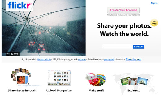
Flickr today unveiled a new homepage design which does away with the app’s traditional minimalist approach. This is the first significant update to the site in a long time, since Flickr rolled out a new photo page design in August last year. Existing users will have to log out to see the new design.
The new design brings far more copy than the page used to house in a clear attempt to win more users over. It’s possible that their departure from a low-copy frontpage corresponds with a plateau or drop in usage — minimalist homepages that don’t make much of an attempt to convert the user are generally a sign of confidence in a service’s popularity.
Also interesting is that despite longer copy, there’s absolutely no mention of video, suggesting Flickr has conceded defeat to services like YouTube and Vimeo.
As you’d expect the page still makes use of large photographs, but there’s a clean and modern layout using grey lines and sans-serif text selling users on the site’s main functions — upload, discover and share. There’s also more of a focus on single sign-on through Google and Facebook.
In case you missed it, here’s the “before” shot:

Get the TNW newsletter
Get the most important tech news in your inbox each week.


