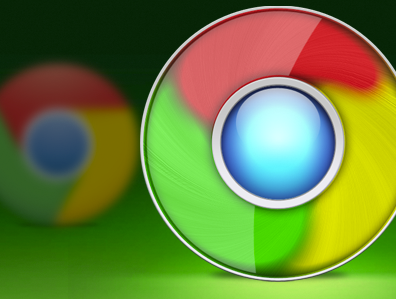
As much as we might love Google, UI and design have never been its strong suits. When the new Chrome icon came out, it was an improvement over the glossy, bubbly thing that we had before, but it still wasn’t great.
A small project from designer Mario Bieh over on Dribbble has given us an idea of what the new icon should have looked like. In fact, if you’re so inclined, you can even download the icon and change your own.
Get the TNW newsletter
Get the most important tech news in your inbox each week.


