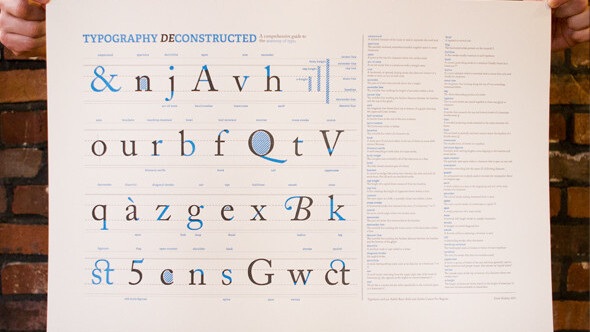
Typography Deconstructed is selling a letterpress poster on the anatomy of type that not only looks great, it awards so much designer geek cred that you won’t need to wear a beret anymore.
Here’s a close up where you can see the letterpress and the high quality of the poster itself:


The <3 of EU tech
The latest rumblings from the EU tech scene, a story from our wise ol' founder Boris, and some questionable AI art. It's free, every week, in your inbox. Sign up now!

It was designed by Drew Binkley, the Creative Director at 38pages. Typography Deconstructed has this to say about the poster:
This letterpress poster is the result of several months of research both on the subjects of the Anatomy of Type and Type Glossary. Inspired by the craft of letterpress printing and a love for typography, Typography Deconstructed aims at providing a resource for educating those interested in what makes type… well, type. Each poster has a comprehensive list of typographical terms with each term being represented by the anatomy of the letter that best describes it visually.
I know I want one on my wall. Maybe even printed onto a duvet. You can get yours here.
Get the TNW newsletter
Get the most important tech news in your inbox each week.