
One after the other, after the other, it will make you dizzy, thrusting you into some insane, location-based alternate reality.
That would be the moving, wiggling 3D map GIFs from the Tumblr, That Map Looks Right — although if you live in earthquake country, as I do, the whole thing makes a certain kind of sorry sense.
While it was Apple Maps’ flyover 3D satellite views, which debuted to scorn and derision in iOS 6 that kickstarted the whole 3D map disaster discussion, it certainly didn’t end there as Google Maps, a year later, got into the 3D act on the desktop.


The <3 of EU tech
The latest rumblings from the EU tech scene, a story from our wise ol' founder Boris, and some questionable AI art. It's free, every week, in your inbox. Sign up now!
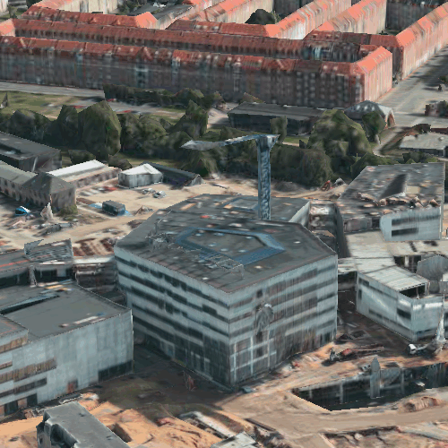

That Map Looks Right elevates the whole mess into an art form of wiggling GIF animations derived from 3D Google Maps, Bing Maps and of course Apple Maps.
This work of total insanity — by an author who for somewhat obvious reasons chooses to remain anonymous — gathers together a huge group of moving specimens to inspire your own migraine-inducing brain seizure.
Get the TNW newsletter
Get the most important tech news in your inbox each week.