It’s unclear at this point why the BlackBerry Playbook was released in it’s current state. From the moment that you try to turn it on it feels very much like a device that’s still in the testing stages.
Awkward hardware, irritating and unintuitive software and the ludicrous decision to hobble the BlackBerry Playbook by excluding native email and calendar functions all contribute to the same feeling that you get from a summer movie rushed to theaters just to meet a release date.

What proved most disappointing for me over the course of evaluating the Playbook is the fact that there were flashes of solid utility buried in here. The QNX OS is different and, at least at first glance, usable. The screen is brilliant and crisp. The tablet itself is a fantastic size and a good weight.

The <3 of EU tech
The latest rumblings from the EU tech scene, a story from our wise ol' founder Boris, and some questionable AI art. It's free, every week, in your inbox. Sign up now!
The touch-sensitive screen borders are far more usable than they sound at first, it’s a very solid feature that I think will be the one lasting contribution that the Playbook offers to the tablet world.
The 7″ shell is counter-programming to the iPad and other 10″ tablets for sure, but there’s nothing inherently wrong with different. I was completely prepared to deal with the loss of screen size as long as what was there was taken advantage of efficiently.
My test unit was the $499 16GB model, just one of the three that RIM produces. They also manufacture $599 32GB and $699 64GB models. Note that these are the same price as the iPad, with less screen real estate.

As I removed the Playbook from it’s gorgeous packaging, I was immediately impressed with the feel of the device in my hands. It’s nicely finished metal frame lends it a comforting weight and feeling of density. A soft touch finish on the back, which also features an embossed Blackberry logo and camera opening, was very pleasing.

The sides of the casing are left clear but the top is broken by power and music playback buttons. The bottom edge of the Playbook is unattractively festooned with regulatory text, a capacity badge and three inset ports for HDMI, USB and docking.
The front face is broken up by a relatively unnecessary BlackBerry logo at the bottom, a light sensor/LED combo and the front-facing camera. In addition the left and right edges have two slices near the edge that act as passthroughs for the stereo speakers. Here’s where things start to come apart. I’ll give Blackberry relatively minor props for including stereo speakers on a device that doesn’t place them far enough apart to actually take advantage of any stereoscopic sound.

Any kudos are equalized by the fact that they placed them exactly where you’re going to be holding the Playbook during any sort of gaming or horizontal use. In my testing I ended up having to hold the heels of my palms away from the surface awkwardly to ensure I didn’t muffle the sound coming out of one or the other.

The power button is also another sign that things are seriously wrong with the hardware design of the Playbook. It’s incredibly tiny and ridiculously recessed for something that you’re going to be tapping all of the time to put your device to sleep or wake it up. You have to point your finger like you’re going to be administering a deathblow and mash the button with the energy of a thousand suns before it will react and power the device on.
The 1024×600 pixel LCD screen is bright, with punchy blacks and rich color. Games, video and images all looked very good on it. The 182 ppi resolution means that it does tend to fall apart a bit at the standard 15″ viewing distance, resulting in aliasing and a generally detectable ‘grid’ pattern. Note that this is a higher ppi than you get on the iPad 2, which clocks in at 132, but the effect is relatively similar to what you see on the iPad because you hold it further away from your face.
The QNX OS shows some basic promise, but it’s lost in the midst of inconsistent interactions and glitchy performance.

The unique menu system of QNX has you pulling down to reveal an options menu and pushing up to reveal the system menu and multitasking panes, which run down the center in a similar fashion to the way that WebOS handles multitasking. The pull up and down gestures must be initiated from the black bezel, something that was so confusing that almost every person I handed the tablet to ‘blind’ had problems figuring it out.
The ‘pull up’ gesture isn’t as bad, but the ‘pull down’ gesture brings down a contextual menu that offers inconsistent options that RIM claims are context sensitive but that I mostly found to be useless and unrelated to anything I wanted to do in the app I was using.
The multitasking gesture shrinks your currently running app but, in a random and confusing choice, does not freeze the apps when they are minimized. This means that if you’re in the middle of playing a game, it will continue to run while it’s shrunk down. This behavior is cool looking when it happens to a video app, but it’s confusing and frustrating when you want to switch away from a game and it doesn’t pause itself until you rotate the tile away.

There is also a ‘swipe to change’ behavior that mirrors the multitasking gestures found in iPad iOS 4.3 developer editions. The gestures also begin on the edge of the bezel, which made for some awkward accidental switches when playing games that require a lot of swiping. This isn’t the most annoying part however, as if you swipe between an app that’s vertically oriented, like the included ancient version of Tetris, and a horizontally oriented app, your sideways swipe stops working and you have to flip the device and swipe in another direction.
It makes switching between apps rapidly feel like entering the Konami code. It’s ludicrous.
Orientation of apps is another problem. Simply put, you had better hold the Playbook almost perfectly perpendicular and rotate it precisely 90 degrees with a bit of a snap on the end of it, other wise the display is unlikely to change orientation.
The accelerometer used in the Playbook is the Bosch Sensortec BMA150, this is a standard 3 -axis accelerometer, similar to the ones used in many other smartphones and tablets. In other words, it’s decent. The fault then must lie in the adjustments and tolerances set in the OS.
It feels as if it was never tested by a human and instead placed in a rack and rotated an exact number of degrees a set amount of times with zero tolerance. That’s not the way humans work and it makes the orientation yet another source of frustration with the way that the Playbook operates.
The list of OS inconsistencies goes on and on. The system volume is separate from the hardware volume, there’s a power off app as well as a hardware power button, you have to tap the volume buttons to change the volume, you can’t hold them down, deleting an app starts out the same as the iPad but then exiting the delete mode is obscure and oddly implemented.

Typing on the Playbook is surprisingly decent, although the screen size makes it nearly impossible to type by touch alone, something I’ve learned to do just fine on the iPad. The keyboard feels like it was laid out in the best way possible and the large blue popups when you hit a key, although initially distracting, are good for confirmation of the letter you hit.
This confirmation comes in handy because there is no system-wide autocorrection feature. As much as people complain about autocorrect, I am here to tell you that if you’re typing on a 3-inch by 5-inch keyboard, you need it. I found it incredibly tedious to move backwards through sections of text that I had typed, tapping on words and replacing them with the suggested words.
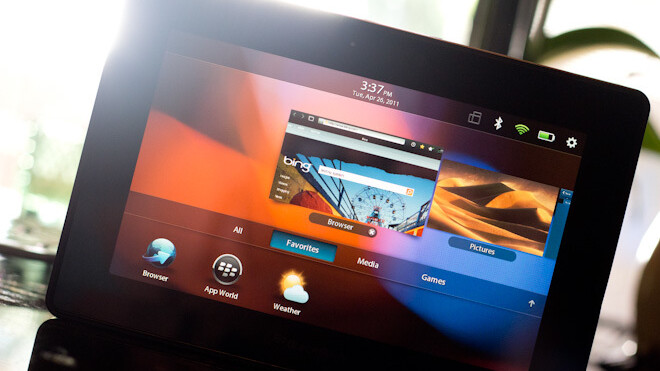
The browser is solid if not great, with a full screen mode and a respectable zoom and scroll rate. Those things should be standard in a tablet so it’s good that they’re here but it’s nothing to crow about. The marquee feature of the Playbook’s browser is instead it’s support for Adobe’s flash player.
I tested out the Flash implementation much more aggressively because it was the main distinguishing feature of the Playbook’s browser. Flash video playback was fairly iffy and ate up battery like crazy, although once it had buffered past the first couple of minutes it subsided from a complete stutter-fest to a faintly unpleasant choppiness. Flash games like those on Newgrounds did work in the browser but the performance was so bad that they were too frustrating to try for more than a few minutes.
The battery life without flash usage came in at a cool 8-9 hours without much effort. This is nearly as good as the iPad 2 and is very respectable considering that the processor is just as fast but the battery is half the size. The smaller screen most likely helped in this regard.

The lack of a native calendar and email app has been much publicized and yes, it’s as annoying as it sounds. The menu comes full of icons that represent all of the major email providers like Gmail and Hotmail. This raised my hopes briefly but left me disappointed when they turned out to just be shortcuts to the websites of those email providers.
In order to use the native calendar, contact, memo, BlackBerry Messenger and email apps you must connect a BlackBerry to your Playbook using the Bridge service. This would be annoying but workable if it was simply a local connection but it isn’t. Instead, you have to grab an app from the App World that AT&T decided to block downloads of so that it could test it’s compatibility with the network, leaving many Playbook early adopters unable to use the Bridge function. Thankfully, there’s a hack for that.
The general thoughts of the industry when it comes to why a basic email and calendar client were left out of the Playbook come down to the probable hopes of RIM that Playbooks would sell Blackberries. In order for this to work however, the Playbook would have had to be an absolute category defining product, something it is, sadly, not.
Honestly the email and calendar things are ridiculous enough, but the omission that stuck out the worst to me is the lack of Blackberry Messenger. It’s the crown jewel of the BlackBerry line software-wise and arguably the one killer feature left on the platform and they chose to withhold it for non-BlackBerry users. It’s incomprehensible.
The rest of the software features are a relatively mixed bag. The Music player is uninspired but serviceable, the Pictures app is decent but crippled by your inability to email pictures out of the device without a BlackBerry. The Camera app is executed well, with good button placement but the image quality, even with the higher resolution front camera, isn’t great. It is, however, the one area that comes in clearly ahead of the iPad 2, whose cameras are even worse.


The indoor images especially are impossibly grainy, even in relatively well lit areas. The outdoor images are decent but overly saturated, especially in areas of solid primary colors. This is common for smaller sensors like those in most tablets. The 1080p video is crisp, if a little over-sharpened and crunchy looking.
In addition to the UI inconsistencies I mentioned above, there were plenty of software bugs to go around. At one point I slid the Playbook out of its case to find this happening.
It continued for about 5 minutes while I tried to power it off via holding the power button, which did not work. Eventually I had to slam the power button then quickly stab the ‘restart’ icon that appeared on the screen. When it rebooted everything was fine.
As I went back through and reviewed my notes for this review, I noticed that almost every major issue I had with the Playbook had to do with a point at which the user interacts with the Playbook. When the Playbook is just sitting there it looks good and feels good, but the moment you try to interact with it in any meaningful way, it starts to feel irritating and untested.
In fact, it feels almost entirely thoughtless, as if the first time they put one together completely they simply started shipping them out, without ever having any humans use them and carefully consider how they worked and would be used.
RIM is a company that has the ability to produce hardware and software that inspires an intense customer loyalty. This good will has allowed it to keep a relatively large chunk of the market for far longer than it should have been able to on the strength of it’s offerings in the last few years.
The good will is running out. Something like the BlackBerry Storm, which was a huge flop and a terrible product, was only one offering in a crowded market. The success of the Curve and it’s successors were an easy counterpoint to the poor reception of the ill-fated click-screen. The tablet market isn’t crowded enough to hide the mistakes made by the Playbook. It’s one of only 4 major tablets to ship so far and all eyes were on RIM to see what the Playbook would bring.
There has been a lot of discussion about the comparisons made between the iPad and the Playbook. Some say that it’s unfair to compare the two but I think that it’s the only fair comparison. If you have the only runaway success so far in the tablet space and one of the newest breed of tablet devices, you’re going to compare them, it’s only right. The only reason that comparing the two isn’t fair is that Apple tests and thinks about every feature of their products in intense detail. RIM it seems, did only the minimum amount and did it poorly at that.
At this point the Playbook is almost assuredly a misstep on par with the Storm but much more visible. The burden of proof that they can stay relevant in the modern era of smartphones and tablets is now on RIM. They have a lineup of several promising phones including the BlackBerry touch, a successor to the Storm that lacks the lame click screen. What we all have to wait for now is to see what they should already be working on, a device that can compete directly with the iPad as a tablet and do it well.
Whatever kind of device it is, it needs to be better than the Playbook, which has arrived feeling rushed and unfocused. RIM doesn’t just need to go back to the drawing board for whatever iteration of the Playbook may be next. This time they need to draw it, think about it, build it and most importantly, test it.
Get the TNW newsletter
Get the most important tech news in your inbox each week.