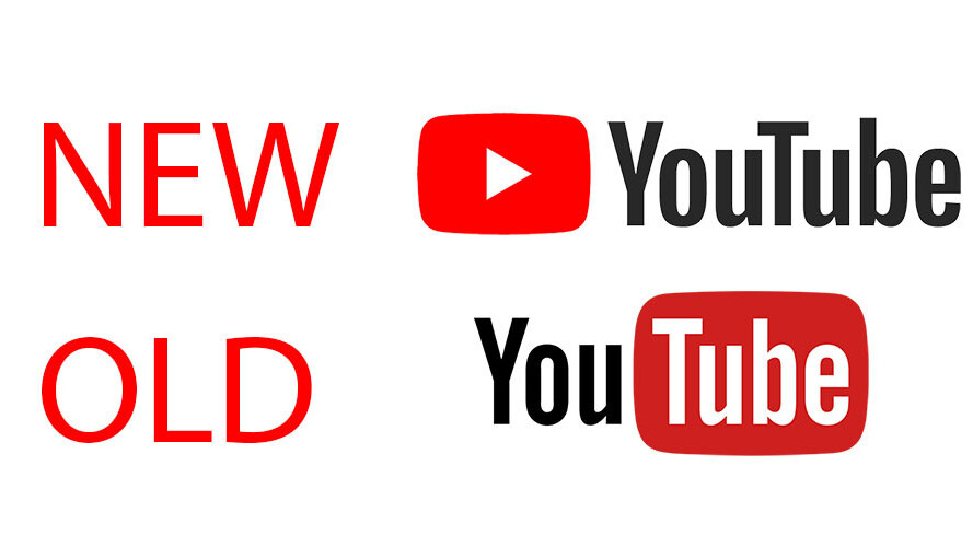
YouTube has a new design, and a new logo to accompany it. In fact, it’s the company’s first new logo in 12 years.
The new logo does away with the classic ‘Tube-in-a-tube’ design. The red blob that covered the second half YouTube has been removed. Instead, the red play button that’s served as the app icon and visual identifier in a myriad of ads now lives to the left of the wordmark. The red color is also brighter now.
It’s immediately familiar, but I think I’m going to miss the quirkiness of the old design. I feel the wordmark now looks a bit bland without the red blob around it. Still, YouTube says the change was inspired by our multitude of devices; the new logo is more adaptable fpr different screen sizes. From its announcement post,:
The bright red cherry on top of this update sundae is a refreshed YouTube Logo and YouTube Icon. Designed for our multi-screen world, the updated Logo combines a cleaned up version of the YouTube wordmark and Icon, creating a more flexible design that works better across a variety of devices, even on the tiniest screens. Why’s it more flexible? When room is limited (say on a smartphone) you can use the brightened up Icon as an abbreviated Logo, which will be seen more easily and read more clearly.
Logo aside, we’ve seen most of the new look already. YouTube has been testing its new design for months, opening it up for anyone to try back in May. It’s immediately cleaner, more in the vein of material design and its ample use of whitespace. There’s also a dark mode for those of us that prefer not to watch video surrounded by eye-searing whiteness.
There a few useful features wrapped up in the update too. You can finally adjust video playback speed on mobile devices, and the app will soon dynamically change shape to match your videos aspect ratio – something that was first shown off in June. But my favorite bit is that the dark mode is also coming to smartphones as well.
The new logo is rolling out to mobile and desktop devices today, and will arrive on other apps and services “soon.”
Get the TNW newsletter
Get the most important tech news in your inbox each week.


