Pandora has been on a bit of a roll lately. Fresh after buying off Rdio and introducing Pandora Plus (which is now available to everyone), the company is unveiling a new logo and branding.
As usual with these branding refreshes, Pandora’s description is rife with hyperbole:
Music is a personal experience for everyone, from the artists creating it all the way to the fans listening to it. And as Pandora continues to evolve the most personal music experience, our new look embraces the dynamic range of sound and color, visualizing the energy and emotion that artists pour into the creation of music, and that we feel as listeners. Our dynamic brand is composed of form, color and pattern, which we implemented into the new P icon and serves as your portal into the unique and diverse range of music you love.
But in all seriousness, its a nice logo. Better than some other branding updates we’ve seen, at the very least.
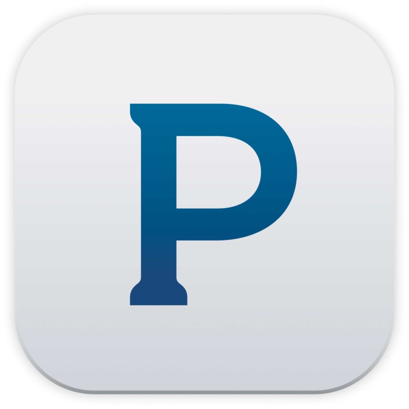
For comparison here are the old assets, which are decidedly Web 2.0:

And here are the new:
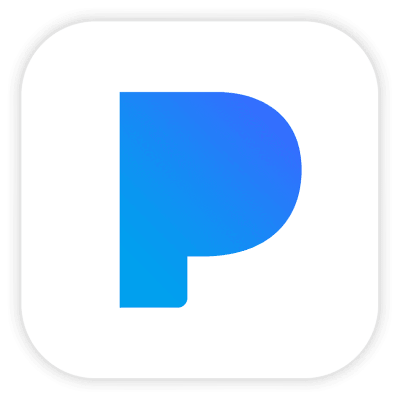

As hinted in the press release text above, Pandora’s new design guidelines are also more flexible to allow for colorful overlays and more variety than the usual blue and white.

The move is likely in anticipation of the company’s plan to take on Spotify and Apple Music. That is, after years of only offering music recommendations, you will finally be able to play anything you want with an upcoming full-fledged unlimited streaming plan.
With Amazon now entering the fray today, Pandora’s going to need all the help it can get.
The new logo is rolling out today across Pandora’s mobile apps, and will come to the web and other devices later this year.
Get the TNW newsletter
Get the most important tech news in your inbox each week.

