It’s often said that we’re in the midst of the information age, which may help explain why there’s been a surge in infographics in recent years – they make data just that little bit more…palatable. But if you’re more of a spreadsheets kind of person than an artist, this application could be what you’re looking for.
DataAppeal is a Web-based, data-design visualization application that allows users to transform their location-based data into infographics through the creation of 3D and animated maps.
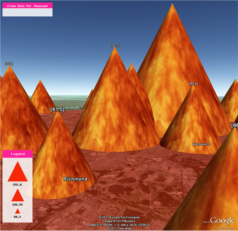
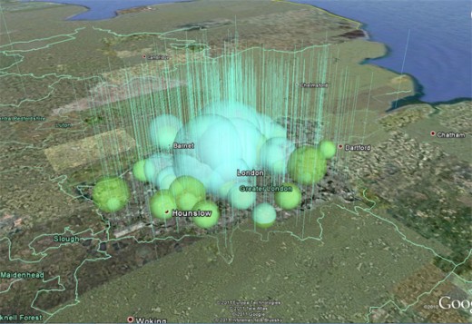
DataAppeal transforms data into what it calls “artful information”, letting users share these visuals with anyone they wish. So you can help people visualize diabetes rates, traffic volume, tree coverage, car crashes…whatever you hold data for, and all by location. Check this London crime map:
“It is, in essence, a simplified GIS tool for the masses”, says Nadia Amoroso, founder and Creative Director of DataAppeal. “Since we launched in beta, we have been getting a steady hit of users, from government agencies, environmental agencies, media and communication groups, universities, banks and market research groups”.
The application is open-sourced and is currently entirely free, though it’s safe to assume that paid enhancements won’t be too far off, whether that will mean a freemium model or a full paid model remains to be seen.
So how does it work? Well, it works off data created in Microsoft’s .XLS spreadsheets, and the information has to be carefully pre-formatted in a certain way:
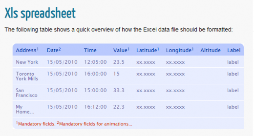
As you can see from the image above, there are a number of columns you can include depending on what information you wish to include, but the only mandatory ones are address, value, latitude and longitude. There is an upload limit set at a maximum of 5,000 rows per file.
Creating your infographic
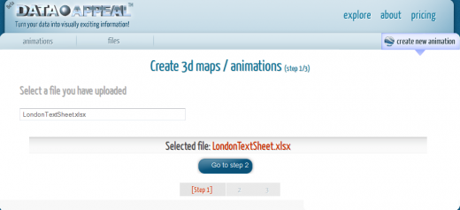
First you need to register for an account which is quick and painless. Then you have to upload your file by browsing for it on your desktop, or you can access previously uploaded files:
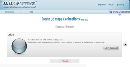
You then select the spreadsheet and select ‘Create new animation’:
Overall, DataAppeal is a very cool application to use, and it will be interesting to see where it goes after its beta stage, whether it will develop new features and, indeed, how it will monetize.
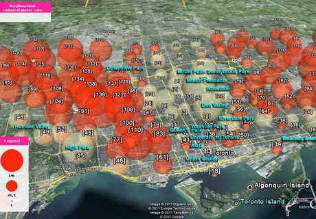
Meanwhile, here’s a couple more visualizations, developed using DataAppeal:
London population: Economic activity and % green space
Get the TNW newsletter
Get the most important tech news in your inbox each week.
