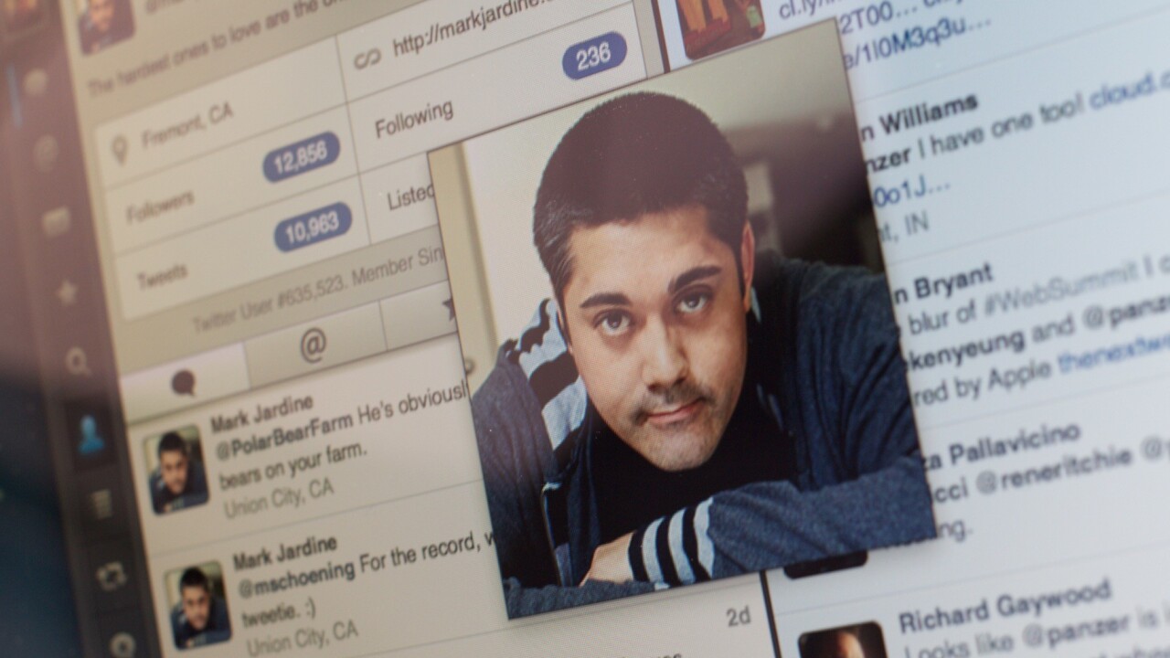
The development team of Tapbots has slowly gained a reputation for crafting polished and clever apps with a unique robotic theme. The pair behind the company include programmer Paul Haddad and designer Mark Jardine.
Haddad and Jardine began working together at the Oakley web group, where Haddad got the hankering to build an iPhone app and enlisted Jardine’s help to design it. The rest is tiny robot history.
Since we’ve already conducted an in-depth interview with Haddad earlier this year, I reached out to Jardine and he agreed to answer a few questions. He rarely gives interviews, so I jumped at the chance to talk to him about the design of Tweetbot for Mac in advance of today’s release. You can read our review of Tweetbot for Mac here.
TNW: I know that with iOS you know point by point how the app will display for everyone, but that’s not true with the Mac. How did you find the experience of designing your first Mac app for Tapbots?

The <3 of EU tech
The latest rumblings from the EU tech scene, a story from our wise ol' founder Boris, and some questionable AI art. It's free, every week, in your inbox. Sign up now!
Mark: Designing for the Mac is definitely far more challenging than iOS. It just feels like there’s an infinite amount of variables you have to account for. Designing a “custom” interface just makes things harder. Then, add the fact that I’m sitting here designing my first Mac app and you have a huge recipe for disaster. I did have a clear goal though. It was to take our signature look and feel on iOS and apply it to the Mac while still feeling like a Mac app. I’m a pretty harsh critic when it comes to “feeling like a native Mac app”.

I always hated Firefox on the Mac because of this. Macromedia apps were notoriously bad and Adobe apps follow right behind them. So yeah, I can see how it must be ironic that I designed Tweetbot for Mac the way it is. But Tapbots apps have a heavily branded user interface. So as long as we keep making apps for this brand, I will continue to take on this challenge. Do I feel like we’ve succeeded in taking our brand and making it feel like a mac app? I’m not really sure. But it’s a 1.0 and we still have a lot of work ahead of us.
TNW: I’ve seen a few iterations of the Tweetbot for Mac icon come and go, but you seemed set on the bird from the start. Was it difficult to translate him out of the square or have you always thought of the bots as three dimensional objects that you translated into icons?
Mark: The original Tweetbot was a drawing I did for the bottom of our website that linked to our Twitter account. At the time, there was no thought of ever doing a Twitter client. No more than the drawing of the nurse or robot with the megaphone becoming an app icon. So when we decided to do a twitter client, my objective was to take that bird illustration and draw him with the same rules we apply to all of our icons (yes I’m still sad that Pastebot lost his eyes). I’m guessing most people have no clue why the Tweetbot for iOS icon looks the way it does. But those who have been following our apps before Tweetbot became big know why the icon looks as it does and that’s all I care about. I think [that] the iOS icon is super clever and definitely a result of pure luck that it worked out. Even when designing the iOS icon, I knew that if we ever did a Mac app, I’d use the full bird for the icon.

So that’s what I did. I drew Tweetbot standing in a 3/4 view to fill most of the icon bounding box and resemble the original drawing I did for our website. But when I started to leak a few screens of it, I got a few comments that it looked too much like the Twitterrific icon. A blue bird plus the 3/4 view apparently caused too many similarities. Paul and I totally respect the guys over at Iconfactory and I’ve personally been a huge fan of their apps and icons since I bought my first Mac (a Powermac G4 MDD).
We decided it wasn’t worth potentially bumping heads with them just for an icon so we decided to take a different approach. The next best thing was to have Tweetbot facing directly forward. The problem with that was he was much taller than he was wide. That made the app icon look really small in the dock. I tried my best to fatten him up and shorten his legs as much as possible, but it just wasn’t enough. So we decided to amputate his legs altogether. It felt weird at first, but it grew on us quickly so we ended up sticking with it.
TNW: Was translating the design language of iOS a challenge, or did everything fall into place as far as the interface?
Mark: Most of it fell into place. The biggest challenge is getting around framework limitations when it comes to customizing the interface. Right clicks replaced long holds on iOS and swipe gestures work the same for the most part. One thing I wanted to make sure I did was make good use of the space we have on the Mac. That’s where the idea of columns came in. At the same time I didn’t want to force them on people because I know some people really hate the “Tweetdeck” concept. For the average user, columns are overkill. But for someone who manages a personal account as well as a company account, it just starts to make a lot of sense. It also makes our “multiple timelines” feature that much more useful.
Another big challenge was solving our tweet drawer issue. In early builds, we used the same tweet drawer we have in iOS. However it just didn’t feel right at all on the Mac. We struggled with that for awhile. Went through a few variations and finally ended up with what we have now. It’s nothing new, but it seems to work the best.
TNW: Do you feel Apple makes it easier or harder to design for the Mac these days, with so much of their focus on iOS?
Mark: iOS is definitely easier in many ways. It’s so easy to do custom UI and get great performance and animation (relatively speaking). But I think we’ll figure out better ways to do things over time. We went through the same problems when we created our first iOS app.
Get the TNW newsletter
Get the most important tech news in your inbox each week.