
Design isn’t just about making things look visually interesting – it’s also about shaping functionality.
Today there is a clear trend towards more attention to aesthetics and engaging user experience design.
However, traditionally conservative when it comes to communications and branding, financial companies aren’t known for flashy brands or affinity for design. The 2014 acquisition of the user experience design firm Adaptive Path by Capital One and the hiring of top design talent Daniel Makoski – founder of Google’s modular Project Ara phone project – was just the beginning of an industry trend.
With mobile and web platforms becoming the main stage for financial companies to interact with their customers, the design doctrines popular with tech startups started to become an influence.

The <3 of EU tech
The latest rumblings from the EU tech scene, a story from our wise ol' founder Boris, and some questionable AI art. It's free, every week, in your inbox. Sign up now!
Here are some of the best examples beautifully designed fintech apps and websites:
User-centric
The marriage of a bank and a user experience (UX) should not seem odd at all. With relatively little differentiation in product offerings, the customer’s experience has become the most tangible offering. This is clearly the case in technology-focused verticals such as consumer electronics and automobiles.
However, without a clear focus on improving the UX for the customer, financial institutions run the risk of their legacy systems pushing them further and further into internal obsolescence and external obscurity. And with this risk, opportunity emerges in the market. Enter Stripe.
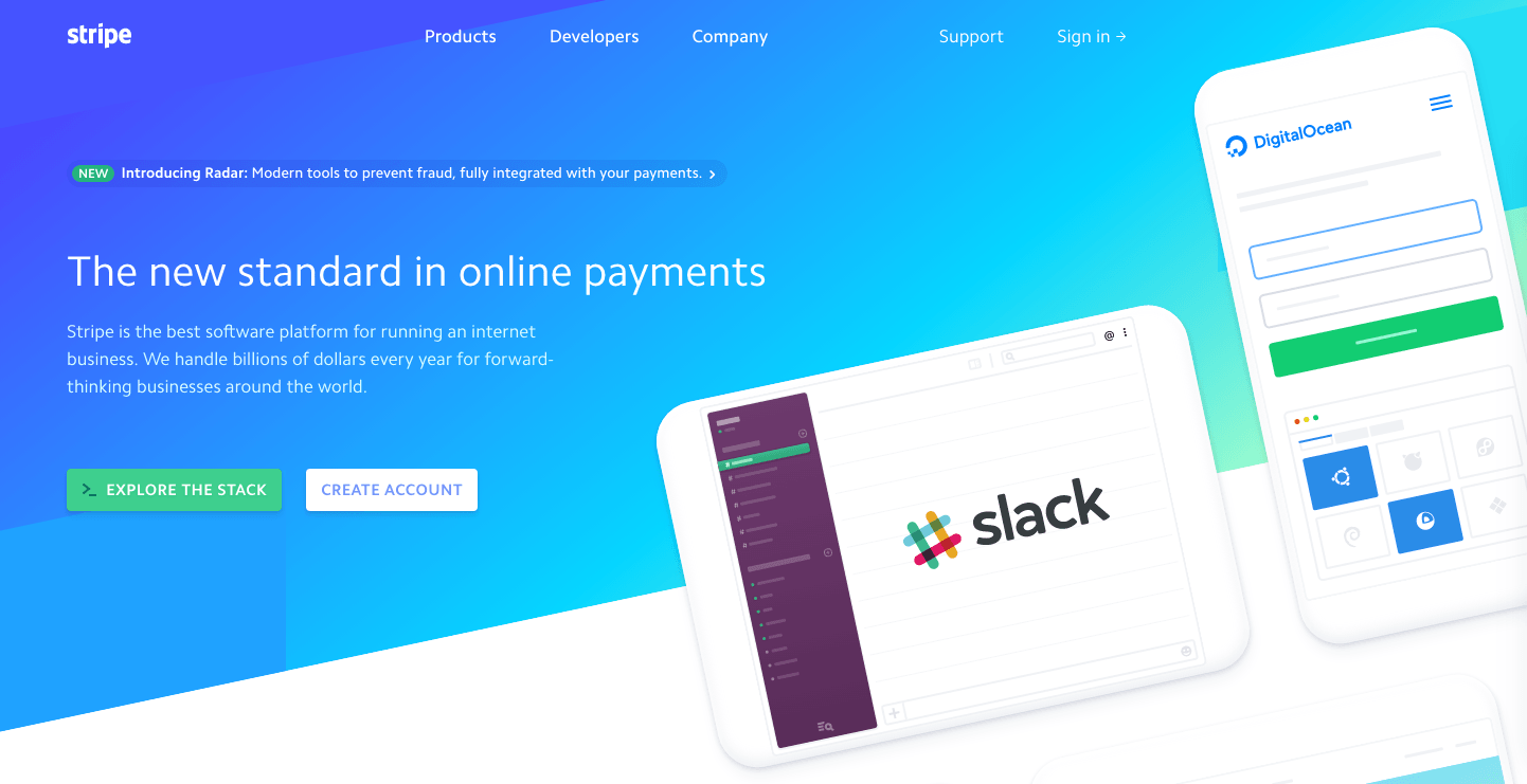
The company offers an online payment processing solutions and platforms to businesses and startups. Stripe, founded in 2010 has established itself as one of the go-to solutions in online payments.
Instinctive design
Many banking institutions provided their prospective and current customers a contemporary, responsive, content-rich, personalized, easy-to-use public web experience. But, when it comes to the post-login online banking experience, whether app- or web-based, the industry falls far short.
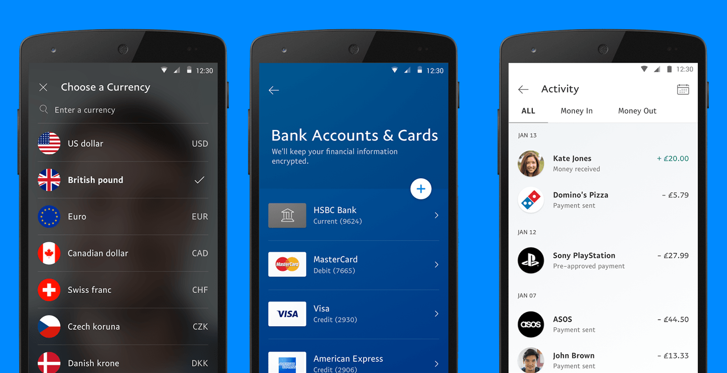
The PayPal app is designed to bring order to the complexity of multiple currencies, bank accounts and transactions. It looks and feels intuitive, spacious and fast.
A human touch
Conducting banking business in a branch comes with certain inconveniences such as having to wait in line or only having access during regular banking hours. Here, however, the “human touch” manifests as active listening, responsiveness, and clear communication — all critical to the successful completion of one’s banking business.
ABN AMRO is a Dutch bank (and the one I use personally) providing financial services across the globe. To get to good designs and great features, the financial institution continuously validates hypothesis, thoughts, sketches and clickable prototypes with clients and then iterates these.
However, compared to fintech startups, the company has more IT legacy and internal procedures concerning security.
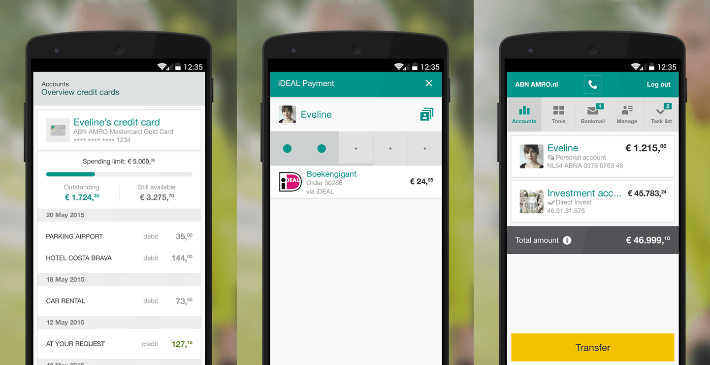
For example, the ability to search by debit or credit amount means clients have a more in-depth look into their accounts when it matters most. Or from a UX perspective, the company knows an easy login is in demand. But sometimes security wins out over design and accessibility.
This all means that, besides being a good creator, designers also need to be very good listeners in validating their ideas with customers, need to be capable to understand the complexity of the technical architecture, need to understand the importance of branding, and must be able to challenge other departments such as legal and compliance.
Go with your users
It’s no surprise that startups are lustfully eyeing the space under the belief that they can provide better financial services with lower fees than the big banks that dominate the sector today. One such startup has actually been around for what seems like the dawn of time – or at the least the dawn of fintech.
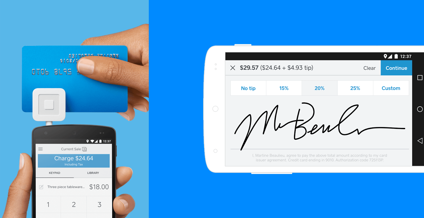
Understanding that the market was always connected, with smartphone in hand, co-founders Jack Dorsey and Jim McKelvey used this information to bring a product to market that consumers actually wanted. If that’s not design thinking, I don’t know what it.
From chaos to order
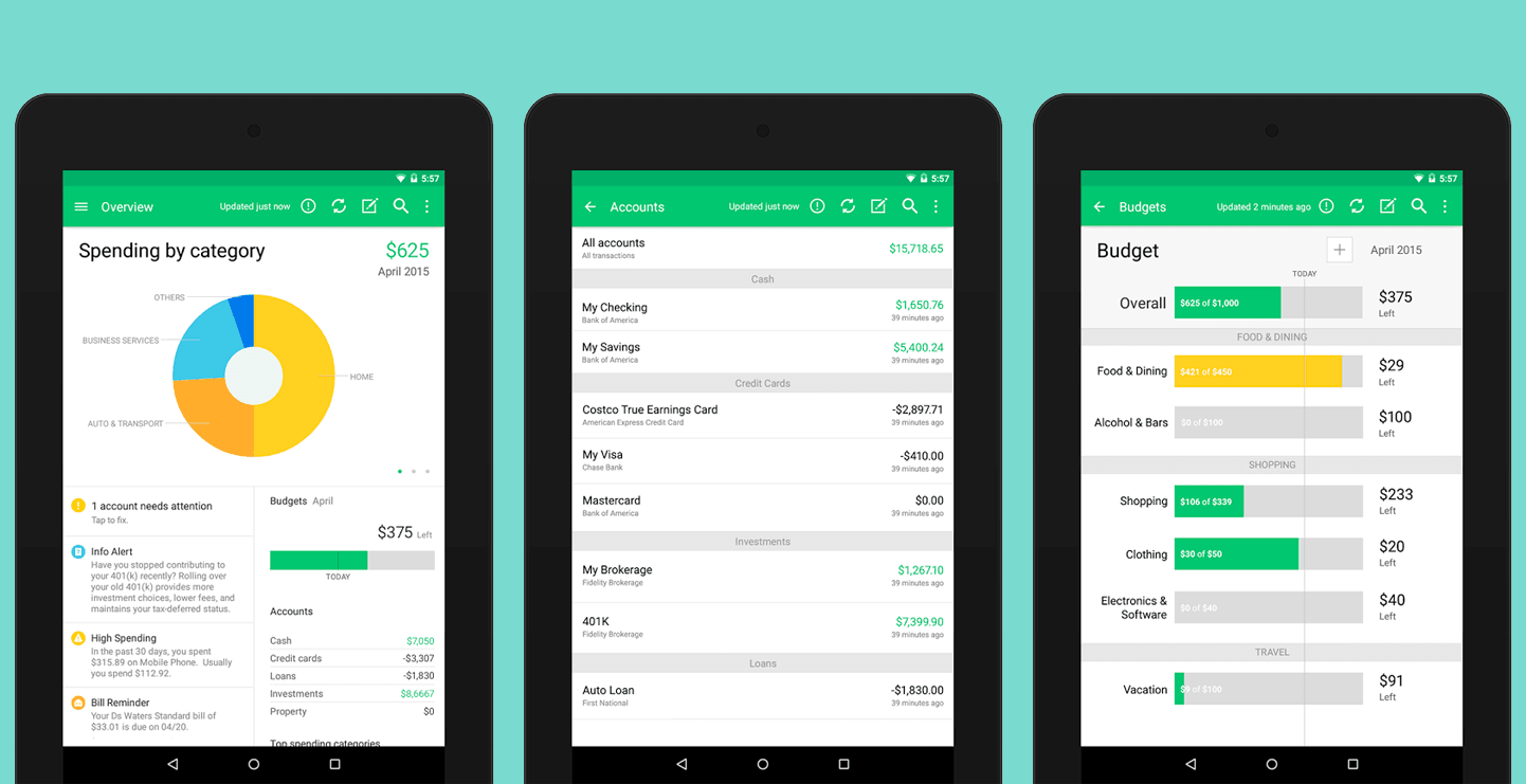
Personal budgets. The bane of everyone’s existence, especially when kept on a traditional spreadsheet. Mint, however, is a game changer.
The a free personal finance management service acquired in 2009 by Intuit for $170 million. Not only does the platform let you create and manage budgets, check on credit scores and track goals, this is an app meant for everyone.
Put users in the driver’s seat
Transferring money shouldn’t be difficult, yet getting money from A to B can be a hassle – especially when it concerns currency conversion.
This is due to digital landscapes and needs as assessed by banking institutions – with the user experience frequently taking a backseat to aged designs and ineffective content.
This is not the case for peer-to-peer money transfer service TransferWise.
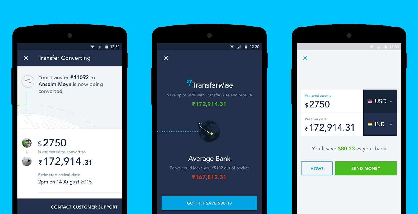
Co-founded by Taavet Hinrikus – who previously worked on Skype as employee number one – the app is absolutely beautiful and easy to use. With large, unmistakable numbers and clear, efficient copy combined with a light aesthetic
Intuitive design
Mobile is an incredibly important first step in a purely digital transformation, but organizations need to think outside of channels to really put the customer first.
The app makes use of some interesting design choices, like swiping up to confirm an order placement. It shows their designers are exploring the mobile platform and leveraging more than what people might be used to.
The future of fintech
We are fans of convenience, expecting 24-hour access to our accounts no matter where we are. Yet the most useful and powerful cross-channel, digital tools rolled out in recent years were not introduced by banks, but by tech companies that understood how to use the internet, data analytics, and mobile technologies to solve consumers’ day-to-day problems.
Unfortunately, banks have a complex problem: Many of their practices and much of their data is heavily regulated.
When banks can navigate the data and customer insight on-hand, they’ll be able to create better hyper-personalized user experiences. We’re already seeing this in the above companies – merging finance with beauty and ease of use.
Get the TNW newsletter
Get the most important tech news in your inbox each week.
Whatever your specialism, with ABN AMRO your talent and creativity will help build the bank of the future. Find out what it’s like to work for ABN AMRO and learn more about their exciting job opportunities.