
Twitter has launched a tool for brands and advertisers in the UK that makes use of its collated ‘Everyday Moments’ data to show exactly how often, where and when people interact when talking about certain topics.
For example, you might want to check out the UK’s ongoing war between tea and coffee drinkers or you might want to see how many people around the nation are grumbling about traffic delays.
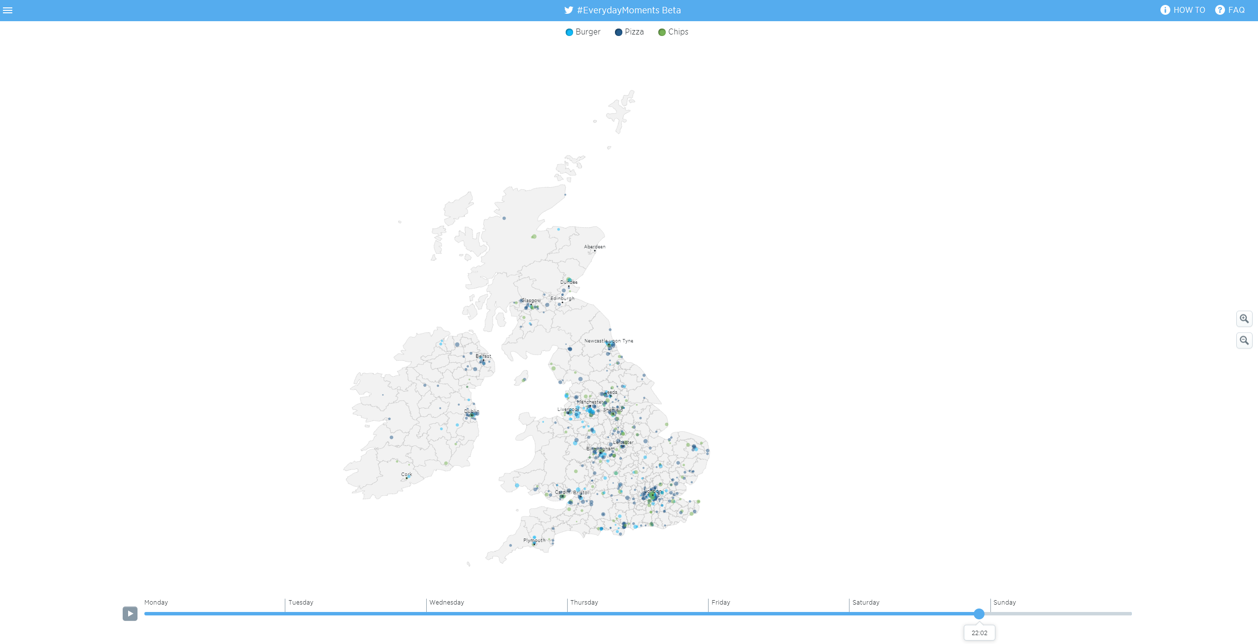
To start with, there are more than 80 preset topics to choose from and using it is really very simple: just select your topics from the left-hand bar and then move the slider at the bottom of the screen to see the volume and geographical location of those tweets at different times in the week. Needless to say, and as you can see above, tweets about ‘chips’, ‘pizza’ and ‘burgers’ are pretty popular on a Saturday night. A spokesperson for the company confirmed that while the tool is accessible globally, the data is currently only from the UK.

The <3 of EU tech
The latest rumblings from the EU tech scene, a story from our wise ol' founder Boris, and some questionable AI art. It's free, every week, in your inbox. Sign up now!
While this is all very interesting for the end-user, it’s ultimately aimed at marketers looking for better insight into potential brand and community interaction opportunities.
➤ Be inspired by Everyday Moments with Twitter’s interactive tool [Twitter]
Featured Image Credit – LEON NEAL/AFP/Getty Images
Get the TNW newsletter
Get the most important tech news in your inbox each week.