
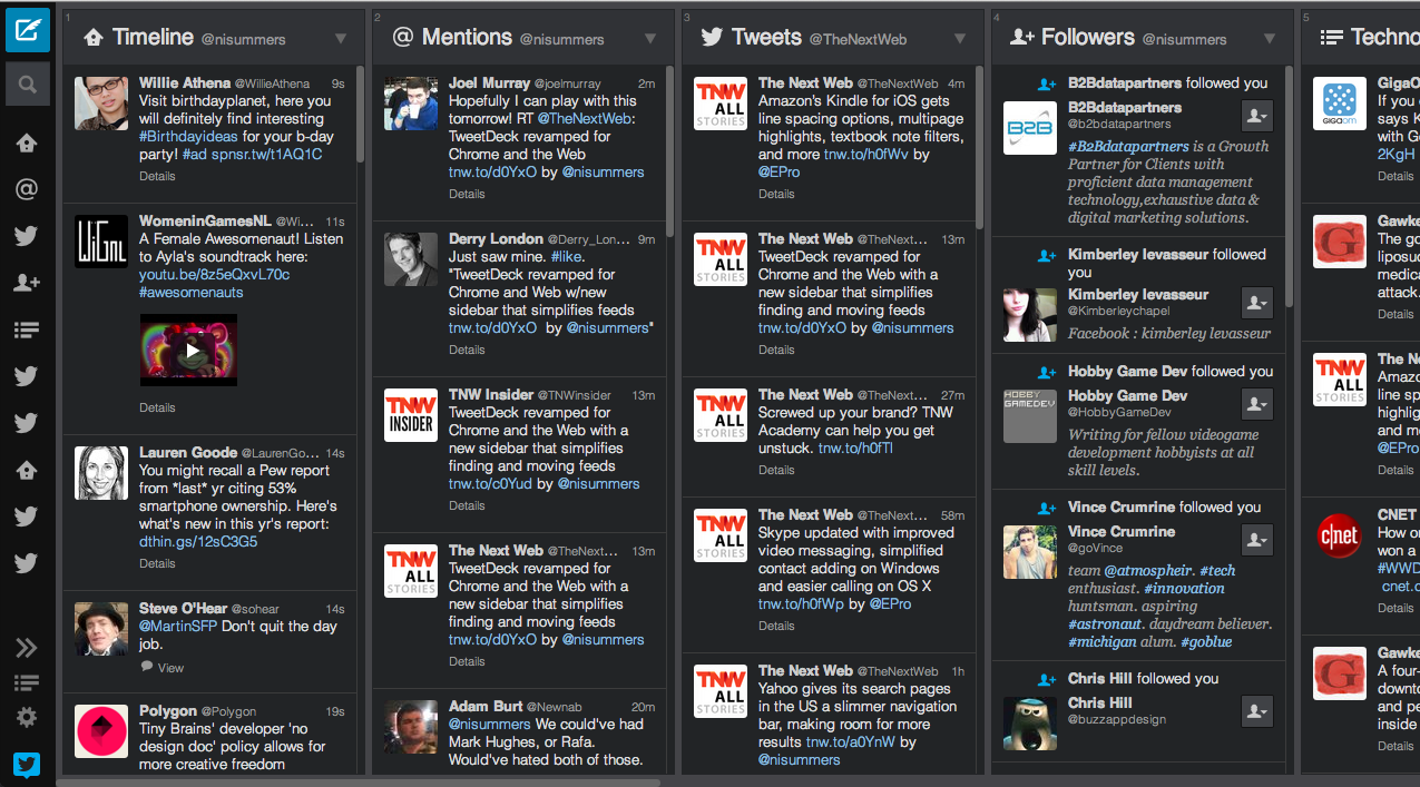
Twitter is rolling out a pretty radical redesign for the Chrome and Web versions of TweetDeck today, adding a slim, expandable sidebar on the left-hand side of the screen that handles search, new tweets and quick navigation between feeds.
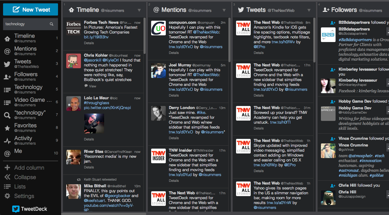
A little blue square now resides in the top left-hand corner, replacing the traditional text box at the top of the screen. It requires an extra click to start typing, admittedly, but means that far more space can be given to the users’ various streams.
Search has also been moved over to the new sidebar, but expands with a list of suggested queries when the user starts to type. It covers some of the column on the left-hand side but that’s not necessarily a bad decision; before it covered a large part the feed on the far left hand-side of the screen, so the change is relatively insignificant.

The <3 of EU tech
The latest rumblings from the EU tech scene, a story from our wise ol' founder Boris, and some questionable AI art. It's free, every week, in your inbox. Sign up now!
What follows is a list of icons representing all of the active columns in TweetDeck. They’re represented by small symbols that can be a little confusing at first, given that many users have multiple streams covering mentions and direct messages for separate accounts. Rolling over these icons quickly reveals the Twitter handle it relates to, solving some of these issues, but it just doesn’t feel very intuitive in use.
At the very bottom of the sidebar is a handful or permanent icons for adding new columns, viewing lists and accessing TweetDeck’s various toggles and settings.
There’s also an ‘expand’ button, however, which brings the sidebar out with full descriptors for each of the available actions and feeds. This makes is far easier to jump to a new column, but the trade-off is that it takes up a lot of screen space on the left-hand side. It’ll likely prove useful for so-called ‘power users’ with ultra wide monitors, but a pain for those with small laptops.
It’s also worth pointing out that the sidebar can also be used to rearrange columns in any order. Simply drag the relevant icon up and down the list, and TweetDeck will move it as required on-screen. It’s a massive improvement over the arrow system used previously and points to a much cleaner and simpler design ethos moving forward.
Image Credit: Justin Sullivan / Getty Images
Get the TNW newsletter
Get the most important tech news in your inbox each week.