I’ve intended to write a post on the topic of Zune’s impact on the Metro design aesthetic for some time, but it took musings from Paul Thurrott to jog me into action.
He has an excellent post up, comparing elements of Zune’s desktop client to Office 15’s design. Once stacked side by side, the verdict is obvious: the Office 15 team is borrowing. And I mean that in the best possible way, being a big fan of the Zune desktop app itself; I used to use no other tool. Have a look:

I don’t even have to explain what’s going on, do I? Of course not.

The 💜 of EU tech
The latest rumblings from the EU tech scene, a story from our wise ol' founder Boris, and some questionable AI art. It's free, every week, in your inbox. Sign up now!
However, this is hardly a new theme, the borrowing from Zune’s design by other Microsoft products. In fact, Zune, from my perspective has been the trailblazer for user interface design for some time at Microsoft. That makes its death all the sadder, in my view, as it’s been so critical to the company.
All things must end.
Right, so what the hell am I talking about? Think about Metro for a moment, that blocky UI style that is now a part of every upcoming Microsoft product. Have it fixed in your head? Good, now peep this image:

Here’s the kicker: that’s from 2006. Yes, that’s a shot of the first Zune software client, from an Engadget review of Zune’s launch. Shocking, right? Let’s take a look at what Microsoft did next, to the Zune player, and software, in version 2:


Those shots are from 2007, for the record. As Zune as a brand was floundering, it was setting the stage for Metro. The software itself continue to be refined, to today, with the Zune client today looking like this:

Windows Phone picked up the charge, and won plaudits for its interface. This is a shot of the phone line when it launched, in 2010. Take note of the boxes that have been part of Zune for 4 years at this point:

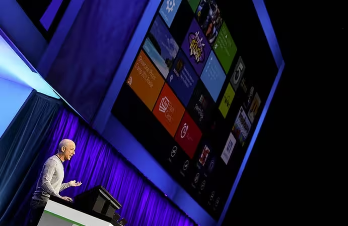
And now we move to Windows 8 and Office 15, which are dressed in the garments of Zune, er, Metro:


It’s been a long road for Metro, and it started in the backwaters of Microsoft various failings to ever ‘get’ music. Of course, the company has a new strategy for that. It’s fun, however, to track the design elements that are set to become the daily interface for hundreds of millions, back to a doomed music experiment.
I know I’ll be alone in thinking it, but I’ll miss you, Zune.
Get the TNW newsletter
Get the most important tech news in your inbox each week.