![The History Of Microsoft [Infographic]](https://media.thenextweb.com/2011/01/gates_001.avif)
Here at TNWmicrosoft, we try and bring you a variety content styles. Today, we start with an infographic.
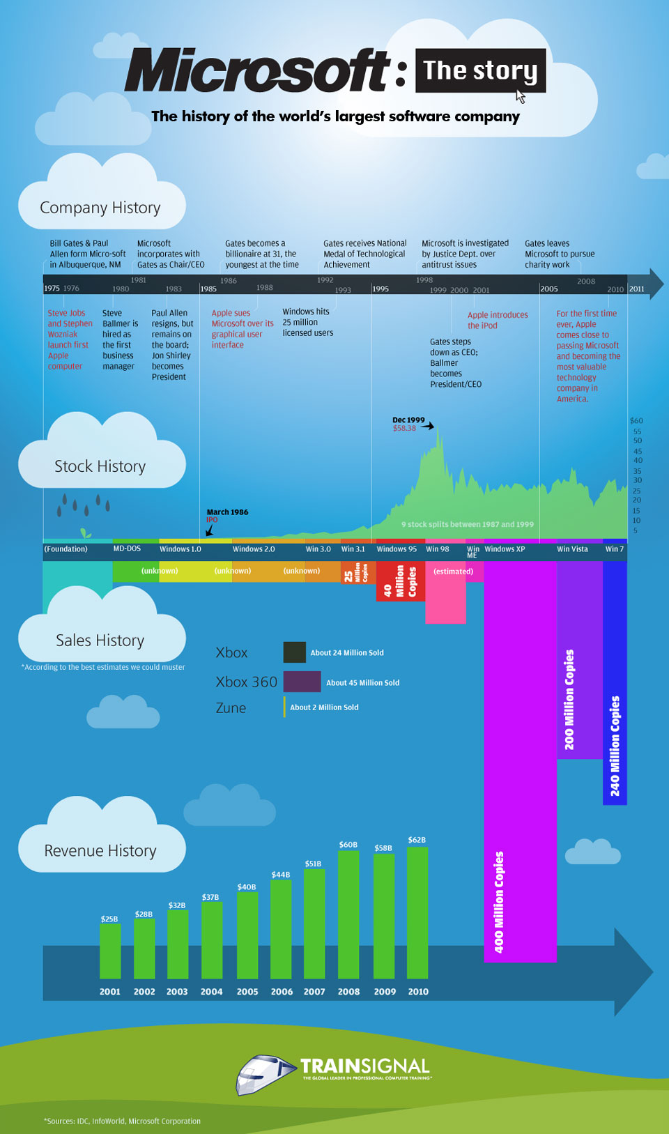
The below image, built by our friends over at TrainSignal, maps out the Microsoft stock price, its revenue, the sales of each version of Windows, and more. Even if you are just a casual user of Microsoft products, the image is a treat. Click for a higher-res version.
Get the TNW newsletter
Get the most important tech news in your inbox each week.