A decade-long experiment regarding highway sign fonts is coming to an end, and the government is calling it a failure.
Called “Clearview,” the experimental font was meant to make highway signs easier to read, especially from distance and at night.
Unfortunately, research didn’t support that position, so the US Department of Transportation (DoT) is keeping its “Highway Gothic” font active.
Safer like this or like this? @USDOTFHWA data says the #font matters. https://t.co/lBZ31PM7SX pic.twitter.com/b3sFYj1OkJ
— TransportationGov (@USDOT) February 4, 2016
Don’t expect a lot of work to remove the signs, though. The DoT says the signs can be used until they reach their natural end of their “useful life” and don’t need to be taken down until then.

The <3 of EU tech
The latest rumblings from the EU tech scene, a story from our wise ol' founder Boris, and some questionable AI art. It's free, every week, in your inbox. Sign up now!
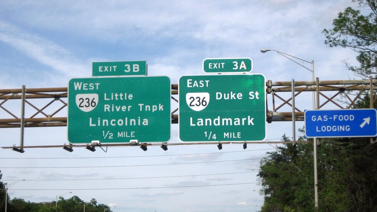
As you can see from the tweet above, there’s a distinct difference between Clearview and Highway Gothic. If it were up to me — considering there’s no safety issue with either — I’d have gone with Clearview.
➤ Keeping drivers safe one road sign at a time [Us Department of Transportation via The Verge]
Get the TNW newsletter
Get the most important tech news in your inbox each week.