Chances are good that you have at least one friend who tracks calories, workouts, or books read. But do you know anyone who puts out an annual report of those numbers in exquisite, visual detail?
Nicholas Felton, the design brain behind Facebook’s timeline feature, has put out his own personal annual report for years. The last one he produced was for 2012 and it featured beautifully rendered charts of where he ate, the airports he passed through, who he spent time with, his most productive days.
When that edition was made available for pre-order at $28 on his website, all 2,500 copies quickly sold out.
Critics might ask why we should care about the aggregated, daily routine of a man most of us will never never meet. But fans would argue that these reports aren’t merely novelties for the coffee table—they represent data as art, a single year of human life parsed into graphs and charts. (You can decide for yourself by viewing a preview of the 2012 report here.)
For a growing number of personal data enthusiasts, this is the way of the future. When Felton’s Reporter app became widely available on the iPhone last year, it was downloaded by thousands of people thirsting for meaning in the fray of their daily lives.
Every 90 minutes the app buzzes to get their attention and offers up some quick survey questions before storing the data on the cloud. By the end of a year, users might be able to find answers to those nagging questions—Where did all the time go? and, Did I spend my year wisely?
Apps like Reporter are part of a growing trend around “the quantified self” or, as statistician Nathan Yau, Ph.D., calls it, “self surveillance.” There are now hundreds of tracking apps in the market place, from the wearable, automated programs that track your mileage and heart rate while on a run to the manual, sharing apps for people around the world with the same medical condition.
According to ABI Research, more than 90 million wearable devices will ship in 2014. Aware of the booming market for all manner of human measurement, Apple just received a patent for a biometric sensor that reads your heart rate through a pair of ear buds.
Meanwhile, companies like MapMyFitness—which serves 17 million users worldwide and logs 400,000 activities on the cloud a day—have had to ramp up their infrastructure to keep up with demand.
If the Quantified Self movement sounds to you like a fringe group for existential mathematicians, then it’s worth exploring quantifiedself.com, the website collaboration that serves over 100 groups in 34 countries.
Gary Wolf, one of the founders of the movement and an organization called Quantified Self Labs, is a contributing editor at Wired. His 2010 TED talk and his piece on the data-driven life for The New York Times Magazine have been hailed as definitive and compelling glimpses into the personal data movement. They offer a close-up look at the people who track their every waking—and sleeping—movement and why any of it matters to them in the first place.
A quick review of the videos on the Quantified Self site reveals that these are not merely vanity projects. People use self-tracking tools to share information on everything from the progression of Parkinson’s Disease to the relative health of an artificial heart valve through blood analysis to the fulfillment of a reading goal of five books a week.
Nathan Yau, the statistician who runs the website flowingdata.com, is interested not only in the aggregation of a single person’s data over time, but in the sum of many people’s activities. He recently accessed public data records for the app RunKeeper to produce some fascinating visualizations called Where People Run.
He produced a kind of athletic heat map for 22 cities around the world. It’s no surprise that people like to choose the most scenic routes possible (as Sydney and New York illustrate below) but Yau also hopes his work will help city planners better serve a health-conscious population.

Where People Run: New York City
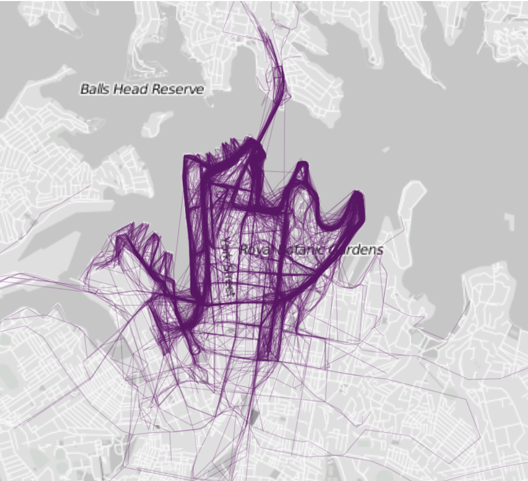
Where People Run: Sydney
As more and more people record and store their daily activities, moods, and biometry, we’re likely to see a lot of “little data” turning into Big Data. Just like enterprises that are mining Big Data for business insight and higher margins, these folks are looking for meaning in the constantly moving stream of information.
Instead of trying to better understand customer behavior, they want to better understand their own. How do they make their days more productive? How do they run faster and further? How do they find more time to do the things they love?
As a result of millions of people tracking some aspect of their activities, we’re probably not likely to see a sudden uptick in the number of personal, annual data reports given as Christmas gifts. We’ll leave that to the true fanatics like Felton and Yau, who’ve managed to turn their obsession with data into fulfilling careers.
Get the TNW newsletter
Get the most important tech news in your inbox each week.