Vimeo has just announced its first major redesign since 2007, and boy does it feel fresh. The longevity of its original design speaks volumes to its quality, but after a certain point, users really need something new to play with.
Now, don’t get me wrong, Vimeo’s redesign is certainly not just about aesthetics, and the spacious and painstakingly honed design can not get much more perfect than this.
From a back-end perspective, “Vimeo rebuilt the site from the ground up using current programming languages and open web standards to deliver optimized site performance and easier, faster browsing. The cleaner codebase allows for more rapid development so the team can release site updates and new features in less time.”
From the functional side, the redesign makes navigating the old Vimeo feel like a chore (I really enjoyed the old design, too). Overall, it genuinely provide registered users with a better experience with significantly larger videos, smoother navigation and clear visual hierarchy.
Vimeo is currently only allowing users in for a closed testing period and you can sign up for that here. Now, let’s get to the tour!
Brand New Video Page
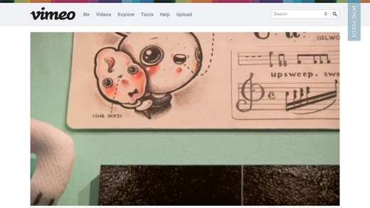 Vimeo’s new video page is simply gorgeous. The main focus is entirely on video, placing the details below the player and out-of-the-way. Everything feels very open and ease to parse, and the pastel color palette is a nice but subtle touch.
Improved Video Browser
 If you take a look at the upper right hand corner you’ll notice a transparent “More Videos” banner. Click it and you’ll reveal the new video browser, an elegant way to find related videos from your feed, particular users, etc.
Browse CC
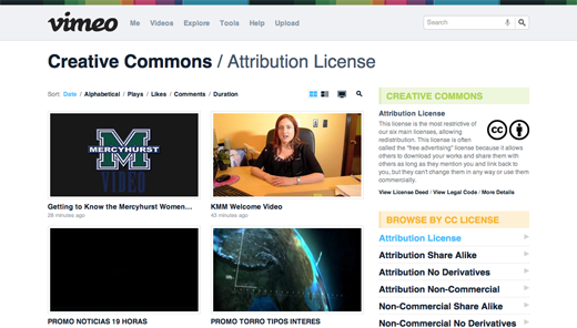 The redesign brings in the ability to browse by creative commons licenses, like Flickr’s The Commons, but exclusively for video.
The Details
 Even the footer navigation looks beautiful, and it’s because the visual hierarchy is nearly flawless. The eyes know exactly where to go, instead of having to search all over the place for what you need. Even the sidebar headers delightfully stand out with pale pastel backgrounds.
Here’s more thoughts from Sockyung Hong, Vimeo Vice President of Design and User Experience:
We completely rethought the user experience to evolve Vimeo into something that meets our users’ needs today and tomorrow. Our goal was to strike a balance between friendly and elegant while still preserving our fun personality.
Many die-hard users are sure to have been attached to the previous design, especially because it had been around for so long. This likely explains why the team was so careful with this facelift, because had anything on awry, Vimeo could have alienated a ton of users.
Overall, I am proud (as a Vimeo user) to say the results are true to what the company stands for. Vimeo is to film as YouTube is to Television, and the redesign echos that very spirit.
What do you think of the new design? Share your thoughts below!
Get the TNW newsletter
Get the most important tech news in your inbox each week.
