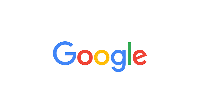
Google has a new logo or rather a new wordmark, if you want to be pernickety about it. And let’s be honest, when it comes to typefaces and logo design, people always want to be pernickety. It’s more than a hobby, it’s a lifestyle.
When it comes to precision in both language and ‘taste’, John Gruber is an absolutist. Many people throw the ‘fanboi’ word around when discussing his work at Daring Fireball, but that’s a lazy shot.
Gruber cares deeply about design and while he is well-disposed towards Apple, he’s also dispensed plenty of harsh words in its direction when it falls short of his expectations. He’s best thought of as a fairly indulgent but occasionally critical friend of Apple.
But when it comes to Google, I don’t think Gruber gets it. His analysis of the company drips with contempt (“A company whose coolest stuff is always in the form of demos coming in the future, not products that are actually shipping now”).
He thinks the company is fundamentally tasteless and its design and product philosophies are anathema to him. Hence his response to the new Google logo:
Their old logo was goofy. This new one is simply garbage. Just right for a company with no taste.
Here’s the tyranny of ‘taste’ at work. The logo is not to Gruber’s taste ergo it is further proof that Google itself has “no taste” and has produced “garbage.” Hell, it’s a strong take and good for ratings but it’s also bollocks.

The new Google logo represents the company pretty well. It is a rainbow of chaotic ideas. Compare it to the clean, single color approach taken by Apple and you’re comparing ideological opposites.
I am more of an Apple guy than a Google one. I’m typing this on a Macbook Air, I have an iPhone in my pocket.
But I’ve also used and enjoyed using Android. I’m adding this post to our CMS using Chrome and was tempted by a Chromebook Pixel after reading Martin Bryant’s recent review of the latest model.
I don’t believe that Gruber is 100 percent partisan in Apple’s favor, but they’re his team. The idea of a playful, almost immature branding, will always chafe at him. He admires clean lines in fonts, precision and attention to detail.
Google values wild experimentation and an almost chaotic approach to the world’s problems. Apple only takes to the field when it has the right team in place and the right idea. Critics call it late. I think Apple’s just more apt to be on time.
But the question of ‘taste’ is the wrong one here. I think the new Google logo is a clear upgrade on the previous iteration, but that’s just my opinion. It’s to my taste. It’s not to Gruber’s.
When you declare your taste superior to someone else’s taste, you’re apt to seem like an asshole. I’m a fan of Gruber’s asshole tendencies – there’s a Daring Fireball t-shirt in my closet and I wrote this post in Markdown – but as he is from time to time, he’s dead wrong here.
This post started pretentious, so let’s go out the same way. There’s a latin maxim – De gustibus non est disputandum (“In matters of taste, there can be no disputes.”) but the Romans and Dostoyevsky, who quotes it in ‘The Brothers Karamazov’, never had to deal with comment threads or forums.
Get the TNW newsletter
Get the most important tech news in your inbox each week.