![Facebook begins rolling out new single-column Timeline with greater emphasis on messages [Updated]](https://img-cdn.tnwcdn.com/image?fit=1280%2C720&url=https%3A%2F%2Fcdn0.tnwcdn.com%2Fwp-content%2Fblogs.dir%2F1%2Ffiles%2F2012%2F07%2Ffacebook-screen1.jpg&signature=06626fca705bf4403025eb11d01f012f)
Facebook has begun rolling out a new single-column design for Timelines which better organize users’ personal pages and places greater emphasis on communication between friends.
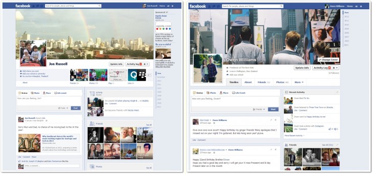
The revamped Timeline has gone live for users in New Zealand, which is regularly Facebook’s first port of call for new rollouts. As screenshots from TNW contributor Owen Williams show, all communication from friends and status updates placed in the left-hand side column only. This left side column has been made larger to place greater emphasis on messages, with the right hand side now made smaller as a result. For example, the Friends box is now 3×3 instead of 2×4.
Update: A Facebook spokesperson tells TNW that the company has “no other details to share right now”. That means that New Zealanders will be the only ones to enjoy it, for now, but we’ll keep tabs on future developments.
Content in the right-side column is now ‘fixed’ to show Friends, Recent Activity and other non-messaging updates. Highlighted posts — such as life events — can no longer be stretched across the page when starred in the new design.

The <3 of EU tech
The latest rumblings from the EU tech scene, a story from our wise ol' founder Boris, and some questionable AI art. It's free, every week, in your inbox. Sign up now!
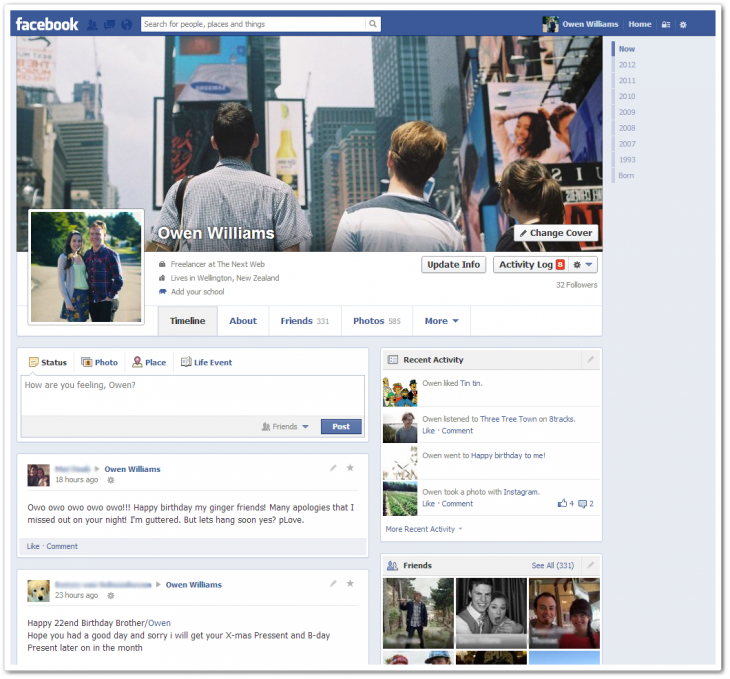
The new redesign also tidies Timeline headers. Boxes that link through to ‘Friends’, ‘Photos’, ‘Maps’ and ‘Likes’ have been removed, these items are now listed in a menu which, when clicked, brings them up separately. Interestingly, relationship information has been removed from the header, which could perhaps be a focus on keeping personal details more private.
It was confirmed that Facebook was testing this redesign on a fraction of users around October time last year and, as was the case with its recent new privacy settings (and many other updates), it has gone live in New Zealand before any other country. That almost certainly means it will make its way to other countries worldwide shortly, but we’ve contacted Facebook for the finer details.
Our initial observation is that the new Timeline is indeed cleaner and easier to navigate. Previously, it could get awkward when messages would appear on both right and left columns, making it easier to miss or gloss over an update from a friend. Of course, the new design does have the issue of wasted space on the right hand side as you scroll down a Timeline but, since most people want to keep up with the latest information — which doesn’t require much scrolling — we think that the positives outweigh the negatives.

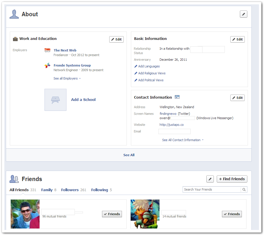
There is no new information in the revised About page but it does lists all the details that Facebook has relating to work, education, relationships and contact information in one place.
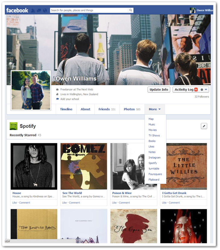
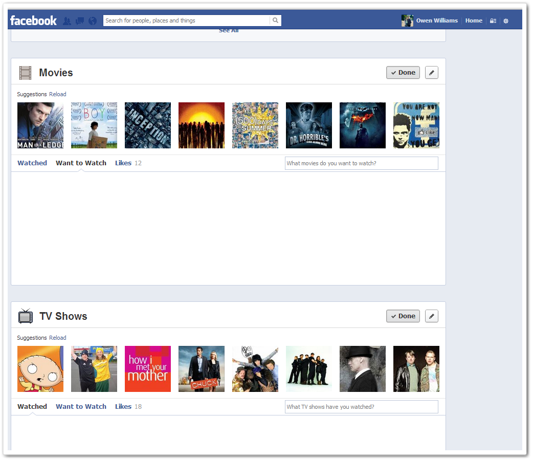
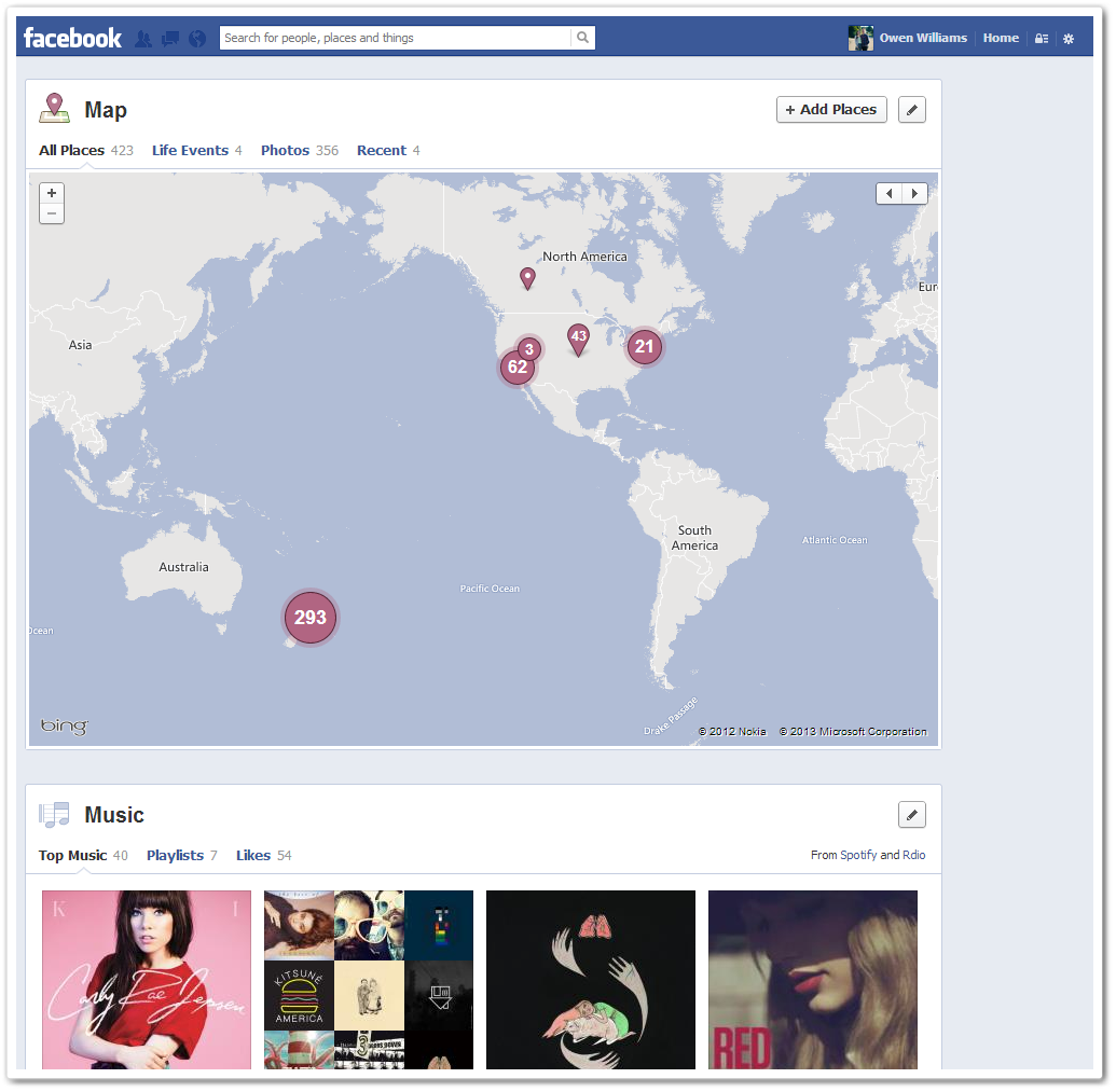
The More tab allows you to view a range of activities — beyond About, Friends and Photos — which includes Maps, Movies, TV Shows and Music, as below. There are also setting for activity from Open Graph apps, such as Instagram, Spotify, Foursquare and Flipboard:

Related: Check out this designer’s beautiful vision for a redesigned Facebook
Headline image via westm / Flickr
Get the TNW newsletter
Get the most important tech news in your inbox each week.