The concept of using windows to manage our operating systems dates all the way back to the 1970s, when Xerox introduced the first basic window manager on the Alto computer.
Fast-forward to today, and it’s still the most popular way of interacting with computers — at least on laptops and desktops.
Even though it was invented more than 45 years ago, the concept itself hasn’t changed that much, with only small tweaks and improvements along the way.
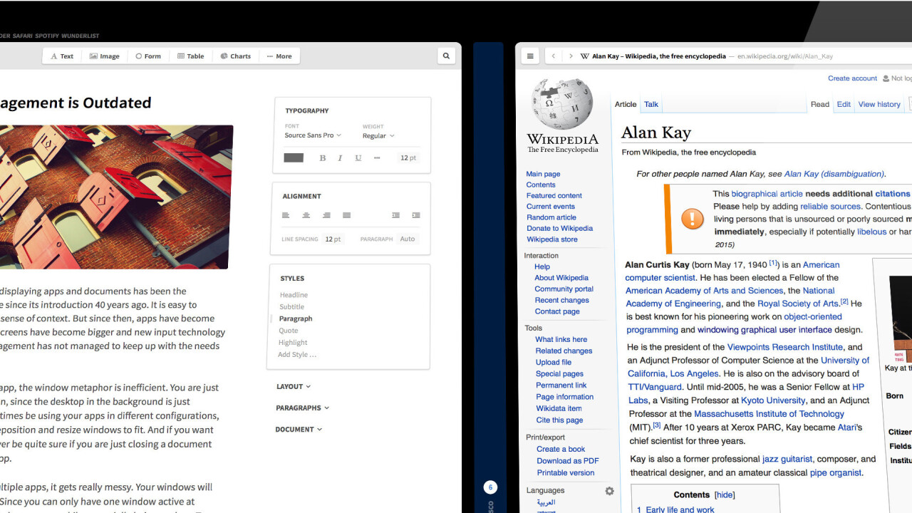
One 21-year-old German student, Lennart Ziburski, thinks it can be done better, so he created his own concept called Neo for what a modern window management interface could look like — and it’s pretty compelling.
Instead of using windows, Neo opts for a panel interface, that fills the height of the screen and scroll from right to left so that no space is wasted. When a new window opens, it slides into your panel carousel.
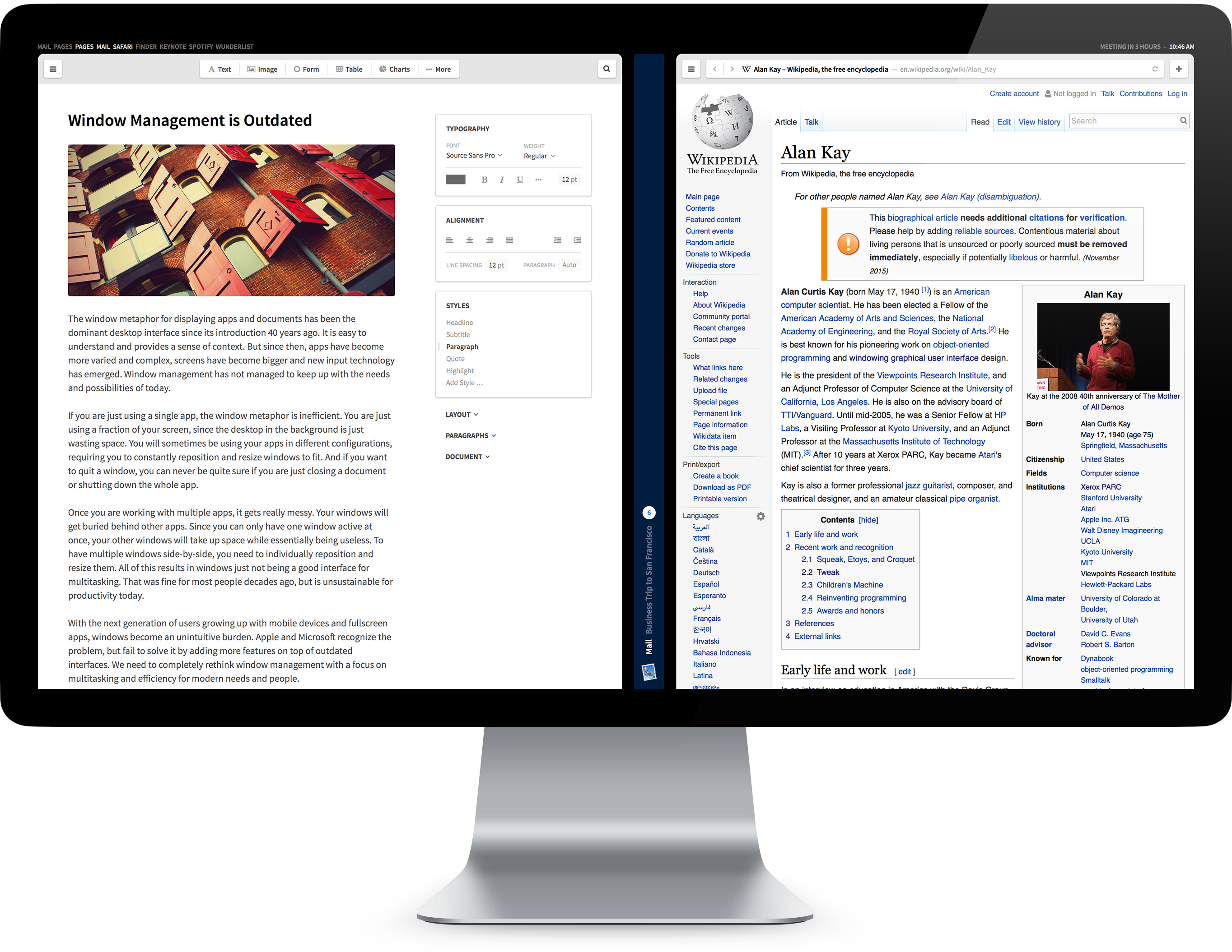
To scroll through the panels or interact with them, Neo heavily relies on three figure gestures that Mac owners would already be familiar with.
In Ziburski’s concept, you can still minimize panels, but they just slide to a small slit in the middle of your panels for later retrieval.
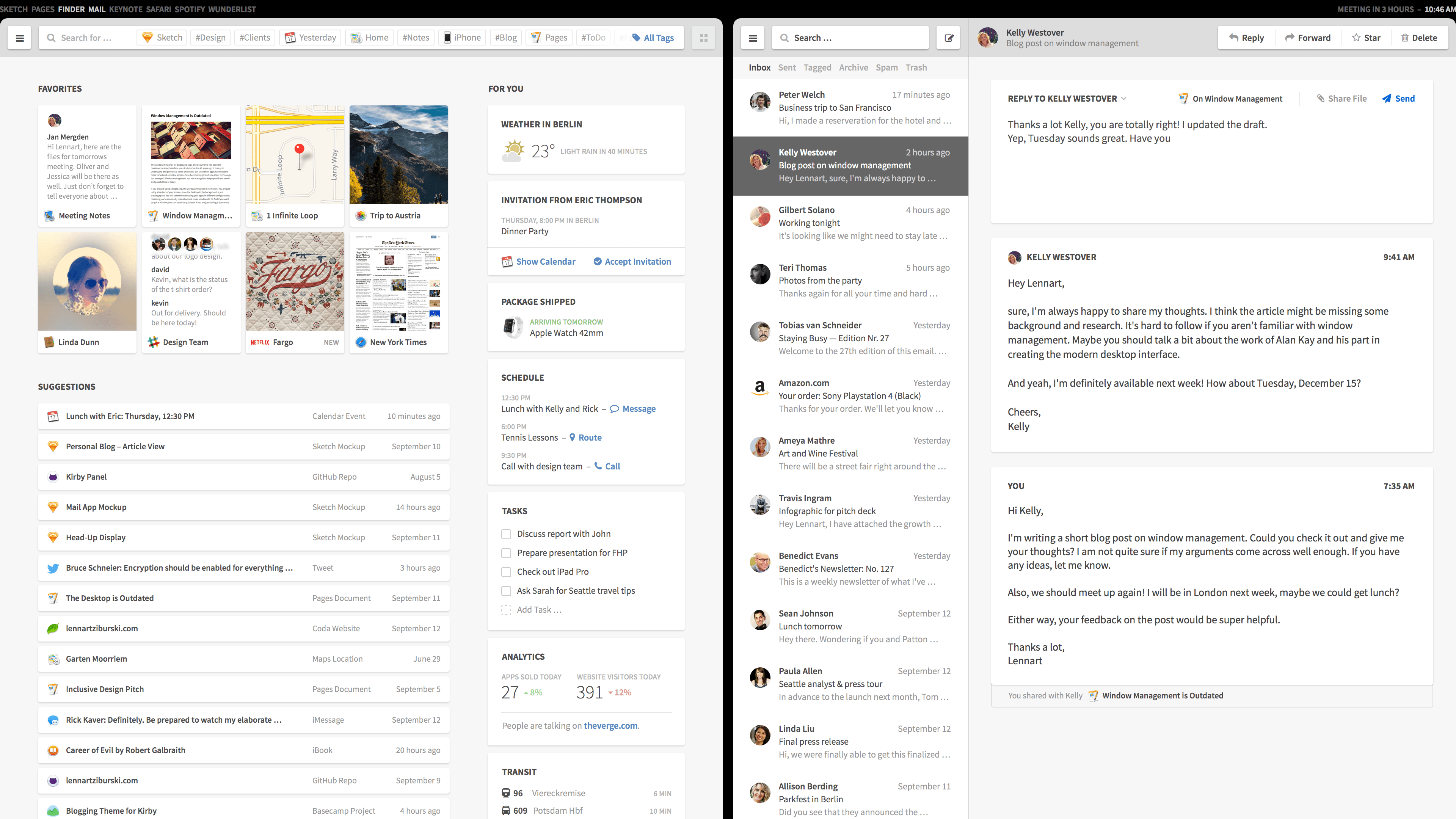
The concept also replaces the familiar Desktop, which Ziburski calls “inefficient and outdated,” instead opting for a Finder interface by default that shows quick access to your content, search and Google Now-style suggestions.
Instead of folders, you just get tags. When you save a document, new contact, email thread or anything else, you’re able to tag it for later retrieval via search or just clicking the tag.
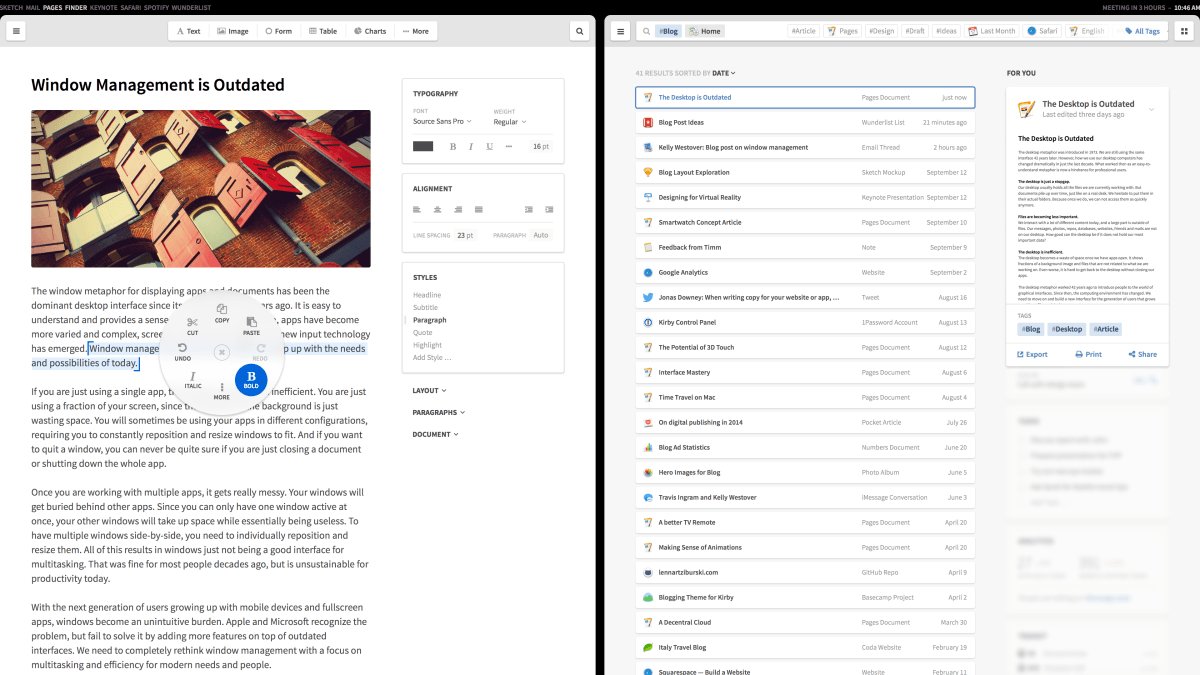
Neo also redesigns the context menu to be a ring of icons rather than a set menu — something you’ve probably seen in OneNote already — so you can swipe straight to what you want.
While Neo is just a concept, it contains some interesting proposals for rethinking how we interact with computers, though could be better suited to devices with a touch screen, like an iPad.
The concept, even though it doesn’t actually exist in software terms, is good enough to make me want to use take it out for a whirl in the real world.
It’s been a while since someone like Apple shook up the world of interaction, like it did when iOS was first introduced — maybe it’s finally time to go back to the desktop and think again.
Neo’s raw design is available in Sketch files, which Ziburski has made available for anyone to download and re-use. Otherwise, gawk at what we could have if someone built this.
➤ Neo
Get the TNW newsletter
Get the most important tech news in your inbox each week.


