
Responsive Web Design, or RWD for short, is an oft talked about and frankly invaluable discipline in the context of today’s design industry. A few short years ago, it was enough for a design to render attractively in four or five different preset viewports.
This is no longer the case today.
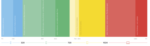
Photo credit: Responsive Design Cheatsheet
As mobile browsing outpaced desktop usage in 2014 with statistics predicting a continuing increase, a website must have a mobile strategy in place in order to succeed. Moreover, the increasing variety of devices and screen sizes require designs to be more flexible than ever before.
And while there were once multiple options for serving mobile users, such as m-dot sites or heavy reliance on mobile applications, the most relevant research to date shows that these solutions just aren’t as consistent or as cost effective as a responsive design.
What is responsive web design?
As the name suggests, Responsive Web Design responds to the user’s viewport, device, or platform. Essentially, it’s a design that can attractively acclimate to any screen resolution.
Responsive web design in 2015 is already going beyond this definition, but it is still traditionally recognized by three primary concepts described in Responsive Design Best Practices:
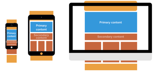
- Fluid grids – An arrangement or organization of content lacking a fixed width, which is composed of intersecting vertical and horizontal lines. This grid is used to structure content in a predictable and consistent manner by adjusting the size and positioning of the elements contained within.
- Flexible images – Any visual content or media that adjusts to fit a user’s screen size. Usually these are images placed within a flexible grid that has the max-width CSS rule applied at 100 percent. In layman’s terms, this prevents images from being larger than the grids in which they’re placed while also allowing images to resize without sacrificing any of their aspect ratio. To avoid slow loading times, designers can compress the images’ resolutions when displayed on smaller devices. Another method is to set the width as a percentage of the width of the page as a whole.
- Media queries – A CSS3 module that controls how the styles within the media attribute are applied. Different styles are applied according to a number of device specific qualities such as screen width, height, orientation, etc.
These cornerstones form the foundation of what we understand as Responsive Web Design. There are, however, other associated ideas which have become more or less synonymous with RWD. Mobile-first approach, progressive enhancement, and unobtrusive JavaScript are current principles that will certainly carry over into the new year.
It will be interesting to see how much the term comes to symbolize in the future. Right now, people are already confusing the term with the more breakpoint centered, Adaptive Design.
Recently, there has even been talk of expanding the definition to include taking advantage of unique device capabilities (such as specific commands on a touch screen).
The definition, perhaps not ironically, is quickly becoming as fluid as the concepts it describes.
Why continue with responsive web design?
The diversity in devices used to browse websites is only growing larger, and it has become an expectation that users take for granted when exploring their preferred destinations on the web. Your design must respond to the user’s viewport if you want to deliver even a baseline acceptable experience.

More to the point, RWD is the preferred method of making a website more accessible by virtually everyone:
- Users don’t like dealing with a redirect, and downloading a dedicated app is a hard sell when they’re dealing with limited mobile disk space.
- Multiple websites for a single domain become costly to maintain, and difficult to update as well. When you add an extra codebase, you also add more maintenance cost in the long-run. You’ll either need to deal with twice the work or use a server-side solution, both of which are more expensive than a responsive or adaptive site.
A well implemented responsive design, on the other hand, addresses all of those concerns. If a single set of images, grids, and the like are automatically resized to fit the user’s viewport, then the UX is by definition more consistent than switching between two separate sites. And if you only have a single codebase to maintain and update, it’s not going to cost as much money nor take as much time.
The advantages of RWD are immediate, and well documented:
- Increases your audience, sales and conversion rates. According to a study by the Aberdeen Group, RWD sites achieve 11 percent more conversions than non-responsive sites on average.
- Forces you to prioritize content for each viewport (especially smaller screens), which inevitably makes for a stronger site.
- Truly future-proof since you don’t need to obsess over every new device screen size
- Improves your SEO: Google officially recommends responsive sites.
- Gives users uniform quality — no one wants to be a second-class citizen.
- Enables you to be detail oriented, which is great because (if you’re a good designer) you care about details.
The old way is fading
M-dots, or separate versions of a site for mobile users, are a dying practice.
M-dot sites like “m.samplesite.com” vs. “www.samplesite.com” provide a different browsing experience for users on different devices. When the goal is consistency, it becomes easy to see why this isn’t the ideal solution. Still nothing is quite as clear as statistical data, and there’s plenty of evidence for the decline of M-dots.
- Pure Oxygen Labs reports that last year M-dot sites fell 20 percent, from 79 percent in 2013 to 59 percent in 2014, while responsive and adaptive (dynamic serving) sites rose 37 percent collectively.
- Users visit the full site anyway — Web Performance Today’s research showed that about a third (35 percent) of users choose to go to the full site if given the option.
- Users spend more time on the full site — The same research states 5.5 times longer. They also calculated that 79 percent of revenue from mobile sales came from users on the full site.
- SEO/Google trouble — According to Google’s own guidelines, responsive and adaptive sites will likely rank better. Not using an M-dot is an automatic boost in SEO.
- Redirect time — While M-dot sites load faster in theory, the extra time of redirecting from your full site to the M-dot (unless the user types the M-dot’s URL) is unnecessary. Alongside the other drawbacks, is it worth it?
- Mobile devices aren’t a single screen size — It’s ironic that what was once the greatest strength of M-dot sites is now its greatest weakness. M-dot sites are designed for a specific screen size, but mobile devices range from 320×240 for some smartphones up to 768×1024 (and beyond) for tablets. It just doesn’t make sense to serve the same layout to all those screens.
Bottom line: M-dot sites are a bad idea because they cost more and create inconsistent experiences. As we roll into 2016, you’ll see them continue to drop off the radar as responsive and adaptive design take over.
There are numerous examples of sites who make the switch to RWD being exponentially more successful after a relaunch. Let’s take a look at an example from a case study performed by Google on the British Internet Service Provider, Plusnet.
Responsive case study: Plusnet
When Plusnet’s analytics began showing a significant increase in mobile traffic to their website, they began considering a major change in their web offering.
As Google’s case study shows, the numbers were impressive and they started growing quickly. More precisely, the amount of mobile traffic was rising a percentage point (in relation to total traffic) every month. Once it became obvious that the trend would continue for the foreseeable future, the decision-maker’s at Plusnet concluded that they had to invest more in a mobile strategy.
They opted for a responsive redesign because they, “…felt responsive web design was the best solution for developing content that will work across all devices on one platform rather than on multiple sites, making it as future-proof as possible given today’s technology.”
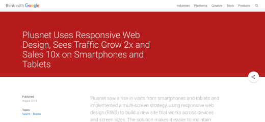
Photo credit: Think With Google
Along with the implementation of RWD, Plusnet decided to dedicate more of its budget to mobile marketing. Even though their site is far from being a pinnacle of visual design, the single act of switching to responsive was powerful enough to yield impressive business results.
Time to conversion was slashed nearly in half (40 percent), and sales via smartphones and tablets increased ten times over in consecutive years. Now, the new responsive site’s mobile conversion rate is higher than the old site’s conversion rate was for all devices combined.
These results aren’t atypical when switching from having no mobile strategy to implementing RWD. When Time Magazine relaunched their responsive site, the number of unique visits to their homepage increased by 15 percent, with time spent going up by seven and a half percent and the mobile bounce rate decreasing by 26 percent.
Good responsive design is good business. And if you want to be a good designer, you must always design for the right business reasons.
Takeaway
The conclusions are easy to draw.
More people are using mobile now than ever before, and the number of mobile users is continuing to grow. More than half of the population has a mobile internet service subscription, and by the end of 2020, that number is projected to grow by another billion people.
But, as we’ve discussed so far, simple media queries, fluid grids, and flexible images aren’t enough to provide the best possible UX. What’s required of designers in 2016 and beyond will be an open mind and a flexible attitude to match that of the evolving web.
Responsive design is more than a game of technical adjustments to a layout. It is a complete reimagining of the way in which content is delivered. The much more difficult challenge is strategizing how to deliver the right content to the right user on the right device at exactly the right time.
Get the TNW newsletter
Get the most important tech news in your inbox each week.