Storytelling in Web design guides the user experience, incorporating all types of media to craft a logical and emotional narrative out of thin air.
Since the beginning of human history, stories have played an important part in how we connect with one another. Just because we now tell our stories on the screen rather than around a campfire does not lessen their ability to captivate people emotionally.
The tricky part, of course, is creating a cohesive narrative when the story is not always told linearly since the “listener” (in this case, the user) can control the flow and pace of the experience through multiple avenues of navigation.
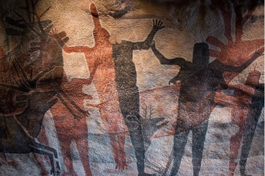
“Cave Painting”. Artotem. Creative Commons.
Before you know your story, know your user.
Conduct user research, create supporting UX documentation (personas, storyboards, experience maps), then dive into the psychology and behavior of your users. Once you know where your product fits into their goals, you’ll know how to start craft your visuals and content to deliver on your promise.
The Web is now certainly a visual medium, though in its early days it was largely text-based. As bandwidth concerns become less of an issue, though, visual media now dominates almost all corners of the web. A website devoid of images looks out of place and often gets ignored in favor of one that is well illustrated and full of rich animations and interactions .
Visual narrative creates purpose in Web design, distilling complex scenarios into a simple dramatic arc. Without good visual storytelling skills, your websites will never live up to their full potential, whether they’re for your own personal or professional projects.
In this piece, we’ll explore some of the psychology behind why visual storytelling is so effective in Web design.
An Image is Worth More Than a Thousand Words
We’ve all heard the old adage that “A photo is worth a thousand words”. But did you know there’s real science behind the statement?
The “picture superiority effect” says that visuals can convey up to six times more information than words alone.
The two primary theories supporting the picture superiority effect both explain how we encode information for later retrieval.
- The Paivio Dual Coding Theory says that we can recall images better because they create both verbal and image codes (because images generally create a verbal label in addition to the image, whereas words are less likely to create image labels).
- The Nelson Sensory Semantic Theory states that since people notice differences more readily in images rather than words, we can recall the meaning of images with less effort. To further support this theory, when people are presented with multiple similar images, the picture superiority effect disappears since they lose the power of distinction.
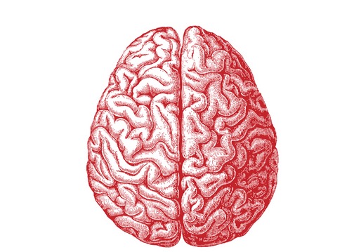
Photo credit: “brain picture.” Allan Ajifo. Creative Commons.
Keep this in mind when creating visual UX, since using images that are too similar can negate the advantages of visual storytelling compared to straightforward verbal narrative.
As explained in the free guide Web UI Design Best Practices, here are a few tips to keep in mind:
- Use images that coordinate and have a cohesiveness to them, but also display distinct content so they’re easily distinguished and remembered.
- Don’t repeat concepts in your images. Let one image flow into the next to tell your story.
- If you’re using visuals with models (or characters), make sure they stay consistent throughout your story. Even if they’re not the same models, be sure they at least look like they’re from the same “world”.
- Just because the story is visual doesn’t mean you can’t use text to guide and clarify the message for your users.
- The more clear, striking, and impactful your images are, the more likely your users will remember them. The goal is unique imagery that stands apart in the user’s mind.
Visual UX for Accessibility
Interestingly enough, the picture superiority effect becomes more pronounced with age. The picture superiority effect even remains in effect among those with with Alzheimer’s disease and mild cognitive impairments, which also makes visual storytelling a useful tool for making your websites more accessible for older populations.
On the other hand, younger people (especially children) have a less pronounced picture superiority effect than do adults. So visual storytelling on sites aimed at children can be less effective than you might expect, which requires that the verbal content is explicitly clear.
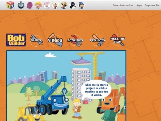
Photo credit: Bob the Builder via Louis Lazarus
In fact, as you can see in the above Bob the Builder site, the overstimulating visuals are designed to capture a shorter attention span than to tell some emotionally captivating story. To supplement the visuals, the spoken navigation also creates more of a “choose your own adventure” feel, which is perfect for the younger audience.
Great Visual UX Improve Retention
Regardless of the type of website you’re designing, you probably want your visitors to remember the information on your site a few days later. On a site with just text or audio content, a visitor is likely to remember ten percent of the information they consumed after three days. That’s not a whole lot.
But, if you add a picture to those words, they’re likely to remember around 65 percent of that information. That’s more than six times the information, just through one relatively simple change.
Even if creating or finding appropriate images to illustrate your content takes two or three times as long as simply writing good text, the payoff is well worth the added effort. We retain so much more information through visual storytelling, that to ignore that aspect of the learning experience is to significantly hinder your user’s ability to retain the information you’re presenting.
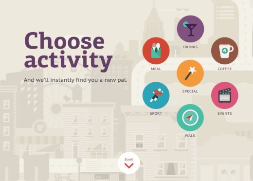
For example, let’s take a look at the colorful site for the friend-making app Yep!. Created in a single-page format that naturally encourages storytelling due to the linear up/down scrolling, the rich graphics and fun copy instantly entice users to learn more about the app.
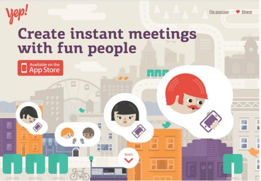
Photo credit: Yep!
As you scroll down the page, the site takes you on a visual tour with each section showing (rather than just telling) how the app pairs people with potential friends based upon shared hobbies.
Once the app has finished walking you through the hypothetical scenario with Brad, the bottom of the scroll reaches the download call-to-action (in this case, the climax of the story they’re presenting). Even if you don’t immediately download the app, do you remember how it works? How about if it’s free or costs money? And can you give feedback afterwards?
The details are much easier to recall because they weren’t just chunks of text on the page. The clever animations and smooth transitions from section to section stitches the story together in a simple, almost film-like format.
Visual Information is Processed Faster
While retention is important when talking about visual storytelling, so is the time it takes to mentally process the visuals.
Users have a limited attention span and know within 10 seconds if a site is worthwhile. If they’re presented with a huge block of text, they may not bother to read it all (or even skim it if they’re really pressed for time).
When presented with images, however, users can process more information faster. In fact, visual information is processed up to 60,000 times faster than text information.
That’s right: 60,000 times.

Photo credit: “eyes”. Christos Tsoumplekas. Creative Commons.
When someone visiting your website can glance at a chart or another visual and immediately draw the desired conclusion, that not only saves them time and effort, but it also is more likely to stick with them a few days down the road. Between those two benefits, visual UX is a strategy that you can’t neglect if you care about educating and informing your visitors.
Let’s think back to the Yep! example we just discussed. The illustrations showing people using the app (selecting hobbies, being paired with people, chatting and meeting up) provide the bulk of on-screen information. The text merely creates context. But because the narrative flows naturally, we’re still able to understand all the content even though not much of it is written.
Of course, visual storytelling also works for conveying benefits of complex products. In the below photo from the Fitbit website, just the simple photograph of a potential use case (showing on-screen messages in the device) is enough to communicate how the product smooths over communication for on-the-go professionals.
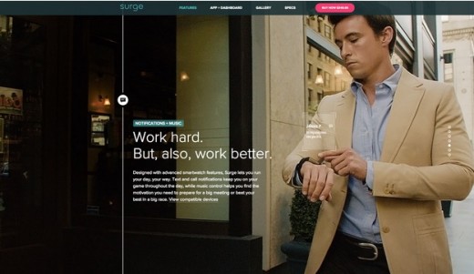
Photo credit: Fitbit
The site follows the beginning-middle-end format of storytelling. When you first land on the site, you’re introduced to the product framed against an HD photo of a person running. As you scroll downwards, the middle of the story explains each benefit against rich pictures of people using the product in real-life scenarios. The picture tells us the story, we relate to the person and the situation, and that is what makes us actually want to read the text to learn more.
Finally, when you reach the bottom of the page, the resolution is presented in the form of a call to action to customize your own Fitbit so that you too can enjoy a better life.
Visuals Evoke Instant Emotions
Visual content can instantly evokes an array of emotions that are more difficult to convey with words alone. An image of a couple holding hands, for example, can evoke feelings of happiness and love, along with feelings of sadness or loss depending on the mindset of the person viewing it.
That is one of the trickiest things about choosing how to visually tell a story: the varied experience of those viewing your content can greatly impact how they perceive it. It’s why you have to carefully think through the images you use, but also, and more importantly, the users who will be viewing those images. Like we suggested in Web UI Best Practices, research your users, create your personas, iterate your design, and don’t forget to keep testing in between.
It’s important that you consider what emotions you’re trying to bring forth when you create your stories. If the point is to excite your visitors and energize them, then you need to choose images accordingly. The last thing you want to use is something that evokes relaxation and a sense of calm, even if it fits your actual story.
The single-page site One to See One to Kill reminisces the harrowing experience of tunnel rats in the Vietnam War. It is, without a doubt, one of the most emotionally evocative sites we’ve ever encountered.
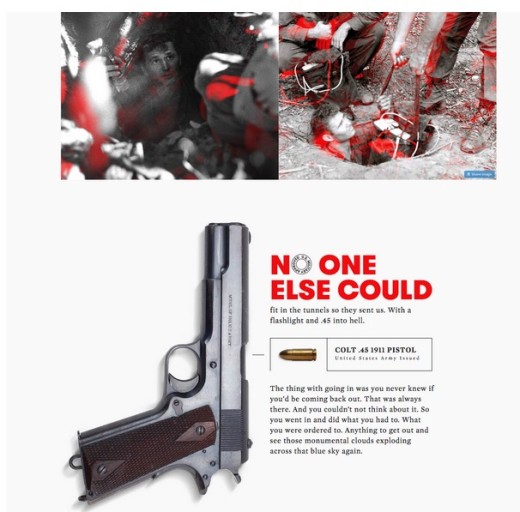
Photo credit: Tunnel Rats
Everything from the flow of veteran testimonials to the black & white images wrapped in red outlines communicates the surreal horror of killing in close quarters darkness.
Photo credit: Tunnel Rats
On a subtler level, the bold typeface and red illustrations continue the theme of savagery, sacrifice, and emotional vulnerability. Once you reach the bottom of the scroll, you feel like you bore silent witness to the war in the tunnels – no easy feat to accomplish with just a single page.
A Long-Standing Concept in Advertising
Pick up any magazine and you’re likely to see pages upon pages of advertisements. And the one thing that virtually all of those ads have in common?
Photo credit: Ads Around the World
They all use visual imagery to illustrate their points. You rarely see an advertisement that relies on text alone to get its message across. Because the advertising industry has known for years that visuals are what people remember, and visuals are what sell products.
Advertising relies on strong, powerful visuals to sell products or ideas. Visual storytelling on the Web is no different. Regardless of the purpose of your site, it’s advertising something, even if that something is just knowledge or an idea.
Bullet Points are Not Pictures
It is often said that most people are visual learners. This is true, of course, due to the picture superiority effect we’ve been discussing. But a lot of content creators are confused about what, exactly, constitutes “visual”.
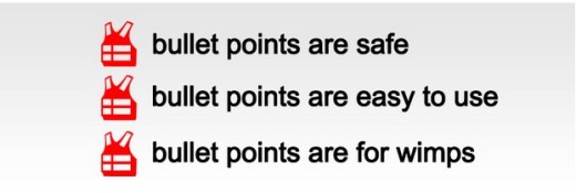
Photo credit: “bullet points.” Sean Macentee. Creative Commons.
All too often, people are told to use bullet points as a way to make their content more visual, and therefore easier to learn. But bullet points aren’t images.
Say it with me: Bullet points are not pictures.
Just because you’ve broken a chunk of text into shorter lines and added a dot next to each doesn’t mean you’ve magically transformed them into pictures. You haven’t magically taken that text and made it an image. It’s still words on a page. Just with a little extra decoration.
Is it easier to process and understand than a giant block of text? Probably. But that doesn’t make it an image.
While bullet points, lists, and text content have their place, don’t fool yourself into thinking that they’re equivalent to visual content. Bullets certainly help chunk out content to reduce cognitive strain, but in most cases you still want rich visuals to add an extra element of delight and allure.
Conclusion
Understanding the psychology behind the impact visuals have on the average user gives you an edge over designers who may approach projects purely from an aesthetic point of view.
The psychology behind concepts like the picture superiority effect allow you to make better informed decisions and create more impactful websites. It puts you in a position to understand and influence your users’ emotional reactions to your story, which will help you design to meet the site’s goals.
For more practical UX techniques rooted in human psychology, check out the free e-book Web UI Design Best Practices. Across 109 pages, the guide deconstructs 33 examples into straightforward tactics for everyday design.
Read Next: How to design with developers
Image credit: Shutterstock
Get the TNW newsletter
Get the most important tech news in your inbox each week.