
The simplicity of minimalism may seem simple enough, but under the surface lies far more than just, “the bare minimum.”

Photo credit: United Visual Artists
When it comes to minimalism, don’t think it’s easier just because it’s simpler. Because there are fewer elements, you must provide the same level of usability (perhaps even better) with less interface. To balance aesthetics with functionality, minimalist Web design is defined by fearless use of space, stunning visuals, striking typography, and an overall focus on the content itself – and nothing else.
We call these techniques the pillars of minimalism, and below we’ve listed the seven most helpful based on our experiences building and appreciating websites. It’s no surprise that minimalism is becoming a popular style today – it correlates directly with many of the modern web design trends, which you’ll also recognize below.
1. Negative Space
The primary design element that most people associate with minimalism is space… in particular, negative space. And lots of it.
But as we described in Web Design for the Human Eye, minimal design isn’t just a small visual surrounded by a colorless expanse. The style also encompasses space of any color, although textures are not included in this context. White, black or very dark backgrounds are the most popular, but some designers also express negative space through full color backgrounds.
As shown below, Lindvall A&D uses a bright aqua background with simple navigation (along with the other minimalist elements we’ll describe later) on the homepage to lure users into the architecture firm’s website.
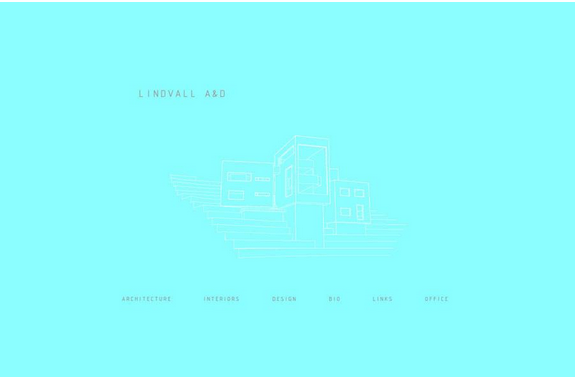
Photo credits: http://www.jonaslindvall.com/
Negative space serves to manipulate the user’s visual flow. As a rule, the more negative space around an element, the more the eye is drawn to it – you can see how this is a powerful tool in a minimalist layout when you’re down to only a few, but powerful elements.
Additionally, negative space allows for more comprehensive organization of elements, preventing the design from overwhelming the user. Negative space is especially useful for interior pages, as you can see below on a more detailed landing page from Lindvall.
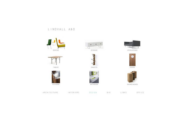
Photo credits: http://www.jonaslindvall.com/
Generous negative space also creates a sense of luxury. The treatment makes a lot of sense for this architectural design firm, considering how they want to appear sophisticated and draw attention to the most important part of the page: the images of their work.
On that note, remember that the goal of negative space is to draw more attention to the content itself. Content-first design is the core of the minimalist philosophy – the bare aesthetics we commonly associate with minimalist design are just a means to achieving that end.
Using negative space is a skill on its own. For more technical information on the ins and outs, download our free ebook The Zen of White Space in Web UI Design.
2. Large & Vivid Photography
For designers who think that pure minimalist sites feel too emotionally distant, oversized photographs add a comforting touch of familiarity without dominating the foreground.

Photo credit: https://makgoods.com/
The most prominent form of artwork in minimalist design, hero headers and hero images are defined by a dramatic image or slider placed near the top of the scroll.
This enables an entire world of emotional connection and atmospheric settings – all reliant on the content of the photograph – while retaining the simplistic interface of a minimal design.
However, remember one key tip when selecting the photo: all the visual minimalist characteristics should be present in the photograph, otherwise you lose the advantage. For example, choose a high-definition photograph composed with ample negative space – expansive skies, or empty white walls as above. Choosing a busy photograph full of distracting items only negates the benefits of the surrounding minimalist interface.
3. Dramatic Typography
With most other elements on the chopping block, the one that every site cannot do without is words. As emphasis is added to the elements that remain, by extension emphasis is added to typography. Beautiful, sharp and even custom typography is a perfect focal point in a minimal framework.
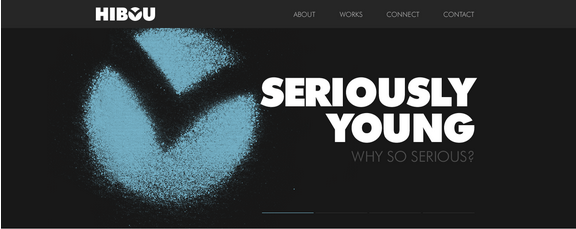
Photo credit: Hibou Digital via awwwards
Typography brings immediate focus to the words and content while crafting a much larger intriguing visual. As we described in Web UI Trends Present & Future: Typography, the most impressive examples of minimal design and typography often include bold styles (with thick strokes) and interesting letterforms (such as a dominant typeface for headlines paired with a neutral typeface for other content).
4. Beautiful Contrast
The white background is such a popular choice among minimalist designers because it’s the perfect canvas for contrast. A hallmark of minimalist design, black or white backgrounds are commonly overlaid with small colorful elements or a bold image.
As stated in Web Design for the Human Eye, designers can create contrast with color, size, shape, location and scale. Contrast brings attention to certain design elements, but also helps create a recognizable visual hierarchy.
Photographer Jorge Riera’s site uses contrast in beautiful ways that change page by page. On the homepage, a large white canvas includes simple, single-line navigation and a large image and the bottom of the screen in black with thick strokes and a bold feel.
Move to the “Who Am I” page for a lesson in typographic and size contrast – custom lettering versus a simple sans serif, and oversized font versus a size that many designers would consider more appropriate for microcopy rather than body copy.

Photo credits: http://www.jorgerieraflores.com/.
Normally, we’d recommend against this tactic due to accessibility and usability issues, but small body copy can be acceptable since it’s not the focal point. Instead, most of the page is occupied with images and examples of work (as you scroll down), which makes sense for an art director who probably prefers to show rather than tell.
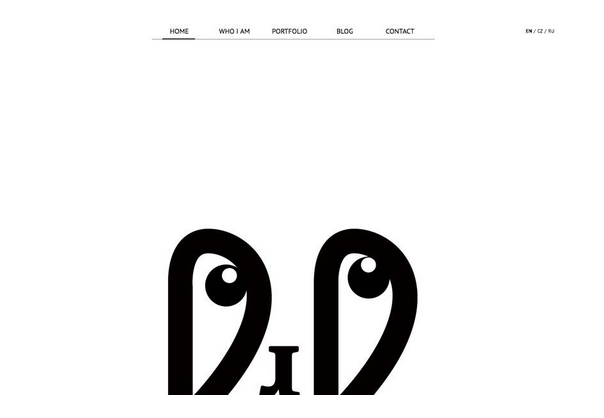
5. Stupidly Simple Navigation
Minimalism meets the hamburger icon.
A simple design aesthetic paired with the simplest (and most controversial) of navigation tools. Even designers who are veterans of minimal frameworks are ditching traditional navigation for the hamburger icon to further trim the number of UI elements.
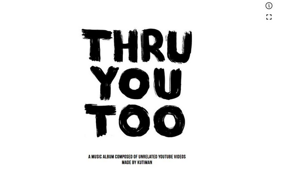
Photo credit: http://thru-you-too.com/#!/
Before you implement a hamburger menu to help simplify your interface, make sure you’re doing it for the right reasons. As Adobe UX Designer Sandyha Talwalker suggests, first understand the primary, secondary and tertiary functions behind the navigation design.
Remember that hamburger menus also result in less discoverability of navigation items, and they can be less clear to people over 44 years-old (as Linn Vizard of Usability Matters points out).
Know your users and the context, then decide if the hamburger menu makes sense. Don’t do it just because it looks trendy, otherwise you’ll end up hiding navigation options that must be easily discovered.
6. Visual Harmony
To be most effective, a minimal design framework needs a solid backbone. The key components of visual organization include a strong grid, visual balance, and close attention to alignment.
A strong grid is the foundation for organization. The grid – built through tactically using negative space – lets the designer place and arrange elements in a way that communicate purpose.
It’s also very important to clarify that alignment is not the same as centering content.
While many minimal designs include the bulk of content in the center of the screen, it is not the only solution. Elements can be aligned anywhere along a grid – text, in particular, can be aligned to the left, right or center.
Arko, below, does a great job of mixing and matching alignment styles to create visual interest and balance while using plenty of white space.
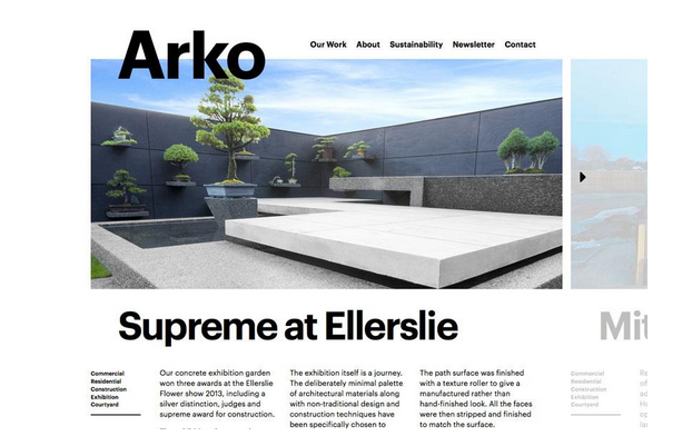
Photo credit: http://www.arko.co.nz/
When it comes to minimalism, many people jump to perfectly symmetrical concepts, but this is not a necessity. Because content will likely be simple and streamlined, the most popular ways to accomplish this are through pairings of large and small elements that balance each other out.
Visual balance comes in four forms:
1. Horizontal symmetry: Both sides of the screen have equal weight with similar groupings of elements.

Photo credit: Hungcwot via awwwards
2. Approximate symmetry: Elements are different on the screen, but the visual weight is the same; this is often accomplished by pairing a lot of space or one large element against a grouping of smaller elements.
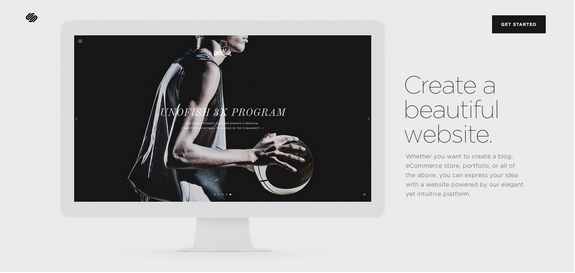
Photo credit: Squarespace
3. Radial symmetry: The focal point of the design starts in the center of the screen and moves outward in an almost concentric-circle style pattern, such as the Carlo Barberis site below.
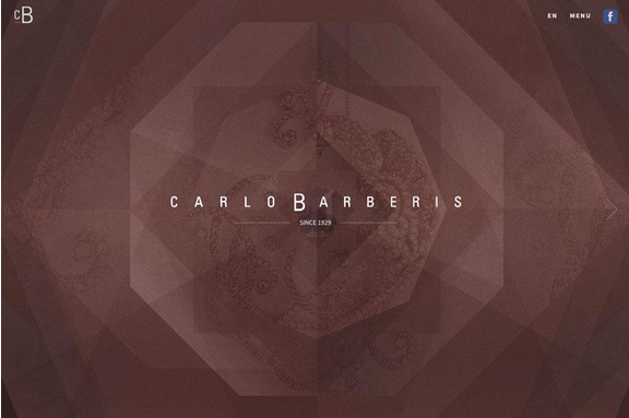
Photo credit: http://www.carlobarberis.com/en/
4. Asymmetry: Objects are designed to purposefully counter one another on the screen with shapes, colors and sizes of contrasting styles. This is arguably the most difficult layout to execute well, considering there’s only a fine line between a visually interesting layout and a confusing mess.

Photo credit: Julie Flogeac via awwwards
7. Flat Design Evolved
While originally defined by an abundance of bright color, flat design has toned down and now works exceptionally well with minimal frameworks.
The techniques mesh because of similar characteristics in visual planning and in the use of content itself. Because flat design de-emphasizes design tricks, the stripped-away concept pairs well with the philosophy of minimalism. The combination is quite common in modern websites – minimal visual hierarchy accentuated with touches of flat design in UI elements like icons and colors.

Photo credit: http://wonderfulcolorado.karshhagan.com/
When it comes to comparing flat design and minimalism, designer and blogger Addison Duvall describes it best with a food analogy:
“If flat design is a trendy new ingredient used in all the hippest restaurants, then minimalism is the classic cookbook that the very best chefs all consult when coming up with new ideas for dishes.”
Because flat design is a visual aesthetic whereas minimalism is a design philosophy, you can enjoy the best of both worlds when you combine techniques from each discipline. Your design remains hyper-focused on the content, but still appears visually rich thanks to the aesthetic values of flat design.
Conclusion
If you think creating a minimalist site is as simple as taking a bunch of elements away, think again.
Minimalism requires a sharp eye and hard-won expertise, and if handled improperly can backfire as a site that looks bad and does nothing. Keep these seven elements in mind when designing for minimalism – you’ll need to master each technique before orchestrating them into a stunning content-focused website.
To learn more about minimalist web design, check out our free e-book The Curated Collection of Design Techniques: Cards & Minimalism. The book includes 70 pages of advice explaining how to create card-style and minimalist web designs with 43 examples from Google, Microsoft, Squarespace, and more.
Read Next: 3 common UX mistakes killing good design
Image credit: Shutterstock
Get the TNW newsletter
Get the most important tech news in your inbox each week.