Sean Mitchell is an interactive designer based in Vancouver, British Columbia, and the editor of Type Release.
November brought us a month of diverse typefaces, from modern to classic, san-serif to serif, lightweight to heavy. Here’s our picks from the past month.
Rene Bieder: Galano Grotesque
Galano Grotesque is a geometric sans in the tradition of Futura, Avant Garde, Avenir and the like.
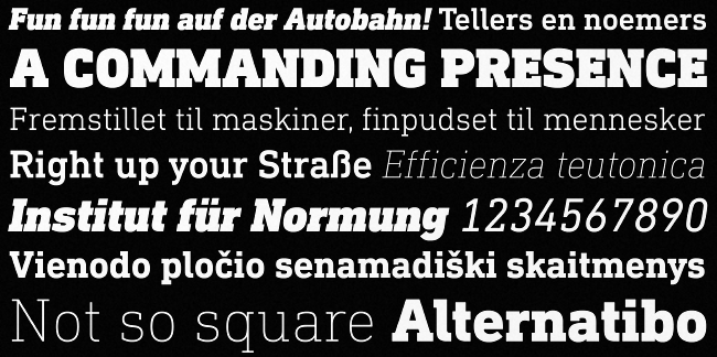
Linotype: DIN Next Slab
DIN Next Slab harmonizes perfectly with the styles of DIN Next: the basic letterforms and weights are identical.
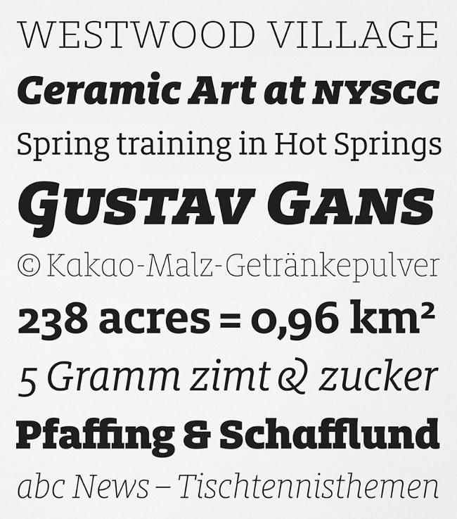
FontFont: FF Milo Slab
FF Milo Slab is the newest edition to Mike Abbink’s best selling FF Milo family.
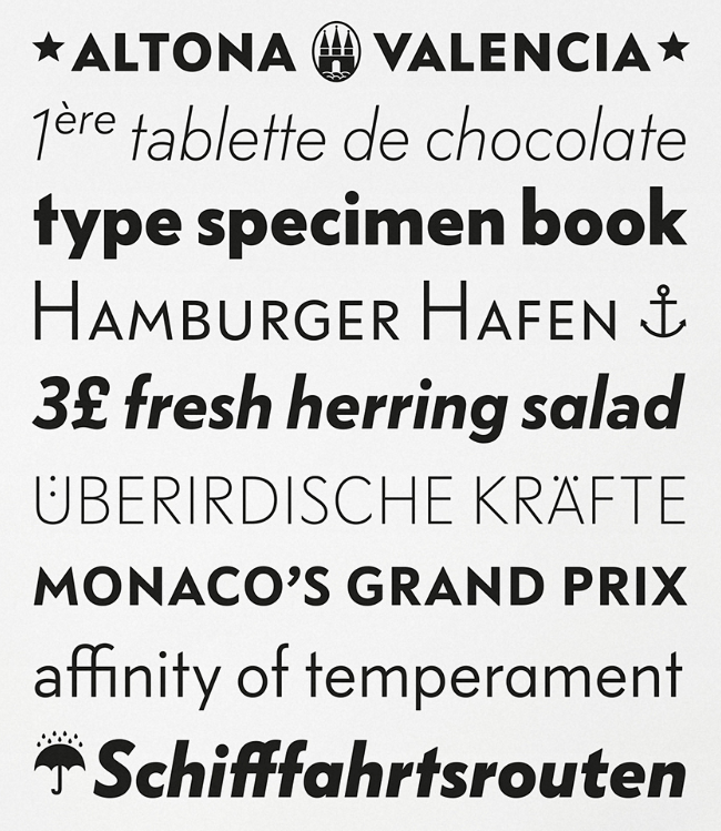
FontFont: FF Bauer Grotesk
FF Bauer Grotesk is revived and better than ever with six weights and italics. This is the must-have Grotesk.
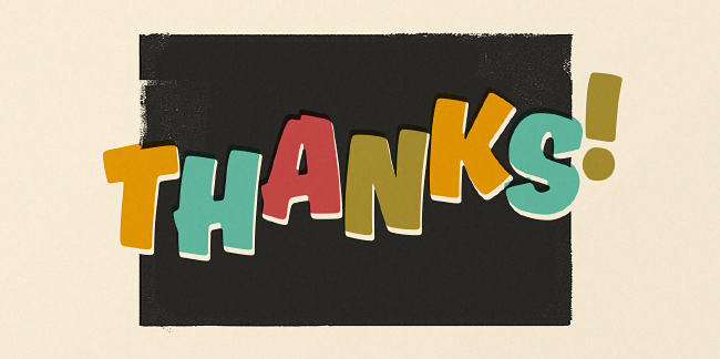
Mika Melvas: Ahkio
Ahkio’s roots are in 1930s sign painting and showcard lettering but with a modern and individual twist.
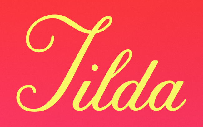
Font Bureau: Tilda
Tilda is a script typeface with size-specific styles by Jessica Hische.
Harbor Type: Graviola
With semi-rounded terminals, Graviola is soft and friendly.
Positype: Rough Love
The only OpenType font with hugs and kisses drawn right in!
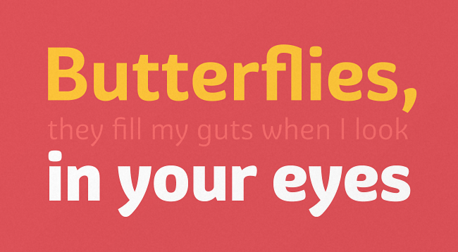
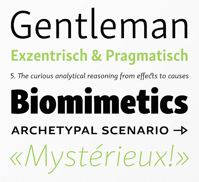
Rosetta Type: Skolar Sans
Skolar Sans is an extensive typeface family for the age of responsive design. From gently thin to extra bold, the four subtly graded width variants will fit all your content needs.
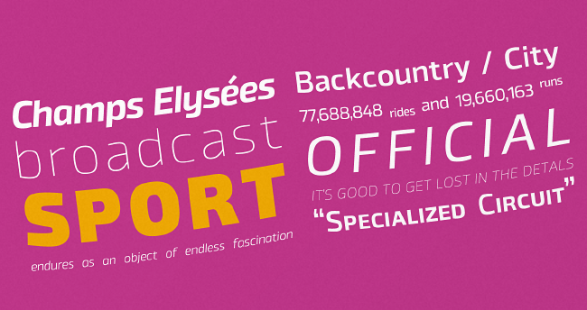
The Northern Block: Byker
Byker is a geometric sans that blends technology and handcrafted skill.
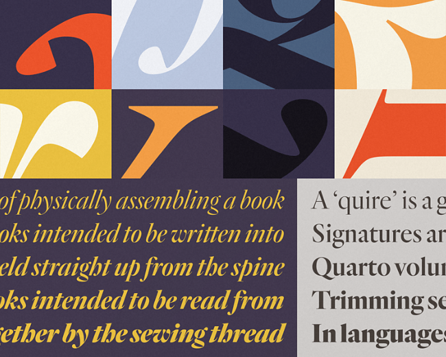
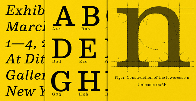
Hoefler & Co: Quarto
A fiery display face rooted in one of typography’s most significant periods, Quarto is a study in contrast and control.
Latinotype: Triump
Triump is a simple sans serif with 14 weights.
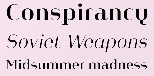
Atlas Font Foundry: Heimat Didone
Heimat Didone is the high contrast serif typeface family within the Heimat Collection, also containing Heimat Sans, Heimat Mono and Heimat Stencil.
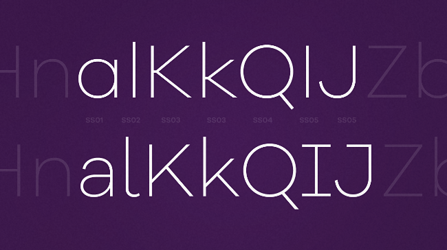
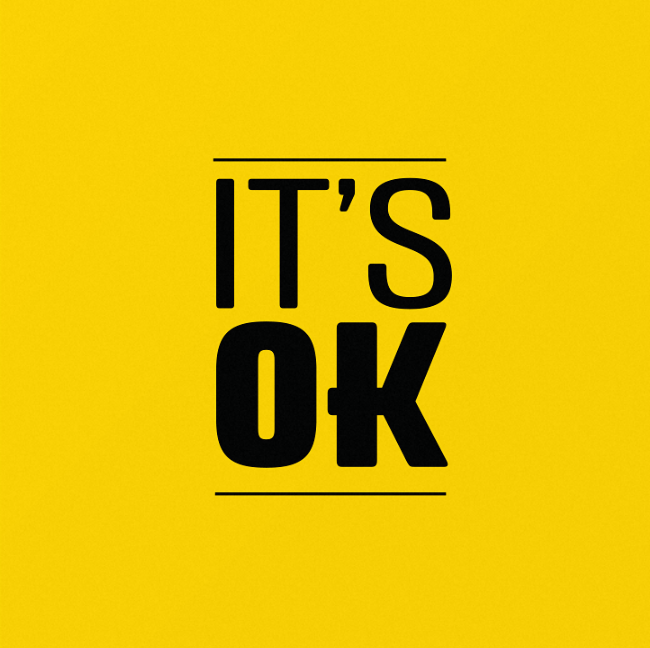
Grilli Type: GT Haptik
GT Haptik is a monolinear geometric grotesque typeface. Its uppercase letters and numbers were optimized to be read blindfolded and by touching them.
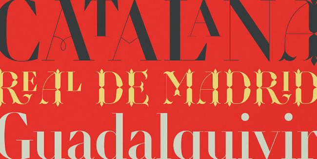
Typofonderie: Retiro
Severe, austere and yet, full of life, Retiro is a vernacular version of Castilian and Andalusian in a typical Didot.
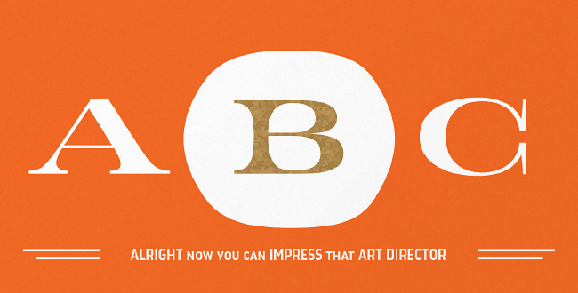
Kyle Wayne Benson: Jeames
Jeames brings familiarity to the often detached feeling extended serif genre. The curved, heavy, joints let the letters bounce along while the proportions and contrast keep your eyes grounded.
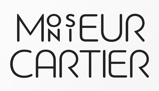
Parachute: Bague Round
Bague Round is a soft contemporary geometric typeface which blends distinct minimalist characteristics with mainstream details.
Drew Melton: Handsome Script
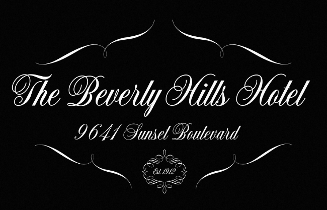
Handsome Script is perfect for luxury products and special occasions such as weddings or parties.
Unit: Common
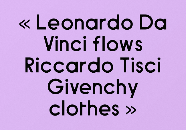
Common is a beautifully modern sans-serif typeface.
Nouvelle Noire: Colroy
Colroy is a superbly and subtly crafted contemporary Clarendonlike typeface.
Want more? Here’s 21 of our favorites from October 2014.
Get the TNW newsletter
Get the most important tech news in your inbox each week.
