
Garrett Heath is a technology storyteller with Rackspace.
While working on an article about responsive design, I realized how frustrating it is when companies design for a desktop only experience. I use a laptop for much of my Web browsing, but when I’m on the go it drives me nuts when there is a poor mobile experience.
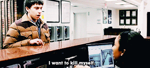
This got me thinking about some of the other UX blunders that make us all want to pull out our hair. A poorly designed website has real impacts, whether page views or sales—faster than Facebook acquiring a billion dollar company, we bounce away to another with a better user experience.
Here are seven things that will drive your users crazy.
1. Requiring users to signup before browsing your site
Nothing gets people’s blood boiling as much as having to signup for an account before they can view a website. Sure, this is one way to build out an email list, but think about how many folks you’re losing.

2. Forgetting about multiple screens
This may come as a shock, but people no longer browse the Web only on their desktop. I know… shocking.
Stop cramming down a desktop experience on the small screen and start developing for mobile. In the long run, it’s better to give your users flexibility.

3. Having ridiculous forms to fill out
No one likes filling out lengthy online forms, especially on a smartphone.
When possible, eliminate fields or trim down options that are unnecessary—if you don’t ship outside of the US eliminate the country field all together.
4. Using hard to read or cutesy fonts
You want people to be able to read your website and take you seriously, right? Your font is your first impression so don’t make a bad choice.
Leave Papyrus and Comic Sans back in the first grade—it’s time to grow up.

5. Implementing a Search bar that sucks
When the Web was a disjointed collection of pages and sites, people had low expectations for search results. That’s no longer the case.
Onsite search functionality that returns results that 1999 wouldn’t even be proud of incites the ire of your users.

6. Bombarding the reader with a wall of text
The Web is a visual medium. It’s more glossy magazine than dusty novel.
Break up the text on your site with graphics, photos and videos. Not doing so will incite a yawn fest for your readers.

7. Displaying your products with low-res images
If you operate an e-commerce store, the Web is your showroom. So don’t have grainy product images that are the size of postage stamps? Not only should your images be high quality, offer multiple product views for your shoppers.

What other UX blunders do you absolutely despise? Share in the comments below!
Don’t miss: The best ways to use GIFs and cinemagraphs for business
Top image credit: Flickr/bryanburke
Get the TNW newsletter
Get the most important tech news in your inbox each week.