
Julian is a heavy-duty number cruncher for Wooga, a mobile games developer based in Berlin.
There’s one unfortunate truth about mobile game development. You cannot make a great game, offer it for free and depend on the masses downloading it. The app marketplace is packed, with every publisher desperately vying for players’ attention. This makes that attention all the more costly to acquire.
Most developers will, at some point, face the problem of getting people to use their app without dangerously overspending while doing so. They need to buy users at a price where they get a positive return on their investment (ROI). Working out ROI, in essence, requires just two key variables:
- cost per install (CPI) – how much it costs to get a user to download your game, and,
- lifetime value (LTV) – how much each user spends on your game
In general, ROI is roughly LTV minus CPI – what the user spends on your app minus what it costs you to acquire them. (You can also account for ad revenue and viral effects, but I will disregard this here for the sake of simplicity.)
Where CPI is fixed by supply and demand in the mobile advertisement space, LTV depends heavily on the product. How well does the app monetize? What variety of in-app purchases does it offer? How well does it retain users?
It is impossible to perfectly know the value of a user before they stop playing the game. You can only estimate it, i.e. make a statement about the probable value of a user. This is where the Golden Curve comes in.
Half a year strikes the balance
In early summer last year, I wanted to estimate the LTV of users in our games. Not through some sophisticated approach, but something that intuitively made sense and everybody could understand.
I started hacking the data and methods. One of the key questions around LTV is how long you give your users to reveal their value. A user’s LTV accumulates by days in the game. If you give it a year, you’re on the riskier side because you have to wait so long until you earn back your spending on user acquisition. This can be especially tricky for small companies.
If, on the other hand, you only give it a few weeks, you end up with a low LTV and can hardly ever run profitable user acquisition campaigns. A commonly accepted compromise is half a year.
So, what I was actually interested in was the cumulative spending of a user on day 180 of gameplay. Put a bit more formally, I wanted to estimate LTV (day 180).
Keep the cohorts coming
When you run user acquisition campaigns, you never buy a single user, but groups of users. This is done by setting a bid price with a certain ad network in a certain country for users with a certain device.
A prediction can also best be done in terms of what is expected on average from a group of users. LTV (day 180) for a user can be conveniently estimated by dividing the cumulative spending of their cohort until day 180 by the number of users in the cohort.
Cohorts are subsets of all the users that enter your game, e.g. ‘daily cohorts’ are the users that joined your game on a particular day. You may also segment your new users by country, ad network and/or device and look at each segment’s cohort separately.
The blue dots in figure 1 show the actual figures for cumulative spending by day in the game for a day’s cohort in a big freemium game. You can nicely see how the cohort spends less and less the longer it is playing the game. The main driver behind the decreasing spending is retention, i.e. that less and less users from that cohort are actively playing.
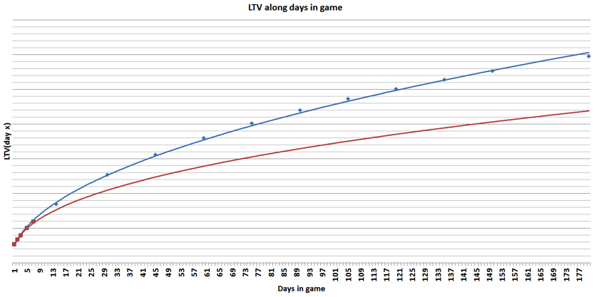
Figure 1: Cumulative spending along days in the game for a daily cohort of a big freemium game
The pitfalls of curve fitting
Have you ever just played around with an Excel chart to get a clearer idea of your data? If so, you’ve probably come across trendlines at some point. It’s that nice function that lets you fit a variety of curves to your data (figure 2).
It turns out that it is pretty easy to find a well-fitting curve ex post, i.e. when you already have data right up to day 180, but it definitely has its problems. The blue line in chart 1 shows a power function fitted to the actual spending data points. The red curve shows what happens when you fit a power function for the same cohort with only seven days of data.
In this case, it could lead to you underestimating the actual LTV by almost a third. Not good.
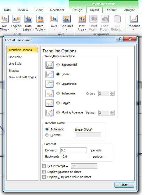
Figure 2: Curve fitting in Excel
Of course, you can also apply curve fitting to other metrics, such as retention. Day-x-retention tells you the share of a user cohort that is still using the app on day x after download.
Ralf Keustermans, CEO of Plumbee, outlined in a recent presentation how using curve fitting for retention prediction had fooled them into believing their LTV would be $9 USD – it later turned out to be $2.50 USD (slide 2 of his presentation).
The key point here? Regular curve fitting for retention and monetization predictions can lead to serious misperceptions.
Moving a tiny bit beyond Excel
So, it seemed like I would have to put in some more work to get more reliable estimates. The first thing I decided to improve on was precision of the fit.
The curves that Excel allows you to fit mostly have two parameters. In the linear case, this is something like LTV (day x) = a + b*x.
You can use high order polynomials, but this runs a high risk of over fitting and generating ridiculous predictions. The curves that had produced the best fit so far were power and logarithmic functions. So, I needed a program that allowed me to increase the number of parameters and also use combinations of different functions.
Luckily, there are a bunch of freeware tools out there that happily fit functions of higher complexity to your data. Generally, there is a trade-off between departure from a simple functional form and increasing fit. The more complex your function is – i.e. combining three classes of functions and having tons of parameters or a polynomial of degree eight – the better it will fit to your data.
However, this also means it will perform poorer for out-of-sample predictions. For a very accessible and highly informative tract on this, see page 6 of Hal Varian’s recent contribution (I would heartily suggest you read the whole thing.).
The Golden Curve
Your prediction will also get more precise, the more data you have. In our case, the further our users proceed in the game, the better we can predict what their LTV (day 180) will be. Fitting a power function on day 90 will get you a better prediction for day 180 than fitting it on day 7.
From my experience, it makes sense to wait until the cohort under study has reached day 30 in the game. Then you can really start betting on your predictions.
You should also make sure that your sample is of a sufficient size. There should at least be a couple of hundred users in the cohort.
After fitting a number of functions on a number of games, my Golden Curve ended up being a logarithmic function with three parameters. So far, it has been the most robust in producing predictions on only a few days of data while still providing a convincing fit over a longer period of time.
Do you really strike gold from this curve?

Sure, if you have a great product. But what I described above is an intuitive and comprehensible approach for estimating lifetime value in freemium. You will not have a hard time convincing anybody that it kind of makes sense. However, this comes at the cost of precision.
Running a real data science model will give you more precise estimates – and empty faces from product teams when you try to explain it to them. Also, small developers may find it hard to provide the resources for a data science model.
In any case, it pays to use several methods. I like to triangulate forecasts. That is, use three different approaches and compare results. If variance between them is very high, they are likely all wrong. If not, that’s a good sign. For estimating lifetime value, another simple approach is the spreadsheet method.
Back in summer last year, we already had a data science model in place. So, there were my three values to triangulate: data science model output, spreadsheet method and curve fitting.
If you don’t have data science estimates at hand, you can tap the industry. Ask your peers what their LTV is. If you cannot do that for whatever reason, check Chartboost’s insights.
The cost per install (CPI) in the segment that you target shouldn’t be awfully different from the LTV estimates that you get. I’m sure there are other ideas out there to get quick LTV estimates or at least an intuition on what your LTV might be – so let’s discuss: how do you do it? What’s your Golden Curve?
Get the TNW newsletter
Get the most important tech news in your inbox each week.