Designer Fred Nerby’s conceptual redesign for Facebook went wildly viral earlier this year, and now he’s back with a new look for Twitter.
Nerby’s project is centered around interacting with a celebrity on Twitter, specifically Rihanna. It’s definitely eye-catching, though I’d be curious to see how these concepts would apply to other uses for Twitter, such as journalism and real-time conversations around events.
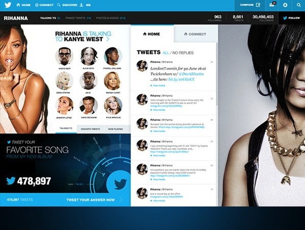
The concept’s look teases one possible revenue stream for Twitter: premium pages for celebrities and brands with customized features for their respective verticals. It’d certainly go against their multi-platform unification strategy, but if the extra features increased engagement, it’d be worth the money for accounts with sizable followings.
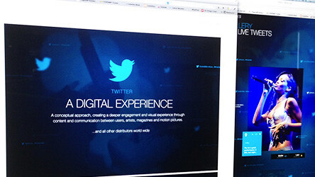
➤ Twitter: A Digital Experience
If you’re interested in learning how Nerby went about creating the redesign, check out our Q&A with him below.
TNW: What made you want to attempt this new look for Twitter?
Fred Nerby: Twitter is one of the main platforms for communication online and I wanted to create a deeper engagement and visual experience between users and that content. By bringing conversations and data to life you’re creating engagement and the excitement to explore further turns in to an experience. It’s the classic “Rabbit Hole effect” where you can stumble upon information that leads you deeper in to a digital experience and that opens up new doors for more content, insight and knowledge for the topic of interest.
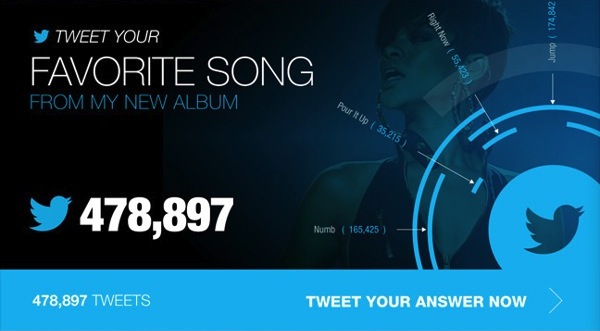
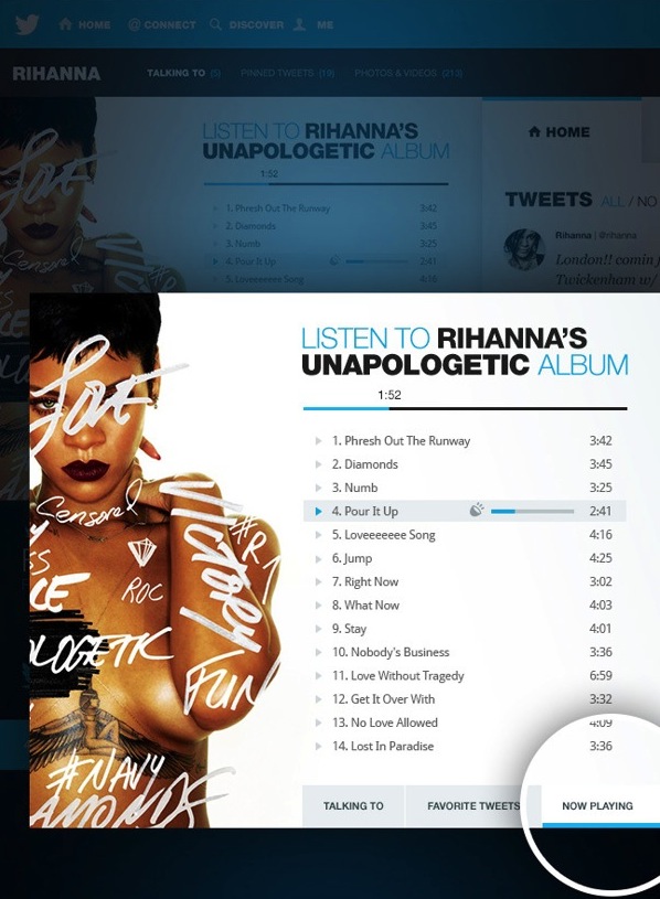
The concept/story is focusing on three major media distributors, artists, magazines and motion pictures that’ll guide the viewer through a discovery process through the concept. The templates were designed up in a way that enables users and companies to gain more control of their account while also injecting more interactive components, such as turning tweets into graphics and galleries with live tweet feeds etc.
Can you describe the process behind the creation of this concept?
The approach of this Twitter concept was very much a sketched up world of conversations and how to get a user to connect with those conversations. I made a decision to never steer away from the visual experience of live tweets and it became the glue that held everything together in this concept.
I wanted to create a desktop experience where content is so much more than just data on a wall. Digital has come a long way and today we’re introduced to innovative applications every day. Design and integration of such data can be so much more and experienced in a whole new way, and the best part of it is that it’s all conversational and based on anyone’s input. A Tweet is a story and a big part of the experience, the more people that contributes with content the deeper the experience.
What was your main source of inspiration for this project?
I don’t draw too much inspiration from one specific source. It’s all about understanding the need for that application or platform that you’re working with and what the expectations are from the end user. I’m not inspired by a specific application as such, but more so the overall UX/UI experience of an application, product or website.
Did you go through many versions and iterations before coming up with this concept and artwork?
I did have a number of versions leading up to this final presentation, however the overall structure and concept was locked in at a fairly early stage. The story has gone through a few minor tweaks along the way but the majority of the time was spent on fine tweaking all the screens and making it all come together. The execution of design and effects has been a great challenge and some areas required a lot of time and thinking, especially where the interface is stretching outside a locked-in template/grid.
Parts of this concept introduce new ways of handling data and those screens required some tweaking because they’re affecting other areas of the entire concept and story as well, such as converting tweets into visual graphics through custom algorithms and other new ways of interaction in terms of filtering data inside galleries to give the user a more personalized experience.
Your previous Facebook concept reached millions, how would you compare this Twitter concept to that project?
The Facebook project was focusing on a personalised experience for its user and heavily targeting behavior. The Twitter concept does that as well, but the concept is leaning more towards a whole new experience when interacting with content and conversations in general. It’s looking at the future of social media and how we could possibly engage with data in a whole new way. Looking at conversations, tweets or research could be so much more engaging than creating yet another static environment that the world has already seen. If you’re after that type of engagement (raw content on a wall) then there are applications for phones and tablets that do exactly that, and they do it really well!
With Facebook and Twitter, you’ve covered the two main social services. Are there any other services or websites you’re interested in creating another concept for?
We’ll see what the future brings. I’m always interested in exploring new opportunities and ideas. I’m sure there’ll be plenty more projects coming out in the near future.
What’s the role of function in your designs?
Function is key for the interactive world. Understanding behaviour is now an essential part of a UI or any digital product these days. I think too many firms stare themselves blind at statistics and numbers where they try to measure results and placement (call to actions) based on figures instead of researching and testing the success of other platforms.
Like anything creative, you’ll always find opinions on what is good and bad and how a layout could have been done in 10 different ways, but I think too many firms complicate their experience too much by adding cool and funky features (just because they can) instead of focusing on the product and what’s really important.
Less is most often more and you’ll find that the user will appreciate your honesty for getting them straight to the point of what they asked for!
What do you find compelling about UI design?
The user-adoption of an application and how that is executed through a well designed User Interface! I love the systematic thinking behind the behaviour of a UI, if done correctly. If you understand behaviour and how people interact with an interface and dare to take the time to invest in this before moving in to a design- phase, you’ll find that the outcome of your work is far greater. When designing a UI you have the ability to make a huge impact on the user and how he or she interacts with their device and how that device is responding to that person’s needs. The world has turned digital and a good UI of any application/product is a major part of its success.
Image credits: Fred Nerby
Get the TNW newsletter
Get the most important tech news in your inbox each week.