Editor’s Note: The following is a guest post by Ryan Matzner of Fueled. Fueled is a digital product design and development incubator based in New York, Chicago and London.
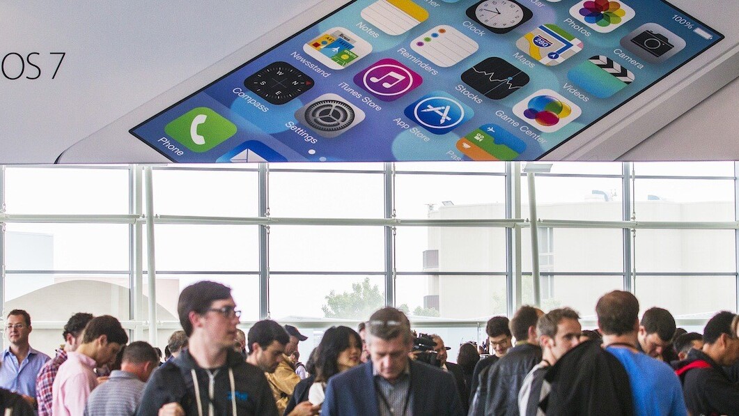
When Apple unveiled iOS 7 to the world on June 10th, it marked the culmination of a massive shift in design aesthetic across the nearly 1 million apps. From the very beginning, app designers and developers took design cues from Apple. The company even offered a document outlining Apple’s official iOS design philosophy.
When the original iPhone launched in 2007, the design was lauded as a masterpiece. Those designs were heavily influenced by skeuomorphic principals, making heavy use of real-world analogies (think leather binding on the calendar or a lense for the camera app) as a way to gently introduce users to the new frontier of the iPhone.
It’s safe to say that users today are familiar with how to use their iPhones but those original iOS designs, largely unchanged for over half a decade, have begun to look stale. And so Apple, taking cues from wider design trends, has completely revamped the phone’s design for iOS 7. The new style is flatter, embracing the phone as an independent entity, no longer needing to disguise itself as real-world objects like a felt table in the gaming app or wooden shelves that hold tomes in iBooks. The operating system has been given its own design language, independent and unshackled from the physical its users inhabit.
The <3 of EU tech
The latest rumblings from the EU tech scene, a story from our wise ol' founder Boris, and some questionable AI art. It's free, every week, in your inbox. Sign up now!
But Apple certainly didn’t invent a completely new aesthetic on its own. Rather, designers seeking to differentiate themselves from the outdated Apple-defined aesthetic have been slowly moving towards a new global aesthetic consensus for some time. Here are 19 apps that were fully there before Apple showed iOS 7 to the world.
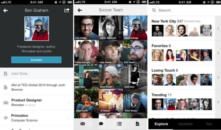
Brewster
Brewster, the contacts app that syncs your contacts across platforms including iOS, LinkedIn, Facebook, Instagram, Gmail and Twitter to create a personalized address book is clean, organized and adheres to iOS 7’s recommendation on clarity. All focus is placed on your contacts and their information, with the interface acting purely a guide.
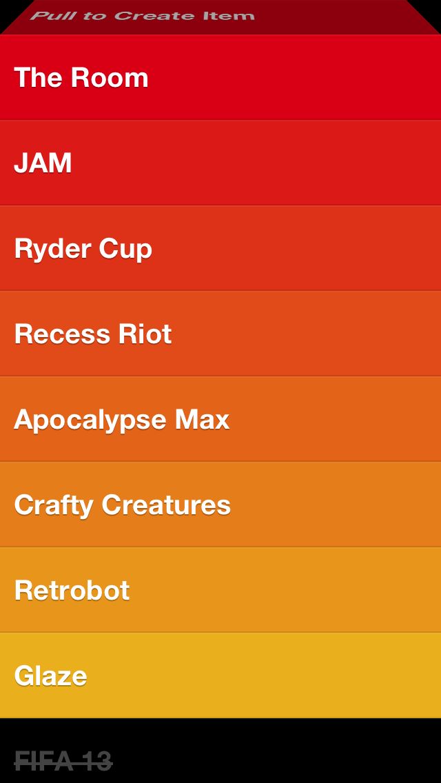
Clear is a list-keeping app with a clutter-free interface that allows users to create and organize personalized lists. The app was redesigned in May of this year with the ability to send to-do lists to another user by email. Apple’s new guideline on deferring to content is strongly adhered to, as the interface is dominated by the tasks you create. The natural gestures are used to enhance the user’s sense of direct manipulation of a task, and don’t conflict with existing standard gestures.
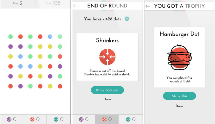
Dots is a connect-the-dots style game from Betaworks that recently hit 250 million games played. It has a very flat and minimal visual style with a harmonious pastel color system. The visual and audio feedback from tapping help instill the idea of elements as tangible items, with the animation based on physics making the app feel grounded in reality.
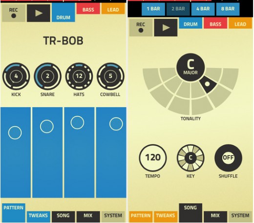
Figure is a music creation app that allows users to combine drums, bass synth, and lead synth through a simple interface to create quick beats. The app employs an extremely flat visual style, whereas previous iterations of iOS you might see liberal use of gradients, shadows and bevel or emboss techniques to make audio knobs and sliders match their real-world counterparts. By just having three primary colors, blue, red and yellow, the user is able to clearly differentiate what settings they are configuring.
The Google Search app allows users to quickly search the web. In addition, the app includes Google Now, an intelligent personal assistant that provides users with automatically updating information cards on weather, places, stocks and more. Sharp and flat iconography, partnered with Helvetica Neue Light, make it already look at home, and the interface always defers to the action or result of searching.
The Gmail application, which was massively improved for iOS in early June, brings the simplicity of Gmail to a mobile device with real-time notifications, multiple account support, and powerful search capabilities. This app also employs Google’s new aesthetic that works harmoniously with iOS 7. The app uses natural gesture techniques, allowing the user to swipe between emails instead of tapping arrows to navigate back and forth. In addition, Gmail’s 3D transitions are reminiscent of iOS 7’s own portrayal of depth.
The Google Hangouts application arrived this spring to support one-on-one and group conversations with the use of photos, emoji, and video calls for free. The app’s design ensures the conversation windows focus entirely on what’s being written. The header simplifies all available options, and the footer only offers input to the chat. It’s extremely flat with minimal use of shading to portray depth between headers and content. Profile pictures are used to illustrate who is talking instead of names, with written usernames being tertiary to all other content.
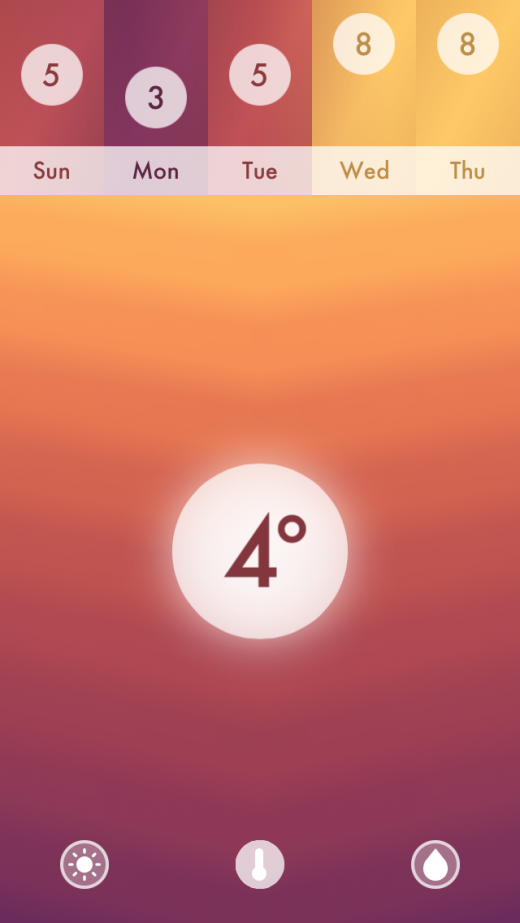
Haze is a simple and fluid weather application that presents users with what they need to know at a glance. Its minimalistic approach hides more detailed information such as humidity and wind direction from the main screen, allowing users to focus on the essentials. The extremely colorful facets of the app convey the climate through a rippling gradient, which works well with iOS 7’s bright and simplified home screen. The clarity of iconography matches Apple’s new principles, and the natural gestures and animation make the interface feel more tangible than traditional tapping actions.
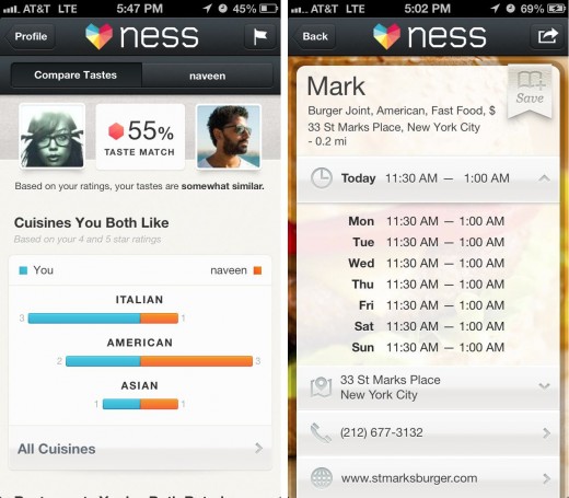
Ness is a recommendations app that raised $15 million last year to provide personalized restaurant suggestions based on the user’s location, taste and mood. The app uses plenty of animation to convey transitions between pages, which help convey depth and make the app feel more alive. The visual style is a little heavy handed in gradients and gloss, but it’s not far off from being an iOS 7 app with its use of photography and translucency.
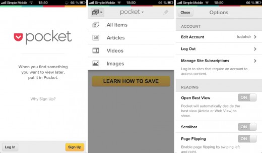
Called “DVR for the web,” Pocket is a news app that allows users to collect articles, videos, or web pages to read or view later. This app already adheres to the idea of borderless buttons in the header, and is extremely clean with white and light grey backgrounds used throughout. Almost all content structure is purely conveyed by text and images, rather than the bounds of a container or a graphical element.
Rando, developed by the UK-based app developers Ustwo, the same folk behind hits such as Whale Trail, is an “experimental photo exchange platform” that allows users to send and receive photos or “Randos” to other users without revealing their identity. The simplicity of the design and functionality in this app make it iOS 7 ready. It’s incredibly clean and flat, uses strong colors to accentuate iconography, and eliminates any extraneous labels.
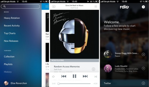
Rdio is a music streaming service that allows users to access a library of over 20 million songs, follow friends or artists, and build solo or collaborative playlists. Recently, the digital music streaming and subscription service provider announced that it has expanded availability to seven new countries and regions in one fell swoop.
Already extremely flat, this app uses very thin and borderless iconography, and employs plenty of whitespace to give elements visual breathing room. The use of gaussian blurring on the album art view mirrors what is being done in iOS 7 to show depth.
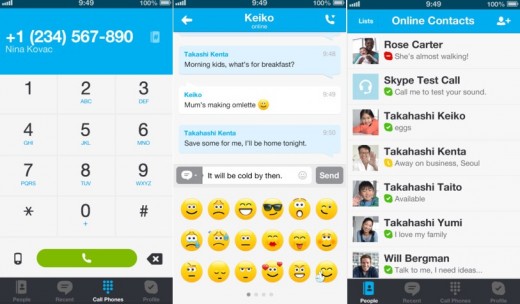
The Skype app brings the popular service to mobile, allowing users to connect via instant messages, voice calls, or video calls. Very colorful and clean, this app matches iOS 7’s use of increased font sizes to improve readability and labels the most important text in a large size to capture the user’s attention.
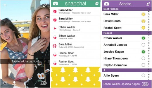
Snapchat is a photo messaging application that allows users to share pictures with their friends for a few seconds before they disappear forever. The app boasts improved clarity, giving text more prominence and avoiding unnecessary gradients. Additionally, the app features borderless buttons on headers and in the camera view.
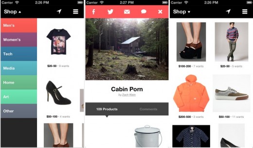
Svpply is a social shopping app that provides users with a hand-selected collection of products that can be saved in personal collections. This app completely defers to the content, prioritizing product imagery over all else. Matching the iOS 7 aesthetic, it uses borderless text buttons in the header and navigation, a flat visual style, and makes minimal use of gradients in the sidebar to color code its categories.
Twitterific is an elegant Twitter client that aims to make tweeting quick and easy. After its complete rebuild late last year, the app includes a unified timeline that displays mentions and direct messages, in addition to a theme panel that lets users customize their displays.
This app has an open and clean visual style, using the entire screen to show your Twitter feed. Small lines are used to separate tweets from each other, but the aesthetic largely relies on different font sizes and shades of gray to portray the information hierarchy. Much like iOS 7, it tries to make the app feel borderless.
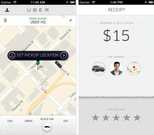
Uber, the popular travel app that allows users to request a private car or cab in available cities such as London, New York and San Francisco, uses thin font weights, cool grays and clean whites, making this app fit in with many of Apple’s default iOS 7 apps.
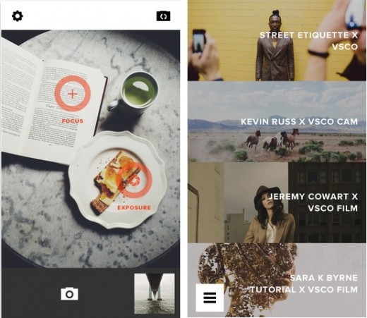
VSCO Cam is a brilliant camera application that allows a user to produce and edit uniquely styled and artistic photos on the iPhone. This app’s design focuses entirely on the photography, using a dark interface to ensure the attention is squarely on what you capture. Like iOS 7, it has large, clear iconography and makes use of thinner text to avoid weighting calls to action away from the content.
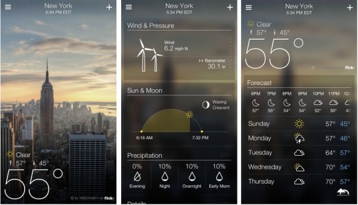
The Yahoo Weather app combines stunning photos with weather forecasts. Its simple interface lets users see as much or as little information as they would like.
Interestingly, it’s extremely similar to iOS 7’s own weather app; it features thin iconography and typography, subtle uses of gradients to make lighter text readable, and big beautiful background photography. Yahoo Weather also utilizes an iOS 7-like blurring technique, appearing when a user scrolls to find out the weekly forecast for a location.
Flat design is a very broad concept that designers will continue to interpret in their own, unique way. Apple is not the first to move in this direction, but the company is certainly doing its part to make it mainstream.
In short, iOS 7 is a significant, splashy departure from what the world has known for the past five years. Here’s to the next five!