Anyone who’s tried their hand at designing a typeface will know it’s a wildly difficult process, and to actually come out at the end with something attractive takes an extreme amount of skill, taste and patience.
 Type design isn’t for everyone, but typography is, and nearly every designer works with it every day. This is exactly why Type Release creator Sean Mitchell is here to share with you a list of 32 beautiful typefaces, all of which were released over the last month. These are his findings:
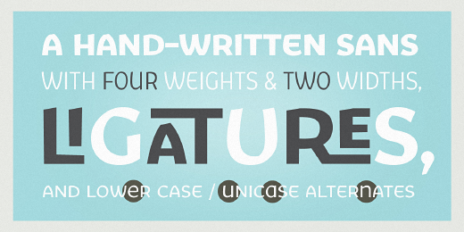
1. Reserves: Acronym
A highly refined neo-grotesque sans-serif based on Helvetica and its modern-day variants.
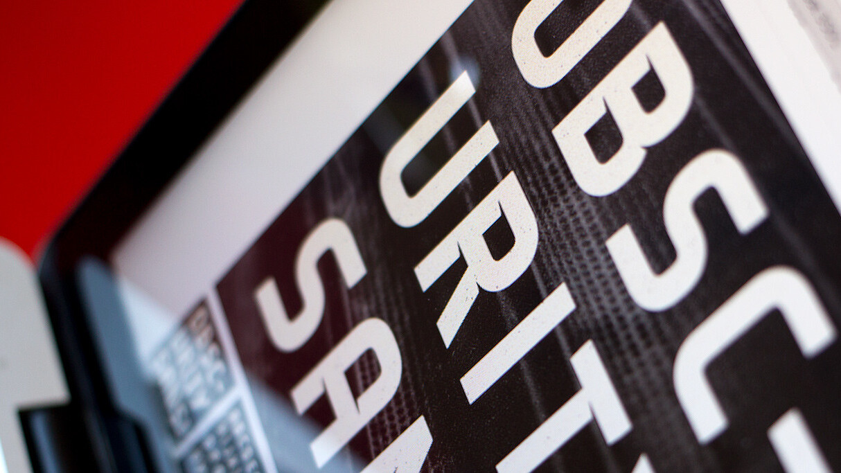
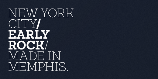
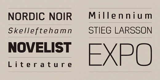
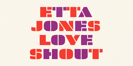
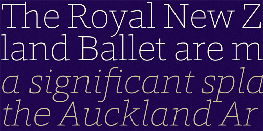
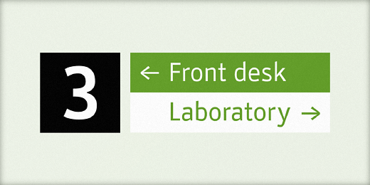
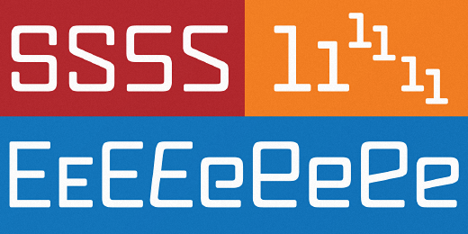
2. Hoefler & Frere—Jones: Landmark

The <3 of EU tech
The latest rumblings from the EU tech scene, a story from our wise ol' founder Boris, and some questionable AI art. It's free, every week, in your inbox. Sign up now!
The signature alphabet of one of New York’s most significant buildings becomes a family of clear and colorful display fonts.
3. Letters from Sweden: Kumla
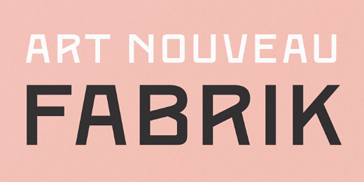
Letters from Sweden’s first release in the “Fabrik Suite” — a project inspired by Swedish industry, factories and harbours.
4. Aesthetic Apparatus: Brass Rule Script
A geometric upright script constructed in the vein of the experimental “brass rule letters” from the 1952 German typography book Hoffmann’s Schriftatlas, combined with mid-century commercial chrome emblems.
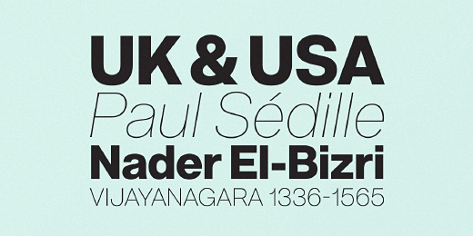
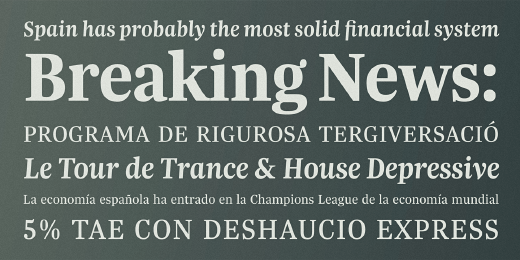
5. Latinotype: Sanchez Slab
A new version, more robust, with straight edges that give it greater character and power.
6. TipoType: Amelia
A geometric sans, with the softness of humanistic strokes.
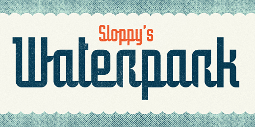
7. Constellation: Brooklyn
Started its life in an architectural model.
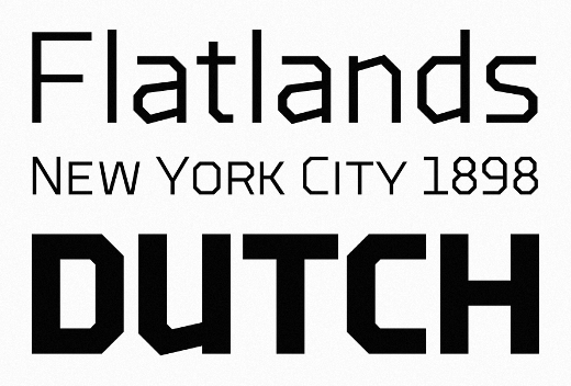
8. District: Hoban
Hoban is about contrast. Hoban wants to be noticed, but only after a second glance.
9. Typotheque: Supernova
A family that combines the spontaneity of a script typeface with the versatility of multiple weights and cuts.
10. Klim: Founders Grotesk Text
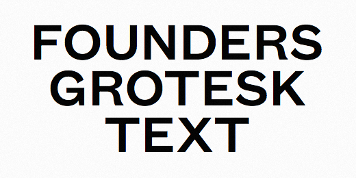
Maintains the same lineage and feel as the rest of the Founders Grotesk family, but works best at text sizes.
11. Letters from Sweden: Trim Poster
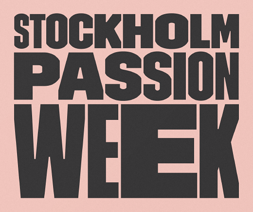
A new member in the Trim family and is designed with one purpose in mind: compact all-capital headlines without crashing.
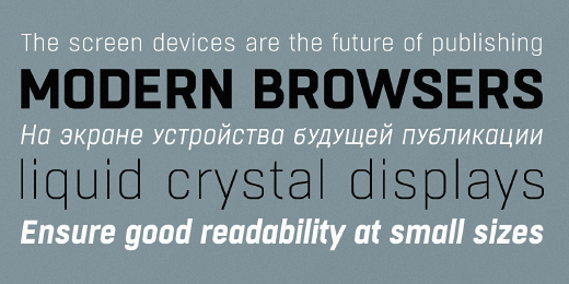
12. The Northern Block: Eund
A geometric sans serif with minimal contrast. Shallow curves are smoothed out of rectangular letterforms to produce a fresh, legible typeface best suited to information based applications.
13. Hanoded: Inky Fingers
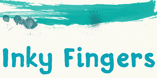
This rather obese font was made by hand — literally.
14. Nootype: Selfico
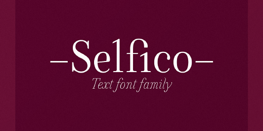
A modern font family, that has a strong verticality intensified with the vertical “y” and a special È.
15. Lennart Breel: Obscurity Sans
An uppercase display typeface inspired by shadow.
16. Associated Typographics: Skol
On or off the screen, Skol is a tenacious, hardy font that would make its ancestors proud.
17. CBdO Fonts: Aloha
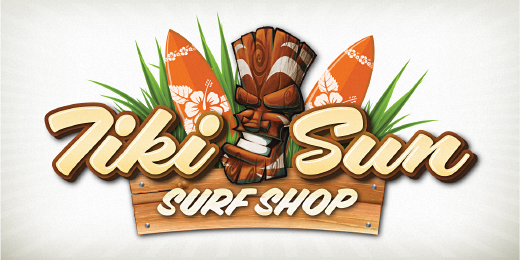
Fun to use brush fonts, Aloha is bound to please.
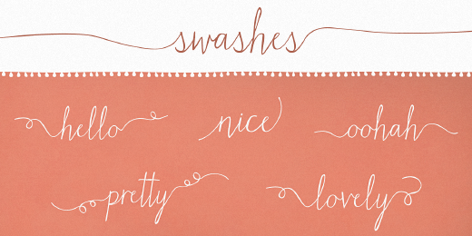
18. Device: Cadogan
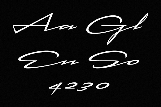
A freeform linking script that uses OpenType programming to replace beginning and ending characters with uniquely designed variants.
19. Sudtipos: Piel Script
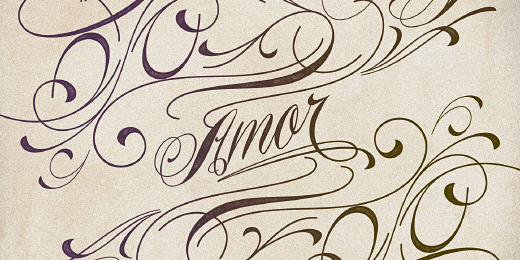
A “tattoo” script, Piel is Spanish for skin.
20. Hoftype: Foro Rounded
The softer sister of the succesful Foro family. Distinct in appearance, with pleasant haptic, objective, and with graphic appeal.
21. Stereotypes: Prism
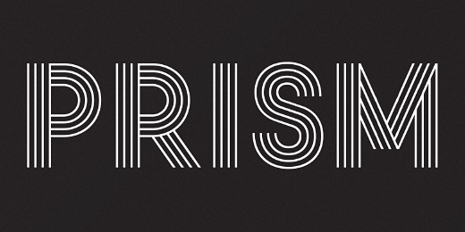
Mainly inspired by two things, the sketches of Rudolf Koch for Prisma and the proportions of Avant Garde by Herb Lubalin.
22. Tipo Pèpel: Boxed
A new and extensive 18-weight typeface, brightly conceived and designed to look good on small screen devices, but offering also enlightened looks on paper.
23. Tipografies: Trola
Its unusual proportions makes it particularly recommended for generous sizes to fit in tight spaces.
24. District: Fair Sans
A distinctive sans serif with much of its calligraphic structure left intact.
25. Jure Kožuh: Stat Display Pro
A sans serif type family legible in circumstances of low visibility.
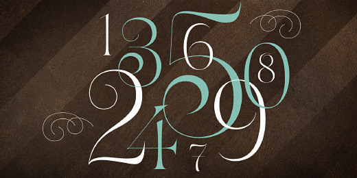
26. Laura Worthington: Number Five
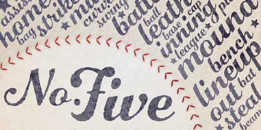
Pure Americana, suitable for titling, display, logo, signage, and editorial work.
27. Fonted House: Matchmaker
Tall, quirky, and juxtaposed letterforms provide a deviation from traditional calligraphy-inspired typefaces.
28. ParaType: Vaccine
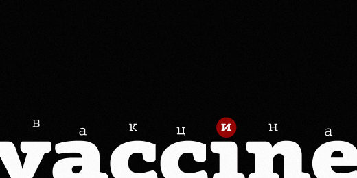
A slab serif font family, soft rounded shapes, distinct and strong.
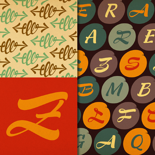
29. PintassilgoPrints: Sheldon
Draws inspiration from the beautiful and eloquent posters by the polish graphic artist Marian Stachurski.
30. Trine Rask: Bornholm Allinge
The third face in a series of rough stone cut typefaces, that shares proportions, but differs in any other aspect like different pieces of rock.
31. FSD: Sys Falso
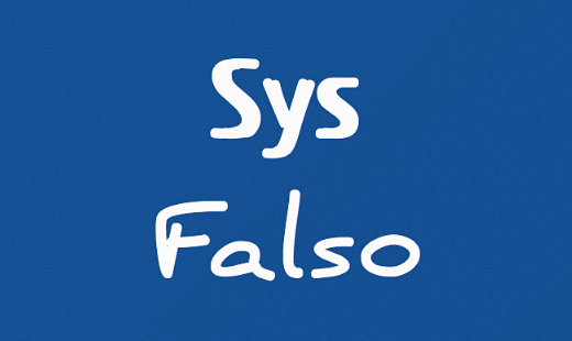
The calligraphic version of the font family Sys.
32. Canada Type: Vox Round
An extensive monoline typeface that can be both precise and friendly.
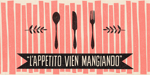
Want more? Check out: 38 Of the most beautiful typeface designs released this winter, this list 0f 40 gorgeous typeface designs released in January and take a peek at our dedicated Design & Dev channel.
Get the TNW newsletter
Get the most important tech news in your inbox each week.