Oh yes we’ve seen something like this before, when Helvetica and superheroes met, but since then designer Matthew Olin has shared a set of educational typography posters that simplify the categorization of typefaces by tying things back to…superheroes!
Update: These prints are now available for a limited time, on Fab!
From there, Olin, extended to display, slab and so on. If you’re not familiar with these terms and you are type-curious, these posters make everything easy to understand. That was actually why they were created in the first place.
Keep in mind, classifications for this sort of thing aren’t set in stone, but everyone agrees that the most basic types, like serif, sans-serif and script, can hold their own.
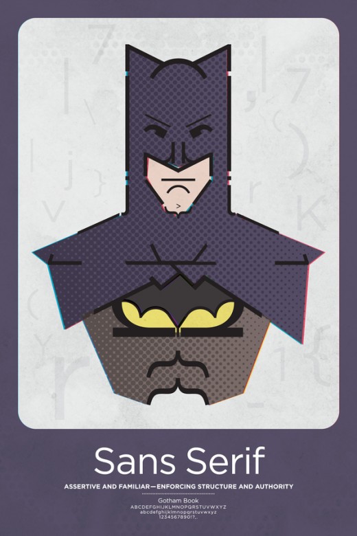
From the creator:
Relating these characteristics to those found within beloved superheroes lets us connect the qualities of each and draw similarities between the two. In doing so, we can champion our profession as leaders in organizing chaos and creating change in an informed world.
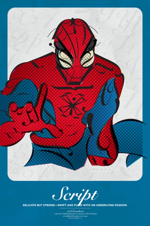
See all of the posters, featuring the Hulk as slab serif, via the link below:
➤ Superhero Typographic Classifications
Featured image by: kyz
Get the TNW newsletter
Get the most important tech news in your inbox each week.
