Just like learning to code, the best way to improve as a designer is to learn by doing. Still, that’s not to say that admiring and even copying (aka practicing) great work can’t do wonders. More than anything, seeing what other designers have done in the past can save you some serious time, because design has a history and everyone should learn from what works and what doesn’t.
And so, we’ve gathered this list of 15 gorgeous user interfaces (UIs) for your design inspiration. Note that designing a UI and evolving that into the perfect user experience (UX) are completely different things, but all fit together as a complete product.
1. 76 Synthesizer:

This is skeuomorphic design at its best, as the simulated textures actually help add clarity to how the app should be used. This serves in stark contrast to much of Apple’s skeuomorphic work, which generally serve as decoration and can end up being more distracting than anything else.
.
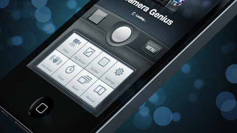
2. Camera Genius:

Once again, the realistic elements in this app feel useful and subtle. The clear visual hierarchy makes this UI look incredibly smooth and easy to use.
.
3. Hype Peak:

This super clean and engaging mobile UI compliments its Web counterpart perfectly.
.
4. FL Studio Mobile:

A completely rethought take on FL Studio’s UI for iOS, this UI does the name justice. I particularly like the bright colors of the audio tracks.
.
5. Dro.pt:

Judging from these mockups alone, I’m loving the app-like user interface of this site. It feels rich, but orderly, and perfect for anyone looking to be distracted by gorgeous imagery for hours on end.
.
6. Envisioning:

Being particularly experimental and risky, this concept app packs an interesting UI that takes the user through science fiction interfaces and combines them with facts and fiction on the subject.
.

This app concept changes the way you’d envision a music player should and could look on a mobile device. The use of space is certainly interesting, and while smaller controls like volume might be difficult to use while on the go, that particular function is resolved by the hardware.
.
8. Galeria:

Although much of this app follows very standard patterns, there are a few original and interesting navigation elements (like the cards which you can see above) that serve as pleasant surprises.
.

As you can see above, incredibly clear weather pictograms make this app concept quite appealing and instantly understandable.
.
10. Bloodnote:

Bloodnote is a simple app where you can track your blood pressure and control your health. Created by Peter Bajtala and Matt Ludzen, This app’s wonderfully minimal UI turns a mundane task into something much easier on the eyes. Read our full review here.
.
11. iORGEL:
This guy deserves a medal simply for trying to turn the classic music box into a full blown app. The fact that he actually appears to have been successful doing so takes everything up a notch.
.
12. Belongings:

This app allows you to make a list of everything you own for insurance purposes — a task that would sound utterly painful and tedious, had it not been for Belongings’ playful branding and gorgeous UI.
.
13. Twidy:

Twidy’s bright, color-coded lists help it stand out from the countless other productivity apps that have managed to fill the App Store.
.
14. Craigslist Premium:

This upcoming app’s elegant and overtly high-end-looking design gives it the right to declare itself “Premium,” especially since it has managed to turn one of the ugliest experiences on the Web (Craigslist.com) into something much easier on the eyes.
.
15. Billr:

Speaking from experience, this app’s goal of simplifying the process of splitting the check is certainly honorable. The fact that it looks pretty in the process makes it even more special.
This list is only the beginning and is in no way definitive. If you have a favorite worth mentioning, definitely let us know in the comments below!
While you’re at it, you might also want to check out The Art of Apps; a recent exhibition that showcased some of the greatest user interface designers of our time, in celebration of Internet Week NY.
Get the TNW newsletter
Get the most important tech news in your inbox each week.