Microsoft Research has released SandDance, a free data visualization app that lets you gain insight in your surveys and research projects.
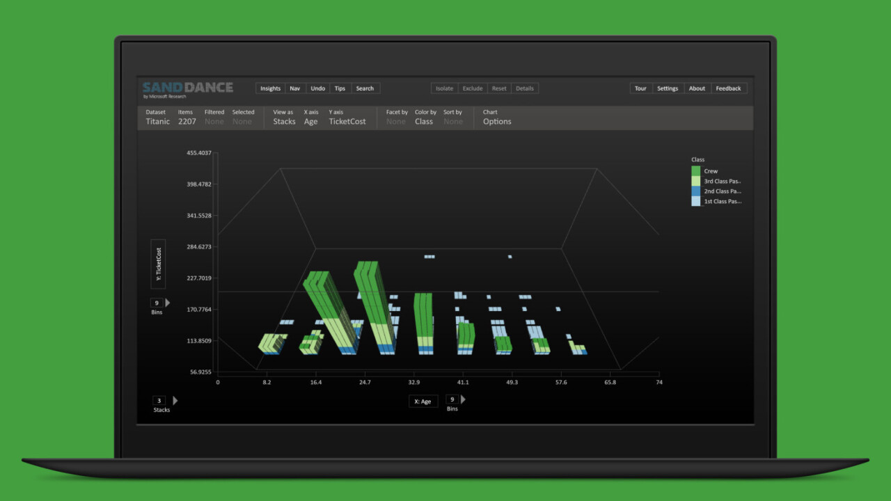
Simply fire it up in your browser, upload a data set (TXT, CSV and JSON formats are currently supported) and you can analyze it in a variety of ways. Whether you’re looking for patterns or outliers, it’s a whole lot easier to spot them when the figures are represented as graphs that you can navigate as you like.
There are a number of visualization options including 3D scatterplot, maps, charts and histograms. You can also select and isolate items, facet them along attributes and distinguish between them with the help of colors.
Microsoft says SandDance works best with data sets have between 50 and 300,000 rows.. You can try a bunch of sample sets included in the Web-based interface to learn how the app works.
SandDance is the latest project to come out of Microsoft Garage, the company’s program to foster experimental products developed by its employees that previously launched a tool to recognize dog breeds from photos, an Android keyboard with useful shortcuts and an interactive alarm clock app.
➤ Discover stories within data using SandDance, a new Microsoft Research project [The Fire Hose]
Get the TNW newsletter
Get the most important tech news in your inbox each week.