Keeping your Android device feeling fresh and new is half the battle to staving off the continual impulse to upgrade, and an easy way to do this is by installing a new launcher or lock screen replacement that gives your phone a new look and feel.
There are certainly no shortage of options to choose from, but Start for Android by Celltick is a relatively new entrant to the market which just been overhauled to provide more options, UI tweaks and a more refined performance.
Celltick’s changes haven’t been made just for the sake of it; the company said many of them are the result of suggestions from its users. We thought it well worth spending a few minutes with the app to get acquainted.
Let’s Start!
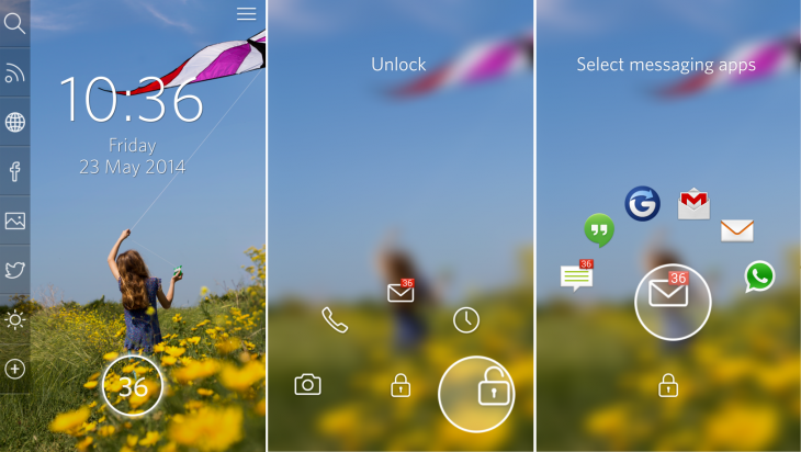
Once installed, you’re met with a new lock screen any time you lock your phone. Unlike some other Android launchers which take over the whole look of your device, Start just changes how your lock screen looks and behaves.
The large circle at the bottom-center of the display shows how many notifications you have, and dragging it over one of the icons brings up a hovering subset of options.
So, for example, dragging it over the message icon (shown below) brings up a sub-menu of messaging apps like WhatsApp, Gmail, Hangouts, SMS etc. Releasing your finger over your selection will launch straight into that app.
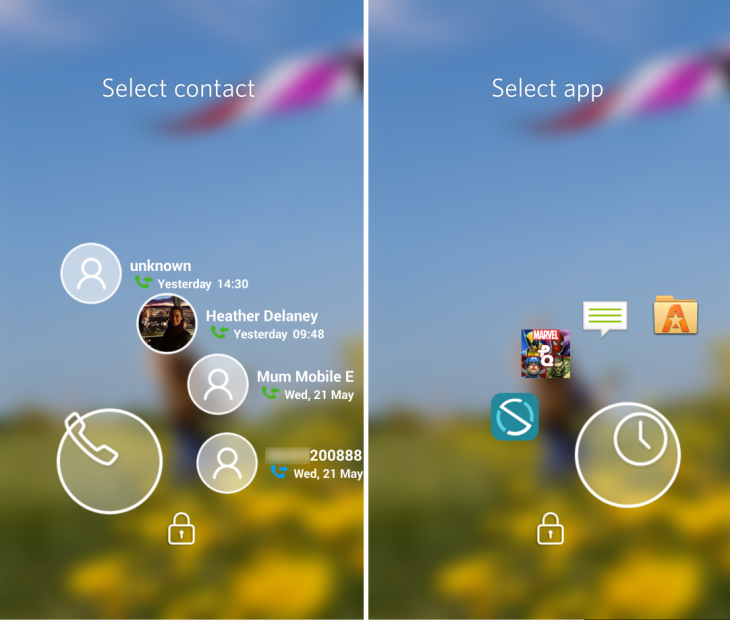
Similarly, selecting the phone icon takes you to your call list, and selecting the clock icon will pop up a list of your recently used apps.
Naturally, no self-respecting Android lock screen app would leave out customization options – and Start is no exception.
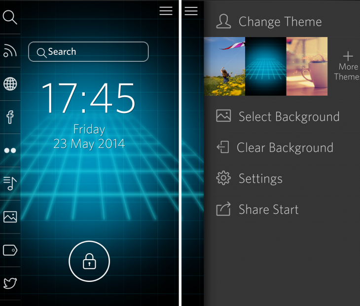
By either searching Google Play or using the in-app settings (an easier method), you can find more themes to customize the look of your lock screen. There are a fair few to choose between (so there’s no obligation to look at a girl flying a kite in a meadow full of flowers) and some popular favorites like a Tron theme, which should please some.
As well as changing the overall theme, you can choose to set a different background picture, or tweak a few of the settings, like the clock and date display size, or choose whether to show them at all. More on that below.
One thing a lot of lock screen apps struggle with is dealing with the security settings. In Start, your settings are preserved as if it wasn’t running, meaning that you essentially have to get through two lock screens. It’s not ideal, but it’s not a total deal breaker and is better than requiring that picture passwords or PINs are disabled.
Getting around
If you did want to change your background or theme, swiping right from the lock screen will take you to the options menu (below right). Tapping the More Themes option will bounce you through to the Google Play store and a list of available themes to download.
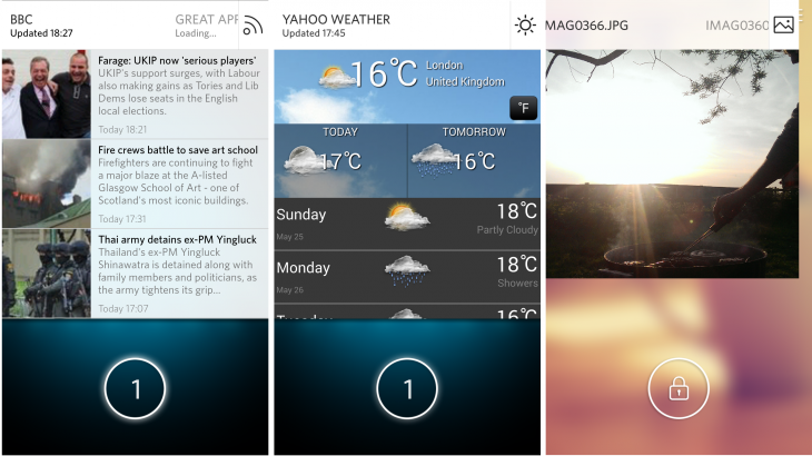
As well as making your notifications look a bit slicker, Start goes a bit further than the average lock screen tweak by allowing you to connect a bunch of apps, which are displayed on the left-hand side of the screen.
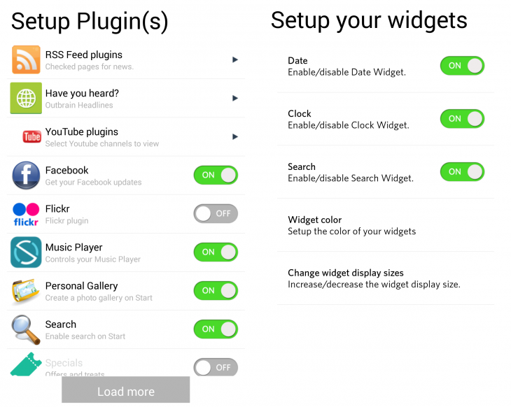
Tapping the Settings button in the options menu will give you more detailed options for the plugins you want to show in the sidebar, and for things like controlling whether the search bar, clock or the date is shown on the lock screen.
Options for plugins include Twitter, Facebook, RSS, a media controller, a photo gallery, news updates and more.
If you choose to switch these plugins on, a vertical list of icons denotes each on the left-hand side of the screen. Tapping the icon for that service will launch it directly on the lock screen, shown below.
Beyond Notifications
While I like the idea of the convenience of these plugins provide, the version I tested didn’t provide the ideal experience. For example, I couldn’t link my Facebook account (Twitter worked fine) as the log-in page wouldn’t show the keyboard on my phone so I could enter my details.
Similarly, I like the photo gallery option – you get to select which images you want to include from across your various albums – but transitioning between each image takes a second or two for each, making it a slower process than you’d really want. The media controller seemed a bit hit-and-miss too – it let me restart/replay a track, but not pause, play or skip forwards.
These minor gripes, however, are just that – growing pains of an app which only launched in October 2013 and that’s still figuring out exactly which features are most useful to its users and how best to implement them.
It’s worth bearing in mind that we tested a pre-release version of the new build ahead of its public launch, which means the version on the Google Play store today could have addressed some of these issues already.
Growing pains aside, Start provides Android users with a slick lock screen option that has the potential to grow into something genuinely useful in the future. The new version is live on Google Play now and free to download.
➤ Celltick | Google Play
Featured Image Credit – Shutterstock
Get the TNW newsletter
Get the most important tech news in your inbox each week.
