
Here’s a neat little app for you. The good folks at hosting provider Peer 1 have launched a new app called ‘Map of the Internet’ which, well, does exactly what it says on the box.
Available for Android, with an incarnation also optimized for iPhone, iPod touch and iPad, the app visualizes the myriad of networks that constitute that thing known as the Internet. It shows Internet Service Providers (ISPs), Internet exchange points, and organizations that help route traffic across the online sphere, such as universities.
How it works
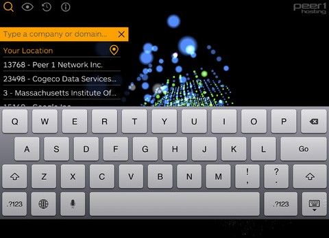
To find your way around the map, you can search using a specific domain, company or ISP, with the various organization-types categorized by color. For example, ‘Large ISP’ is light blue, ‘Small ISP’ is a darker blue, ‘University’ is bright blue, and so on. You can also search for companies such as Twitter or Facebook to see where they’re ‘located’ on the Internet.
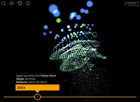
It also features an Internet timeline, which lets you drag a clock along to display key moments in time, such as MySpace launching and iTunes opening to the public.
In terms of the interactive 3D map, well, you can zoom in/out and spin the globe, while tapping on nodes serves up more information around them. You can even carry out a traceroute to a node from your own network, supplemented with real-time data that calculates the time taken for data to travel between the two locations.

The <3 of EU tech
The latest rumblings from the EU tech scene, a story from our wise ol' founder Boris, and some questionable AI art. It's free, every week, in your inbox. Sign up now!
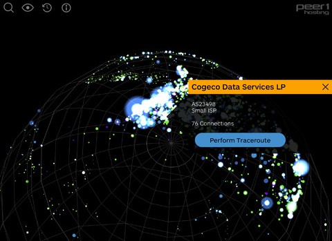
Peer 1 says that the app has been designed as an educational tool for the “hosting industry, academia and everyone interested in networking and the physical infrastructure of the Internet”. It’s built around Internet topology from the Cooperative Association for Internet Data Analysis (CAIDA), and tells users about the Internet’s evolution from its beginning through to today, depicting 22,961 autonomous system nodes, interlinked by 50,519 connections.
“People are curious about what’s going on under the hood of the Internet and this app allows users to easily view and understand how it works,” says Robert Miggins, a senior vice president at Peer 1 Hosting.
While Map of the Internet may not find its way on to your homescreen alongside your everyday essential apps, it is a really fun way to explore the Internet and get an idea of how it works. It’s actually a little reminiscent of one of Google’s London Web Lab experiments called Data Tracer, which essentially maps where all the world’s online information is physically stored. This is designed to help demonstrate WebGL, an advanced Web-based graphics library that’s present in many modern browsers
Meanwhile, Map of the Internet is available to download for Android and iOS now.
➤ Map of the Internet: iOS | Android
Disclosure: This article contains an affiliate link. While we only ever write about products we think deserve to be on the pages of our site, The Next Web may earn a small commission if you click through and buy the product in question. For more information, please see our Terms of Service.
Get the TNW newsletter
Get the most important tech news in your inbox each week.