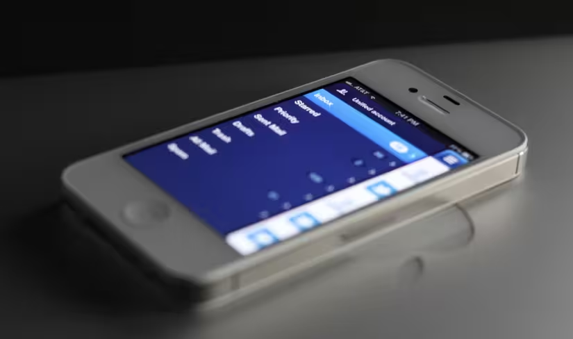
The new, hotly anticipated, Sparrow Mail app for iOS has been approved and is now making its way through the App Store. Our review is live here right now, but we wanted to start out our coverage with an interview of Sparrow co-founder and CEO Dom Leca.
Along with the rest of the team at Sparrow, Leca has crafted one of our favorite mail apps for the Mac and now, one of our favorite apps for Mail on iOS. We’re holding our review until the app is live in the US, but until then, enjoy the interview.
Matthew: There are very few things that are more integral to daily life on an iPhone or portable device than mail. It’s a cornerstone app, so it seems like it would be a challenging thing to translate well. It’s not a light task.
This is not just an optional app somebody could use if they feel like. This is something that’s a core app. They’re going to use this thing everyday, day in and day out.
Is that the reason you guys took on Sparrow in the first place? Was it because it was a challenge or were you just frustrated with your current mail clients? Why did Sparrow come about in the first place even on the Mac?
Dom: The idea was pretty simple with the first iteration on the Mac. The idea was that most mail clients that we were using weren’t satisfying in the sense that they were taking up too much real estate on the screen. That was really the basic statement about the app.
And this feeling came [up] especially when we were using Twitter for Mac. We realized that if Loren [Brichter] had filled Twitter in another way, it could have been a full screen app like Tweetdeck or anything, but he made it this little thing that you could have open fulltime on the side of your screen and just use it while doing something else and you can still see your Tweets coming up.
The idea was just instead of doing all this back and forth between a full-fledged, full-screen mail app and the other thing you are doing, you can just have a quick check on your mail from time to time and you won’t have to do anything other than move your eyes. The basic statement was this.
Matthew: I think that definitely translates when you use it, because that was one of the things that attracted me to it. You have a limited amount of space on your desktop. You have a column for Twitter. You have a column for Sparrow. And then you still have space for a browser and that kind of thing.
Dom: And the second one was that we were Gmail users and we couldn’t get the Gmail experience or something near it on a mail app. We are still convinced that Gmail has [brought] some really important stuff to mail as it stands today like sending to an archive. It seems to be a detail, but it really makes a lot of sense and helps you get rid of the clutter in your inbox.
Matthew: But without fearing that it’s going to be gone forever.
Dom: Right. And then also, on a very large scale, democratized the idea of archiving so you’ve got this in between state where it’s not deleted. but it’s not visible. And still people aren’t really familiar with archiving in the mass market industry.
Matthew: So you wanted to create an idealized Gmail experience?
Dom: Yes.
Matthew: You liked their innovations, but you felt that the level of execution of a desktop app is what you wanted to strive for?
Dom: The execution of Gmail is great, really and I really like the new design. They are doing a lot of stuff, even if it’s only one team at Google. For a team at Google, a big company, they are changing a lot of stuff. But it was mostly because the native experience — we think at least — is always better than the web experience because it’s faster, or it gives the illusion that it’s faster.
Matthew: As far as the iPhone version of the app, how difficult was it to translate that single column experience, that kind of same feel, to iOS?
Dom: On the iPhone, it’s completely different because you only have one screen so the user is engaged in your app. I think the main challenge was to give all of the options to the user, but with the shortest path possible on the iPhone. The question of the screen real estate is completely out because basically we’re using all of the screen, whatever configuration.
But the challenge was more [about] making sure that we have less clutter in most screens which means getting rid of the top button bar and the message list and getting rid of the button bar in the message view.
For example, the two-step composer…when you compose a mail on a mail app, you have this little thing.
It’s the main thing you’re going to do, but still the first input zone is something like 20 percent of the screen which is weird. That’s why we split the compose view making it easier to select your contact and then compose your message.
Matthew: And once you’ve got that done, move onto your work.
Dom: Yes. The two main guidelines were, “Let’s give a lot of space to content.” And the other one was, ‘let’s also…we had the possibility of polling our users, and ‘people want to go fast.’ Because obviously in my case, along [with] most people I know, 80 percent of what we do on mobile is just classifying mail or getting rid of it. I’m not composing a lot of mail from Sparrow or from Mail App. I’m mainly just dealing with it. Archiving, labeling and stuff like this.
The main idea was to allow people to do this really quickly from the main view and still [have] nice animation. So just having delete and archive on the swipe is stupid, though I think it’s just better than having one option. You’ve got all the move to options and stuff like this that you can use really fast.
The most important thing, I think, is the thread system. You can just swipe up and down to move conversations instead of having this extra step that Mail.app has where you select a thread, see the whole mail in the thread and then go into the message that you want to see which is kind of cumbersome.
We have this system where, once you’re in a thread…you tap the nav bar — if you’ve seen this — you’ve got this thread navigation where if the thread is too big, you can just get back on your feet and go to the first one if you are the on the 25th one in two clicks.
Matthew: I hadn’t actually seen that, so thank you. That’s interesting.
Dom: It’s pretty obscure because we figured most people won’t really need it. The case where you want a really long thread and you want to navigate in 20 messages is not that common.
Matthew: But every once in a while when you really need it, it’s a life safer. And for some users — it may be an edge case — but for some users who deal in long threads a lot that could be a selling point on its own because they’re able to jump in and out from the thread to a message with a tap. That’s interesting.
Now, what do you think is the biggest thing that is wrong with most mail clients on the iPhone?
Dom: My honest answer is that we all share the same problems. Mainly that mail isn’t displayed as it should because we are displaying messages instead of people. That’s the point of our next iteration. I don’t see Sparrow on iPhone as a revolution or anything like that. It’s just an evolution of what has been done so far.
It’s made to facilitate the user mail for the kind of people who want to be efficient and who are — most of the time — tech savvy, so it’s not a mass market thing. I think that we share most of the problems that mail applications have. I think the Mail App from Apple is really streamlined. It’s a beautiful app. It delivers what it’s supposed to do. We are just iterating upon this with some more…
I’m looking at Sparrow on iPhone as the update that Apple could have done if they had the time to make a new iPhone mail app — I’m guessing.
Matthew: OEM plus. Are you a car person? Do you like cars?
Dom: Yes.
Matthew: In the car modification world, they have OEM which is the original equipment from the manufacturer. And then OEM plus is stuff that looks like it could be from the original manufacturer, but isn’t. Maybe it was supposed to be on a higher model, but you put it on your lower model to make it look more… So OEM plus, that’s what it feels like to me. It’s like an OEM plus version of Mail.app. It’s modified and customized, but not necessarily turned into something else.
Dom: I think my main gripe with the older mail application that we have today on the iPhone is honestly the Mail App from Apple feels really static. Even though it belongs on the iPad… Wait two seconds. I’m sorry. The meeting room is busy.
The main problem is first I think it didn’t evolve and that is a problem with most default apps that you’ve got to pull to refresh [indecipherable 12:21] that has come up, the cell swipe that has come up also from line. You’ve got the system of pull up and down that the guy from [indecipherable 12:28] introduced that makes a lot of sense.
You’ve got a lot of animation that came up with third-party offers that Apple isn’t really taking into account which I understand because some of them are kind of weird or new. But just have the pull to refresh in mail is something that will feel natural to everybody and I don’t even know why Apple didn’t put it in the new update or some other patch. Chances are they will in two years or something like this, but they are slow to integrate new stuff.
But we’re just taking advantage of this. Another thing that we take advantage of is the fact that Apple doesn’t want to rely on third-party APIs. So basically bringing up all of the other tasks from Facebook, Twitter, Google and stuff like this is something that we can add. It seems necessary for mail and that isn’t there because of political reasons more than development reasons, so…
Matthew: Right, got you. So Apple Mail, you know, integrating Twitter is one thing, but they’re never going to be doing anything unless they have a solid partnership with somebody, and they really don’t want to be reliant on those. So that’s a gap you can fill, you can take advantage of those things.
Dom: Yeah, exactly.
Matthew: Right. You mentioned Loren Brichter…your board of advisors is pretty impressive. How did you get involved with these guys and get them to, you know, come aboard and, you know, help you out and give you advice about what you were doing?
Dom: Honestly, for Loren, it was from the very beginning — even before starting Sparrow for Mac — where we were thinking about, you know, the sidebar system. We weren’t satisfied with what — I mean, when we saw Tweetie for the first time, I thought OK, this is going to be the default for many apps.
When we started Sparrow, I just asked Loren, OK, honestly, I [can’t] find any better solution than the one you have for the icon switch, and since it was one of the main features of Sparrow, I just asked him if I could use it, and he said yes.
Then we just reconnected something like three months later when the first beta was released, and yeah, I asked him, OK, do you want to be an informal advisor for the company, and once the company got incorporated, I asked him more formally if he wanted to get involved, and he said yes. So yeah, it was quite natural.
Matthew: Well, very cool. And then how did you become involved with Dave Morin?
Dom: So Dave Morin just contacted me by mail and told me that he wanted to invest into the company and be our advisor because he was really interested in communications software and stuff like this, so that’s really, I mean, yeah, he contacted me, and we just set it up a few weeks later.
Matthew: Got you. And I noticed that John Maeda is also an advisor
Dom: Yeah, so John, that’s even more funny. I just saw some orders on our license service on our website, because we’ve got the Sparrow Store and we’ve got the Mac App Store, we sell it on both, and he bought something like five licenses. And yeah, I just contacted him and told him oh, that’s really nice that you’re buying Sparrow, and really proud that you’re even looking at it, and he told me OK, I just want to be into the project, because I think that we could do some nice things.
And yeah, the three of them are really — I mean, they are sending mail every week and stuff. Loren a bit less, because I suspect that he’s on a stealth project that is going to make all software on the Mac weird or old in a few months, but yeah, we’ll see.
Matthew: Yeah, he has a history of doing that, yeah. Cool. And then, sorry, I’m taking a couple of paper notes here as well.
Now, I noticed that the navigation bar, or navigation method, the slideover pane, that feels very much like Path. Does that — I mean, was that intentional? Was that something else that you thought is like a natural thing that a lot of people will adopt?
Dom: Yeah, of course. No, no, no, yeah. Yeah, in fact, the thing I realized when Path got out that didn’t — that the Facebook app didn’t have, you know, with the Facebook app, you can slide, but you can only slide on the nav bar, so it doesn’t make much sense.
But what we realized with Path, and we added it in, because we were on the beta of the 2.0 versions, so I mean, it was this summer or something, we just realized that it’s a question of performance, because clicking a button is kind of tricky, and it’s always a pain in the ass if you miss it, but you can’t really miss a swipe.
So it feels natural and easy to do it, so it’s just that it allows you to do something that you would do with a button and that you can still do with a button, but you can do it painlessly, and yeah, it’s even playful to, you know, just swipe through it. So we just added the subpanels because it made sense in Path, and it’s faster and funnier, I think.
Matthew: Got you. So that way, maybe the first time somebody uses it as a button, but after they find the swipe, they probably don’t go back to the button, you know, because they’re like oh, no, I don’t need to do that.
Dom: Yeah, in fact, we just designed an animation. At first launch, you just enter your account, you go through the tutorial, and then you’ve got the two animations moving alone without you acting on the screen, just showing you how the panels work. Most people will get it from the launch of the app, in fact.
Matthew: Now, just as a real quick step backwards, how did you get started in app design, app UX development, that kind of thing?
Dom: Completely accidental. I just went to business school in Paris, and before finishing it, I met with some hackers who were doing some iPhone app development before the iOS App Store was opened, and I just ended up creating my first company with them doing some B2B apps for companies in Paris. I did this for three years and learned a lot about UI design and UX design. And I just founded Sparrow when I got out of that first company one year ago.
Matthew: Right.
Dom: That’s how I did it. So I don’t have any formal background on UI/UX design or anything.
Matthew: That being said, since you — I mean, Sparrow is one of my most-used apps on the Mac, and I, you know, have a feeling it’s going to be on the iPhone as well, at least so far, so I’d like your opinion on this: why can’t Google write a mail client for the iPhone that’s worth a crap?
Dom: Because they don’t really care about it. I mean, they’re not in the native app business, and all that matters with them is to have an app that is identified as the Gmail app on the iOS App Store for mainstream to use, I think. I mean, they don’t believe at all in native things, which makes sense in relation to the whole company.
Matthew: Right. So they just, they don’t believe in the native thing, or, they probably could deliver it, but they just don’t want to?
Dom: Oh, yeah, of course. They could deliver something I think far better than Sparrow or the application they released, but they’re just not allocating any resources to this because they think it’s irrelevant.
Matthew: And do you disagree? Do you think that they’re going down the wrong path, or do you think that’s the right path for them?
Dom: No, I think that’s the right path for Google, because they’re seeing long-term, and yeah, the web will one day just match the performances and feedback and usability of native apps, maybe, at least I hope it will. But yeah, I think that’s seven years, seven to 10 years from now, so we’re kind of safe as a small company.
Matthew: Sure, got you. So you see web technologies at some point delivering a native feel?
Dom: Yeah, I think. I mean, some companies, like Sencha, you might know the company, Sencha Touch. They’re focusing on doing this, I think. Replicating the native UI on the web and trying to make it as responsive as possible.
Matthew: Got you.
Dom: I think eventually they’ll get there.
Matthew: What advice would you give to a new developer or designer?
Dom: If the guy is a developer, he needs a designer. That’s my best advice. And if he’s a designer, he needs a developer.
I would say that the main thing is just finding the project that you are…that causes you a problem when you are using your computer. I mean, Sparrow wouldn’t be born if we were satisfied with the Mail application.
Matthew: So you have to be motivated by that problem, yeah.
Dom: Yeah, you’ve got to be concerned. I mean, it’s hard to build something that you don’t either believe in or have a problem with.
Matthew: So it can come from either of those directions, an issue you’re passionate about or a problem that you’d like to fix.
Dom: Yeah, exactly.
Matthew: Excellent, and now, as you’re approaching the launch of Sparrow on iPhone, are you considering bringing it to iPad, or do you have anything, or are you comfortable on the iPhone only?
Dom: No, we don’t know yet. We’re still small, we have five people. There are three developers, myself, one designer. So we have to carefully select what kind of projects we are going to start.
Transposing the iPhone experience on the iPad and just making some UI tweaks, that won’t be minor. Because redoing the UI for the iPad could take something like three to four months. So we could do this, we could try to jump on the Android bandwagon, or we could just start a new project, the second version of Sparrow for Mac.
So yeah, the choice isn’t made yet. We’ll know soon, because it depends a lot on the cash that the iPhone app could or could not bring the company.
Matthew: You have limited resources, and you’ll kind of make your decision on the fly?
Dom: Which is not the best strategy, I think.
Matthew: Yeah but it’s — you’d be surprised at how common it is. And especially because this is all new ground. The app ecosystem has only existed for the last five years.
And that is — I think you’d be surprised at how many people I talk to who are roughly handling it the same way you are, which is you have to be responsive, you know, you have to be sensitive to how, you know, things are working, but there’s no real predictor, you know? It’s not like stock market trends or anything like that, it’s, every day is new, you know, every day is fresh. So I think you’re probably, you know, not alone in that.
Dom: Yeah. We’ll see if we took the right path.
Matthew: Anything else about Sparrow that I should look out for?
Dom: No, I think you know everything.
Matthew: Well, my wife would disagree, but thanks anyway!
Sparrow for iPhone and iPod touch is live now on the UK App Store and should be live elsewhere in the world soon and you can read our review here.
Get the TNW newsletter
Get the most important tech news in your inbox each week.