From the house of ZURB, creators of such apps as Bounce, Notable, Reel and Strike, comes another Web app called Spur. It’s a free app that aims to help Web designers return to basics and ensure that they adhere to the purest of design principles.
The folk at ZURB, above all else, seem to be interested in making tools that they themselves have a need for. Therefore, they tend to be targeted for a niche audience, but usually demonstrate a very keen understanding of what that audience requires from the product.
In this case, Spur gives website owners and designers seven tools to help measure the design of their website. These are all classic design methodologies — such as viewing your layout in grayscale to see if the design still works — and they have been transformed into simple benchmarks for you to use.

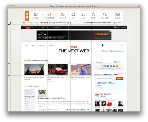
When you load a website in Spur, seven large buttons across the top let you access the various tools, while the Original button to the far right reverts the webpage to its original state. Here’s a summary of the various tools available:
- Grayscale: It drains the colour from your website so you can judge whether the contrast is still OK and the various elements pop out as desired.
- Intersections: It allows you to draw grid lines on the page to “show its focal points”.
- Contrast: It bumps up the contrast of the page so you can figure out which areas are most visible to a user at first glance.
- Blur: With the contents of the website blurred, can you still get some valuable information out of it?
- Mirror: This tool laterally inverts the page, so you can focus on the layout with the text rendered unreadable.
- Rotate: The rotate tool flips your website on its axis. It can help you judge if the site is still attractive if someone is viewing it on a handheld device and others look at it from a 90º angle.
- 50% Zoom: This tool reduces the size of the site by half, so you can figure out if the design still works at the reduced size.
If there is one thing I can point to and say that needs work, it’s that the app loads websites a little too slow and does not always preserve the original layout. In the screenshot above, you can see that it had difficulty with the layout of images next to the articles on The Next Web’s homepage. Hopefully, these are just teething troubles and will be sorted out as the app matures.
The classic design principles mentioned above apply universally to every good, clean design and Spur helps you ensure that you are adhering to them. And since it is also free, if you are a graphic designer, there is no reason you shouldn’t at least give it a shot.
Get the TNW newsletter
Get the most important tech news in your inbox each week.


