It’s only been six years since Apple launched the iPhone and already iOS is the oldest smartphone operating system on the market – from pioneer to the old guard in little over half a decade. Look at it like that and a complete overhaul of iOS was an inevitable move for Apple – and why not do it now, when most people were generally happy with it as it was? Better now than in another year or two, when Android has leapt forward another few version numbers.
The visual refresh is the most obvious change in iOS 7 – the one that will grab the most mainstream press headlines in the next few days and cause the most confused visits to the Apple Store by people who accepted a software update only to be presented by a phone, tablet or iPod that suddenly looks completely different. Still, dig deeper, and it’s window dressing for some far more important and fundamental changes to Apple’s smartphone OS.
Let’s start at the most obvious place though – that visual revamp.
A new look
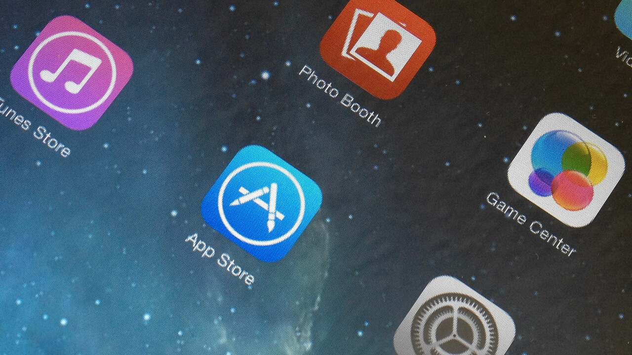
From the fonts, to the icons, to the transition effects and beyond – everything looks different in iOS 7. Upgrade your existing iPhone, iPad or iPod touch and it really will look and feel like a new device.
The icons and the fonts in particular were subject to a backlash from users of the earliest beta version of the OS back in June but both have seen marked improvements in the following months. Still, it’ll probably take you a day or two to get used to them. Ride it out though. Once you’re used to it, iOS 7 is pure joy to use. On an iPad, you’ll find the layout now better complements the larger screen size – it looks less like a ‘just a big iPod touch’ than ever.

Screenshots don’t do it justice. From the zooming, focus-pulling transitions as you switch between apps and the gaussian blur applied to overlaid menus, to the subtle animation effect applied to wallpapers that makes it appear as if they’re tilting ‘inside’ your device as it moves in your hand, iOS 7 feels ‘alive’.
Oh, and those bored of the batch of iOS notification sounds that have been with us for years will be pleased to hear (literally) that there’s now a completely new set of sounds. Those of you married to your Marimba ringtone are safe, though, the ‘Classic’ batch of tones is still available, stuffed away in a folder.
Control Center
Once you’ve got past the new look, it won’t be long before you’re delving into the new features. One that makes a welcome debut is something that iOS desperately needed after countless Android widgets have proved over the years – a quick way to manage the settings for your device.
Control Center is accessed via a quick swipe up from the bottom of the screen. By default, it can be accessed from the lock screen (without unlocking the device) and from within apps, although you can change this if you prefer. It provides toggle switches for airplane mode, WiFi, Bluetooth, Do Not Disturb mode and rotation lock. There’s a slider for the display brightness, audio player controls and access to AirPlay and AirDrop (more on that later).
There’s also fast access to four functions you may use your phone for regularly – a flashlight (goodbye, third-party flashlight apps), the stopwatch from the Clock app, the Calculator app and the Camera.
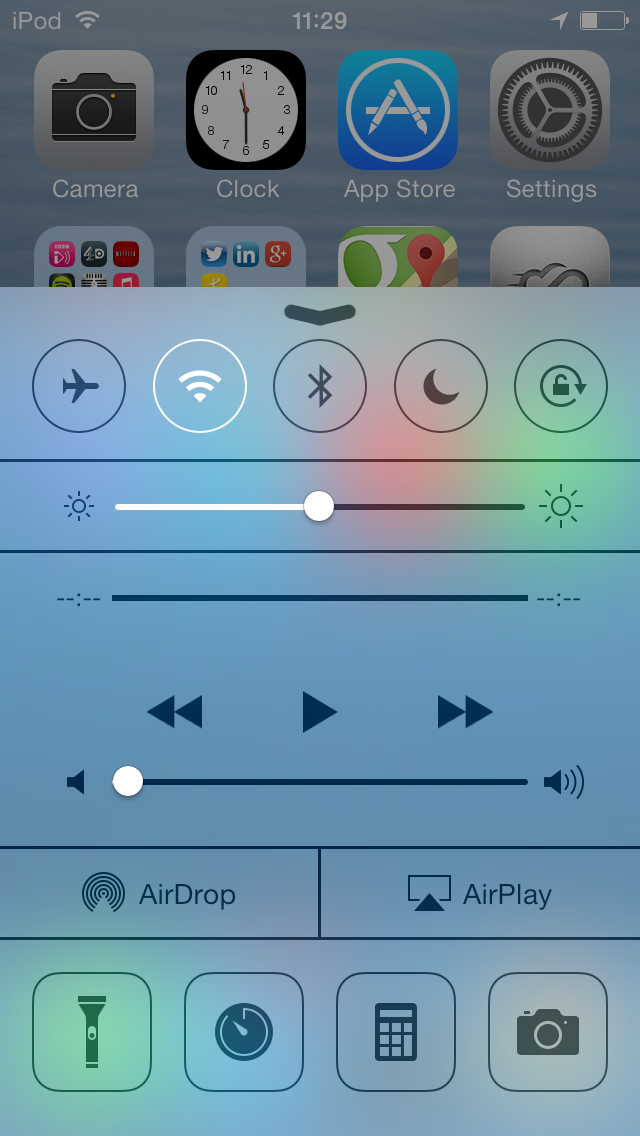
What you can’t do is change the four app shortcuts listed on Control Center. That’s a shame, as if you use something like Twitter or another third-party app more than a flashlight, quick access from a swipe up anywhere in the OS would be a nice bonus. There would be a clear problem with access from the lock screen, of course, but that could be worked around with an unlock required before you access them. Also, it would be nice to be able to switch off cellular data here – that’s a popular activity for anyone who travels abroad regularly.
The four apps that Control Center does give you access to don’t have this problem as they don’t offer any personal data and once you quit them (after accessing them from the lock screen) you’re back to being locked out – anyone picking up your device will still need any passcode you’ve set up to get into anything juicy.
Notification Center
While a lack of personalization isn’t a huge problem in Control Center, it’s far more apparent in the redesigned Notification Center – so much so that its headline feature is perhaps the single biggest missed opportunity in the whole of iOS 7.
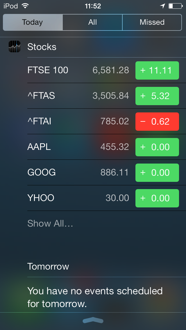
Apple proudly showed off the Today screen during its WWDC keynote in June. The concept is a good one; swipe down from the top of the screen to access Notification Center as before and its newly tabbed interface offers access to Today, a screen giving you an overview of your agenda for the day. There’s a calendar for the current day and tomorrow, plus details of the weather in your current location, any stock prices you’re tracking, alarms you have set and any relevant reminders you’ve asked for.
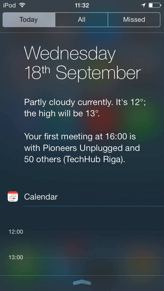
Sounds useful? Well, the calendar certainly is if you use Apple’s own Calendar app to manage your appointments. Use a third-party alternative like FantastiCal or Sunrise and you’ll find that the blank agenda offers no value at all. No wonder that one calendar developer we spoke to was itching for Apple to offer third-party hooks into the Today screen.
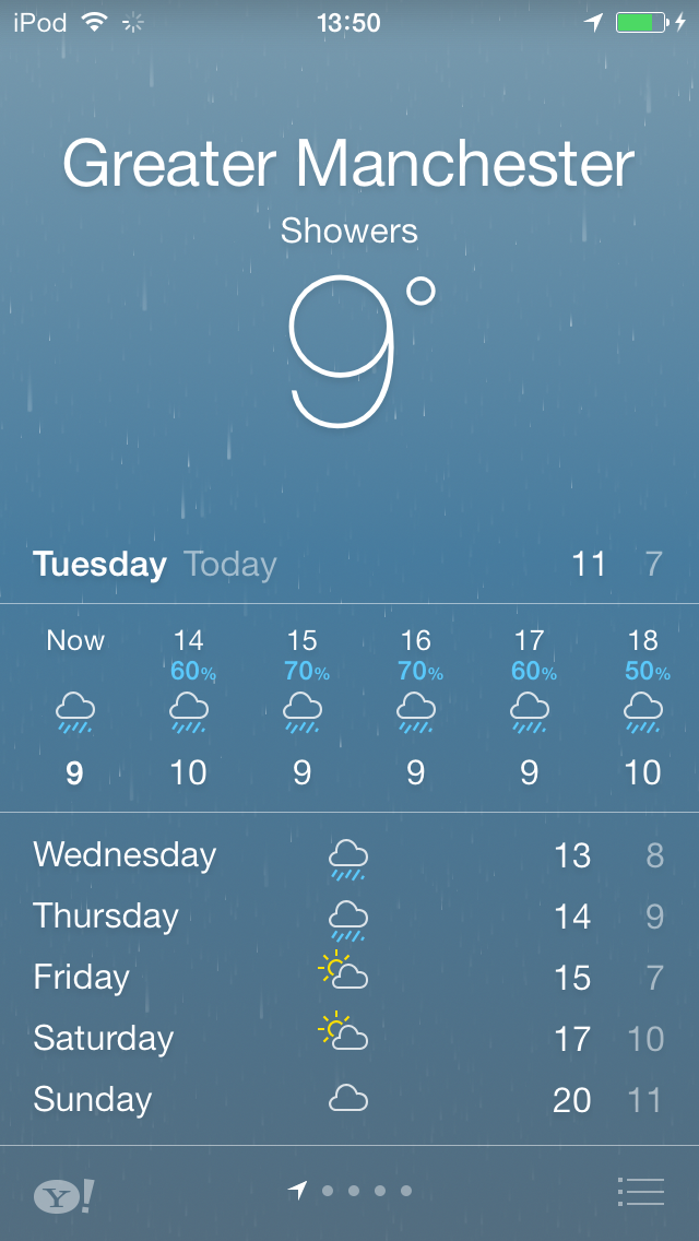
Then there’s the weather overview – once again a useful thing on paper. However, in what appears to be a triumph of design aesthetic over utility, the forecast is spelled out to you in words, rather than using the familiar icons that we’ve got used to seeing in just about every weather forecast we’ve ever read.
“Showers currently. It’s 7 degrees, the high will be 14 degrees. Your alarm is set for 09:41” simply takes longer for the brain to parse than a picture of a raincloud, a couple of temperature indicators and an alarm clock icon with a time next to it. And again, if you use a third-party weather app because you prefer its forecasts, you’re stuck with data from the Apple app in Notification Center.
While many people will find it perfectly usable, the Today screen as it stands, with no support for third-party apps, feels odd coming from the company that invented the smartphone app economy. While Apple no longer rejects apps for duplicating the functionality of apps that come with iOS, it’s certainly discouraging them by locking them out of a screen than users will likely see many times per day.
Aside from the Today screen, Notification Center consists of two other tabs – ‘All’, which lists notifications from every app permitted to send you them, and ‘Missed’, which provides easy access to important alerts like missed calls or calendar appointment alerts. While the ‘All’ view still lacks an option to get rid of all your notifications in one tap (it’s still a per-app job), the spacing here is superior to iOS 6, making it easier to quickly scan through a long list of notifications when you return to your device after a while.
Interestingly, the option to tweet and post to Facebook from Notification Center is gone, indicating that it wasn’t a well-used addition in iOS 6. It never really felt like a natural place to ‘be social’ from to us.
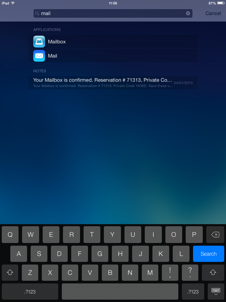
Search
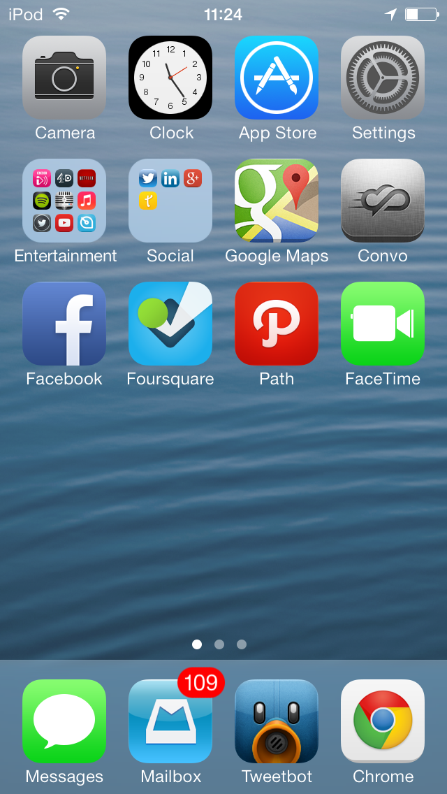
If you’re a long-time iOS user, you’ll be used to swiping one screen to the left from your first homescreen to access the search panel. That no longer works, with search now accessed by way of a short swipe down anywhere below the top of the homescreen. It can take little time to get used to, but it’s a much more natural way of accessing search. If you’re a few screens to the right of the homescreen it’s quicker too, requiring a single gesture instead of multiple scrolls to the left.
Multitasking
Apple has always put battery performance above usefulness of apps when it comes to multitasking, and although iOS 7 sees a new approach to the way that iOS handles background running of apps, it’s still not as straightforward as Android.
Multitasking in iOS 7 is based around intelligent background updates to the data in the apps that you use. If you check Facebook first thing every morning, it will learn this and over time it will ensure that your feed is fresh when you open the app at that time. Apple says that these background updates are most likely to happen at ‘power efficient’ times, such as when your device is connected to WiFi rather than a cellular data connection.
Meanwhile, push notifications from an app can now be used to retrieve fresh information before a user acts on them. So, a notification about a new message from a friend in your favorite IM app will now be able to pull that message onto your phone as the notification appears. That means that when you slide your finger along that notification and the app opens, there will be no waiting while the content you were notified about actually loads.
It’s a bit of a smoke-and-mirrors approach, but it puts stability and power management ahead of anything like ‘true’ multitasking – not a bad thing when it comes to mobile devices.
How this works in practice has been hard to judge during iOS 7’s beta period but as the flood of iOS 7-optimized apps arrive over the next few days we’ll have a better idea of exactly how well it performs.
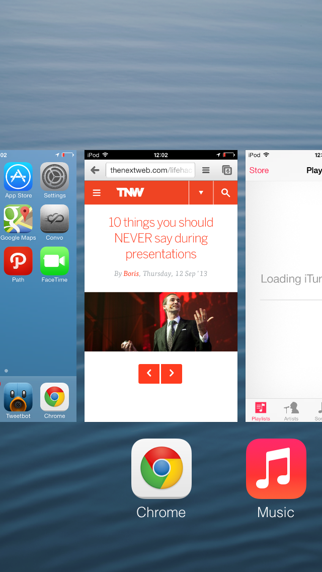

All this said, for most users, the biggest change to ‘multitasking’ as they see it will be the new interface for switching between ‘active’ apps and closing those they no longer want to run. As before, this is accessed via a double-tap of the home button but the pop-up row of app icons is replaced by a full-screen carousel, showing a screenshot of each app the user has ‘open’, A simple flick up closes any app – nice and simple.
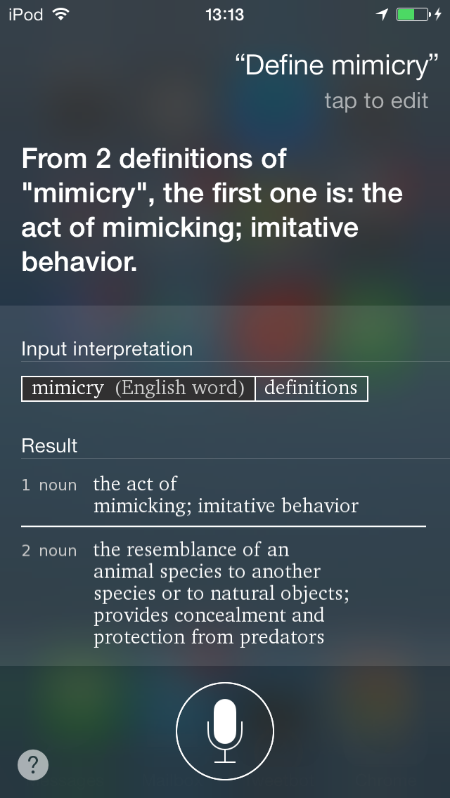
Siri
With iOS 7, Siri has finally lost its beta tag and she (or he, depending on your preference – the American and Canadian options now have a choice of gender) has some new tricks up his or her sleeve, such as displaying Wikipedia results directly within the Siri app, and being able to search Twitter and Bing.
The look of Siri, with a moving sound wave that undulates gently as it waits for you to speak, has matured and befits its newly beta-free tag. That said, having a conversation with a computer is still far from a flawless experience. There are times when it will fail to help you because you didn’t phrase your question in a way it can understand, while asking Siri to “Search for The Next Web” always resulted in a Web search for the phrase “The next.”
Yes, there’s still the question of how much you’ll actually use Siri. Aside from its value as an accessibility tool for those who find a touchscreen keyboard difficult to use, most people will still find it little more than a mildly diverting novelty.
Siri is still best thought of as Apple’s preparation for a time when we all become happy with talking to our devices… or buy an iWatch.
Sharing with the new share sheet and AirDrop
iOS 7 offers a new Share Sheet that contains AirDrop, a feature for quickly and easily transferring files between your iOS device and someone else’s nearby. You select the AirDrop-compatible device you want to share with, its user approves your request and bam – you’re done. All sorts of things can be shared this way – contact details, photos, even Passbook passes. As developers roll out AirDrop support it will become even more useful.
There’s the slight chance of strangers sending you unwanted Airdrop requests as you walk around in public, but by default you’ll only be able to receive requests from your own contacts.

In terms of important changes to iOS in version 7, this is definitely up there. Sure, Bluetooth file sharing has been around for years, but Apple’s implementation makes sense for consumers in a way that should mean that people at conferences can exchange contact information this way instead of swapping business cards. Google’s purchase of Bump this week is both a timely exit for that startup and a chance for Android to adopt similar, OS-wide, wireless file sharing in the future.
Camera
One of the biggest visual refreshes to the built-in iOS apps is reserved for the Camera. A new interface makes it simple to switch between taking photos and shooting video, and there are slots reserved for the panorama mode and a new square photo option.
Square photos aren’t the only nod to Instagram’s influence on the world of mobile photography. Yes, a selection of eight filters can be applied before or after you take a photo. They’re pretty tame though, ranging from monochrome to ramped-up exposure via subtle Instamatic-style effects. If you’re looking for something more extreme, you’ll still need a third-party app.


Still, the introduction of filters is an admission that they’re far from a fad, and lots of us are going to be enhancing/ruining our images with them for a long time to come.
Photos
Once you’ve taken your photos, there’s a whole new Photos app to view them with. Designed to work equally well whether you have 5 photos or 5,000, Photos displays your snaps via a zoomed-out view of tiny thumbnails, sorted by year. Tap on a time period and the view zooms into a view that divides photos into groups gathered by date and location. So, pictures from your vacation in Miami should be gathered together in one cluster automatically.
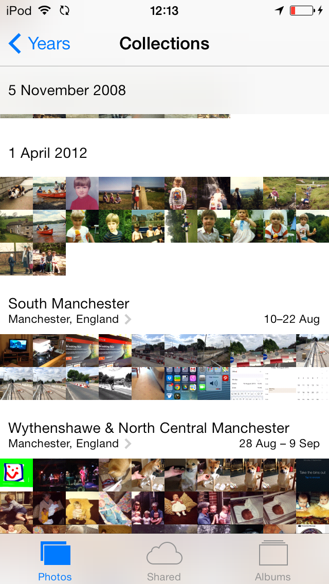

It’s an intuitive way of browsing through a big collection of images, and one that makes perfect sense no matter the size of your image collection.
Of course, you can still create traditional albums that can be synced to iCloud and shared with others using Photo Streams. There’s a new Activity stream that makes viewing the latest updates to shared streams a simple process.
Safari
Safari used to be the gold standard for a mobile browser, but in recent times, Google’s Chrome, with its infinite tabs and cross-device (and cross-OS) syncing has surpassed it in many ways, even if Safari remained technically faster on paper.
On top of an iOS 7-friendly new look, Mobile Safari has finally caught up with the unified search/URL bar trend that its desktop sister had previously adopted. Some may be annoyed by the way that only the domain name for any page you visit is displayed in the bar instead of the full URL, but it’s not likely to be something that will bother most users. Meanwhile, the 3D effect used in the new tab browser is a nice way to zip between tabs when you have loads of the things open.
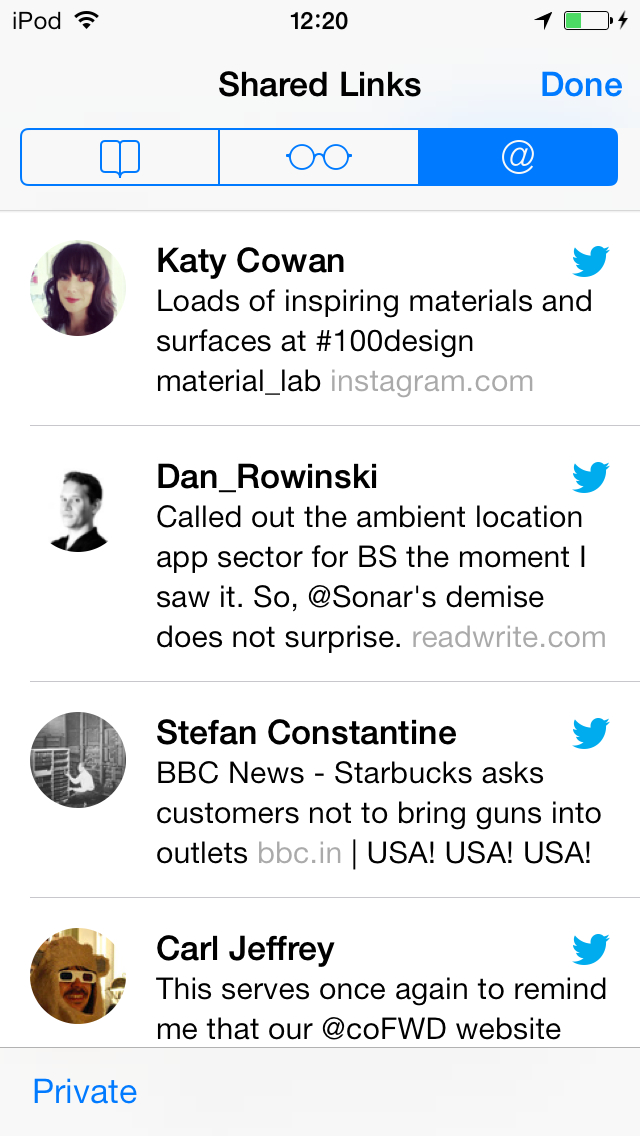
One very useful addition to Safari is the Shared Links tab within the Bookmarks section, Here, links shared by the people you follow on Twitter (on the main account you have set up in iOS settings) are listed in a simple fashion that allows you to scroll through and find something to read when you’re bored or want inspiration.
In all, Safari now feels faster and smoother to use than before. If you work entirely with Apple devices but were tempted away from Safari by Chrome’s featureset, the updates to Safari on iOS make it well worth coming back to. However, those who use a mixture of Apple and non-Apple hardware may well find Chrome’s synchronized history and synced tabs, regardless of OS, too useful to give up.
FaceTime
Aside from the obvious new look, FaceTime’s big addition in iOS 7 is audio calling – yes, as long as you have a data connection, you have native VoIP packaged with iOS 7. That’s not a big move when you consider that third-party VoIP apps have been around for a long time and FaceTime has offered video calling for a couple of years. Still, Apple is clearly confident enough in its relationship with mobile carriers now that it can effectively go into direct competition with them over voice calling. It’s simple to use and works exactly as you’d expect.

A new design language for apps
This week will see updates to many, if not all, of your favorite apps to fit in with the new look of iOS 7. While early indications are that many of these refreshes look quite samey, it’s early days for developers who are learning a whole new design language, and we’ll probably see more diversity and innovation as they become more fluent.
This will be helped no end by iOS 7’s built-in support for things like advanced physics effects in animations and improved, easy-to-implement typography styles. For now, it’s Apple’s own apps that we can look to for cues as to best practice for app design.
So, what are the highlights? The bubble-based interface in Game Center manages to convey a sense of fun without the need for that ugly green felt from the previous version. The Weather app boasts animations for precipitation, so you’ll get a nice rain effect on wet days.

Aside from its headline (and initially US-only) new feature, iTunes Radio, which we’ll cover in more depth in the future, the Music app boasts a reworked landscape mode coverflow view.
Elsewhere, apps like Notes and Reminders get on with things with the minimum of fuss, adopting functional new designs that simply get the job done – no bad thing.
It’s not all good news though. The Calendar app has lost its useful split-screen view that showed a date browser at the top and the details of a selected day below it. Now a Year view lets you zoom into a specific month and then once you’ve selected a specific day, you’ll only be able to switch between days of that week without having to zoom back out to the Month view.
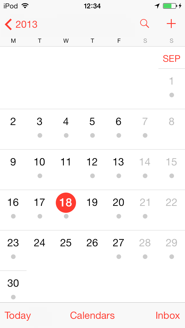
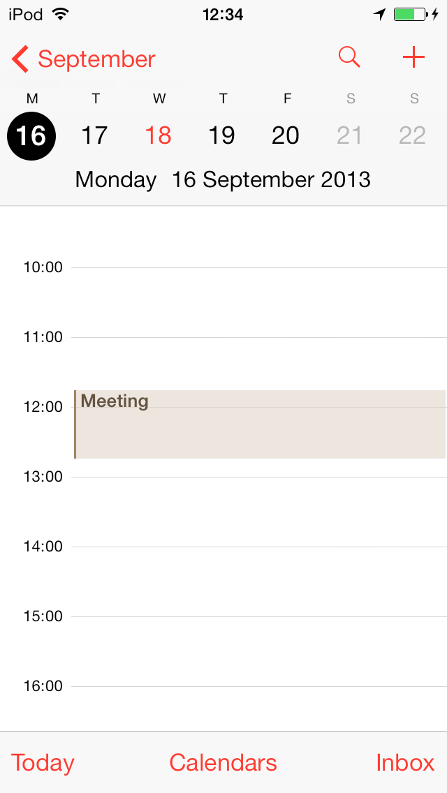
It’s not exactly time-consuming, but it’s a small change that makes browsing dates just that little bit more inconvenient, and a third-party calendar app all the more tempting. As we’ve already mentioned though, that will mean giving up a lot of the usefulness of the Today screen in the Notification Center. One benefit the new Calendar does have, though, is the ability to enter a text search for events.
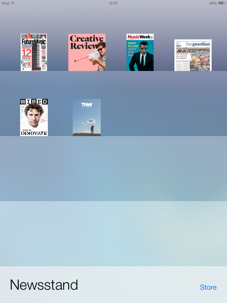
Elsewhere, now that Newsstand has lost its analogy to a real-life news stand, it somehow seems to make less sense, losing a lot of its visual appeal. You now simply get rows of small magazine cover thumbnails. It looks especially odd on the iPad – a device that’s, conversely, naturally suited to reading magazines.
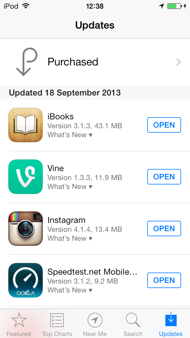
The App Store
The App Store is looking better than ever in iOS 7 and it boasts some useful new features. The biggest one for many will be the option to set apps to update automatically. No more will you have to manually start the update process and keep an eye out for that little red number counter on the App Store icon. If you switch the auto-update option on, you’ll still be able to see what’s new – the App Store now keeps a date-sorted log of updates (including changelogs) and any app that has been updated now has a blue spot next to it on the homescreen until you’ve opened it.
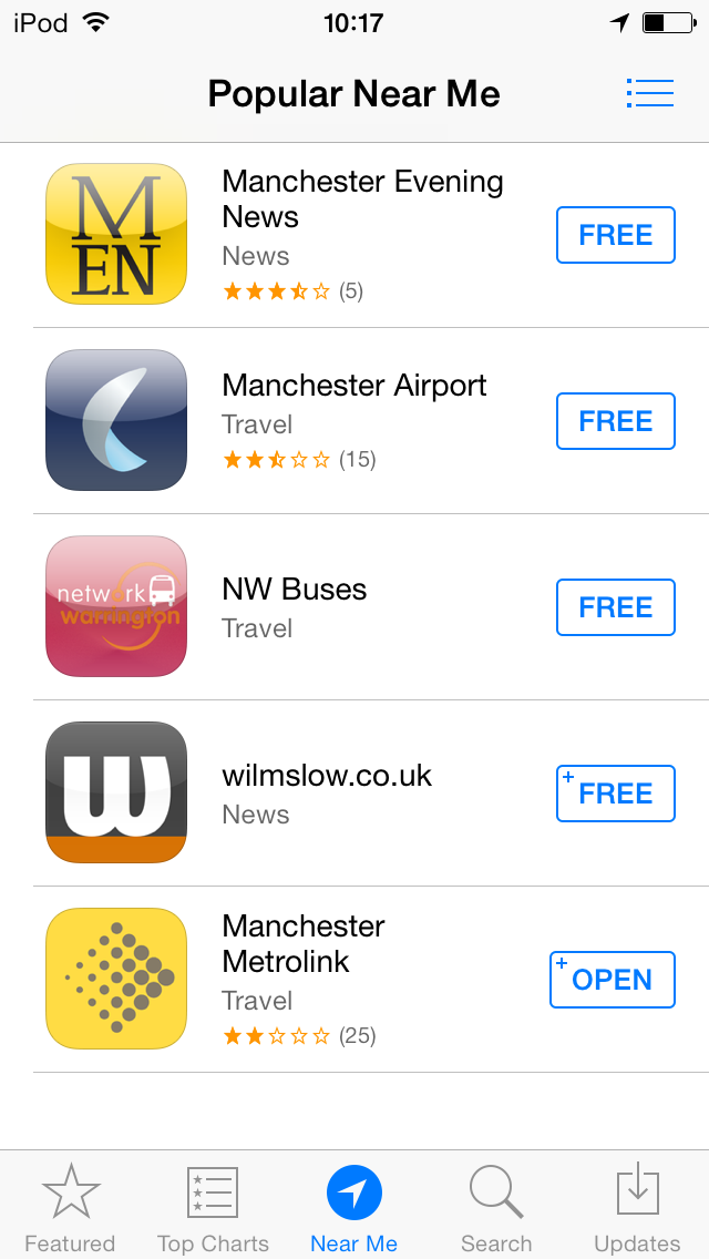
The Nearby option is interesting, providing recommendations for apps based on what others have downloaded in the same geographical area as you. For example, close to me, people unsurprisingly like to download the local newspaper’s app and local public transport apps. If you’re new to an area, the Nearby page could be a useful form of local guide.
The Wishlist is handy – it’s a way of keeping track of apps you’re thinking of buying, and is synced across all your iOS apps. Maybe one day I will splash out on that AP Style Guide app if it stays in my wishlist long enough.
Security
Apple has been making a big push in the field of security lately. The iPhone 5s Touch ID fingerprint sensor is an obvious example of this, but iOS 7 has useful new security features built in – and there’s more to come.
Find My iPhone is now more useful. A thief can’t turn off the feature, erase or reactivate your device requires without your Apple ID and password. You can also set the device to continue to display a custom message after it’s been wiped. A side-effect of this is that your Apple ID is more important than ever.
Elsewhere, enterprise IT managers can now decide which apps employees can use to open documents and attachments, and on-device data from all third-party apps is better protected.
iCloud Keychain, a new feature that saves things like website passwords and your credit card details in the cloud for use with Safari, was present in some beta versions of iOS 7 but was removed before the production release. Seeing as its true benefit will be realized when you can share this secure data between OS X and iOS, it’s likely that this will make a reappearance in time for OS X Mavericks’ release later this fall.
A missed opportunity – the keyboard
There’s plenty more we could discuss about iOS 7, from its in-car support (which isn’t available yet) and its improved enterprise features, to the as-yet untapped potential of iBeacons, but I’d like to finish off with a note about one thing that should have been improved but wasn’t – the iOS 7 keyboard.
Very little has changed about the iOS keyboard in years, and bar some cosmetic changes (particularly on the iPad) there’s nothing new here. While dedicated iOS users may not have noticed, keyboards on other mobile operating systems have come on in leaps and bounds in the past couple of years.

SwiftKey is the first thing I download for any Android device I use – its predictive text that learns about how you structure sentences makes writing ridiculously easy as time goes on. Come back to an iOS device from that and the difference is stark – the keyboard on an iPhone, iPad or iPod touch is a real pain to use in comparison, with the same “Oh he’ll, I’m feeling really I’ll today” autocorrect blunders that have been around since the OS first came to market.
I was really surprised that Apple didn’t either create its own SwiftKey-style solution, acquire a touchscreen keyboard company’s tech for use here or license an SDK like SwiftKey’s (which is already iOS-ready, essentially waiting for Apple’s call). It’s a missed opportunity that will hopefully be remedied in iOS 8.
A note on battery life
Those concerned about battery life will be pleased to hear that the Gold Master version we’ve been using since it launched last week gave us no concerns at all. It was no improvement over iOS 6 but it wasn’t noticeably worse on the main devices we used for this review – a 5th Generation iPod touch and an iPad 2. Still, your mileage may vary, so it’s something to be aware of.
In conclusion
iOS 7 brings Apple’s mobile operating system up to par with the competition in most of the areas that it had started to lag behind, and pushes it far ahead in others. There really is nothing that looks anywhere near as good as this out there. It strikes a fair balance between end-user satisfaction, the needs of developers and Apple’s own interests.
Sure, some will still prefer the flexibility of Android or the look and feel of Windows Phone, but Apple has its own, highly successful approach and it’s sticking to it. Users upgrading today will likely have the same negative initial reaction as many beta users did – the new look takes time to get used to but it’s a significant improvement over iOS 6. iOS 7 is a bold leap forward that puts Apple on the right track for the next few years as mobile devices become ever more important to our lives.
Now read: Roundup: Here’s what the first reviews say about the iPhone 5s and iPhone 5c
Get the TNW newsletter
Get the most important tech news in your inbox each week.