Apple is known to be obsessive when it comes to the smallest design elements of its products. This attention extends to the icons that it uses for its official apps. Many of those icons, when examined closely, display cues that point to Apple history, products and relationships.
We took a look at just 10 of these icons here, to explore their secrets a bit, and to demonstrate the focused detail that the company displays in the creation of its software.
Mountain Lion Crazy

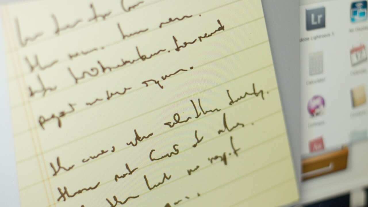
As pointed out on Twitter by John Siracusa, the icon for the new Notes app in Apple’s Mountain Lion release of OS X appears to be a sloppy rendition of the text from the famous Crazy Ones commercial aired during the Think Different campaign.

The <3 of EU tech
The latest rumblings from the EU tech scene, a story from our wise ol' founder Boris, and some questionable AI art. It's free, every week, in your inbox. Sign up now!
That commercial was narrated by actor Richard Dreyfuss on television, but, famously, was first narrated by Apple founder Steve Jobs. Jobs chose not to have his version aired because he felt that it would make him look egotistical.

Interestingly, the icon that appears on Apple’s Mountain Lion preview site shows a different set of text. Sometimes Apple alters the icons at lower sizes to make them display better, but I checked all of the sizes in Mountain Lion and they’re the same. So this must have been tweaked at some point previous to the developer preview being shipped out.
TextEdit

TextEdit, in the versions of OS X starting with 10.5 Leopard, features a much more legible rendition of the Crazy Ones text. John Appleseed is Apple’s standard ‘John Doe’ user name. This version is still in use today.
More ‘Crazy’ files

Another use of the ‘Crazy Ones’ text comes in Lion’s All My Files icon, which contains slips of paper that spell out some of the text written for the campaign by Chiat/Day’s Rob Siltanen and Ken Segall. Note that this version of Crazy Ones is the ‘original’ one, not the one that was aired in the commercial.
The full text, which can be found here, contains the line “Maybe they have to be crazy. How else can you stare at an empty canvas and see a work of art? Or sit in silence and hear a song that’s never been written? Or gaze at a red planet and see a laboratory on wheels?”
The final commercial version did not contain this line.
Find my family

The Find My Friends icon is an interesting case. As with many recent Apple apps, it displays a what can sometimes be attributed to skeuomorphism, in that it emulates a leather patch, sewn on to your home screen. This trend toward emulating ‘real-world’ objects and textures, without necessarily enhancing the usability of an app, has been a hot topic of debate among Apple product users lately. In the case of Find My Friends, the icon doesn’t actually represent a physical leather button or toggle, so it’s more of a design styling.
A little birdy has told us some interesting stories about this particular icon, though. First, the app was originally supposed to be called ‘Find My Family’, but Apple executives thought that was too ‘creepy’, so it got a name change.
Although the skeuomorphic design of some other apps might feel like they’re there for no apparent reason, that’s not the case with Find My Friends. Instead, it’s likely that it was given its particular leathery look because it felt more familiar and comforting to users who were going to be dabbling in something almost inherently ‘creepy’: tracking their friends and family.
It’s a classic example of Apple’s detail-oriented attitude being embedded in its thought process, from app function to icon design.
Bono

The Artists button in the Music app on iPhones and iPod touch devices is a silhouette of a man (scaramouche, etc.). If you look really close, you’ll notice that the outline is of Jobs buddy and frequent Apple collaborator Bono, the frontman of U2.
A Keynote Awakening

The Keynote app icon isn’t exactly the place you’d look for for a puzzling Easter egg, but it has one. If you look closely at the Keynote icon that has been in use since the ’09 release of iWork, it has a document on the podium entitled “Q4 2009”. But the text is far from businesslike. Instead, it’s the lyrics to a song by Duncan Sheik featured in a musical version of the German play Spring Awakening.

Why? No idea, but Apple has long been a proponent of the arts and the musical cast did perform the play at the Apple Store in Soho, NYC at one point in 2007. Apple also has a profile up on Sheik and the play in its ‘Pro’ section on Apple.com. Note that the play features Lea Michelle, now of Glee fame.
Mapple
![]()
In iOS icon news, I doubt there are many people who don’t know that the Maps icon shows the rough location of Apple’s Cupertino headquarters at 1 Infinite loop. You can see the circular shape of the titular drive right next to the CA 280 freeway.

Some artistic license has been taken with the proportions, but you can see from the screenshot above that the basic geography is correct.
BSOD

In one of the funnier Apple icon references, the Windows Network icon in OS X takes on the shape of a boring beige monitor displaying the famous Windows Blue Screen of Death. The error screen is familiar to any Windows users as the most common sign that your computer’s software or hardware has taken a crap. I saw this a lot as a Windows user.
As a bonus, Apple gets in a dig at how boring most PCs used to, or still do, look. Especially when compared to the design-conscious Apple machines.
iCal Launch

The icon for iCal is a simple reference to the launch date of the app. It was revealed by Jobs on July 17th at the 2002 Macworld Expo in 2002. You can watch that keynote, at which Apple also launched OS X 10.2 Jaguar, here.
Hello from Cupertino, CA

Apparently Apple has its own Post Office, because the routing stamp on Mail.app is customized with the company logo and a friendly ‘Hello’ message.
There are dozens more Apple icons that show an impressive level of detail, like the Dictionary.app icon, which features ‘lorem ipsum’ on its cover, or the old iTunes icons, which had Apple text around their inner rings. But you know of any with interesting stories behind them? Let us know in the comments below.
Catch the latest Apple news right now at TNW Apple.
Get the TNW newsletter
Get the most important tech news in your inbox each week.